


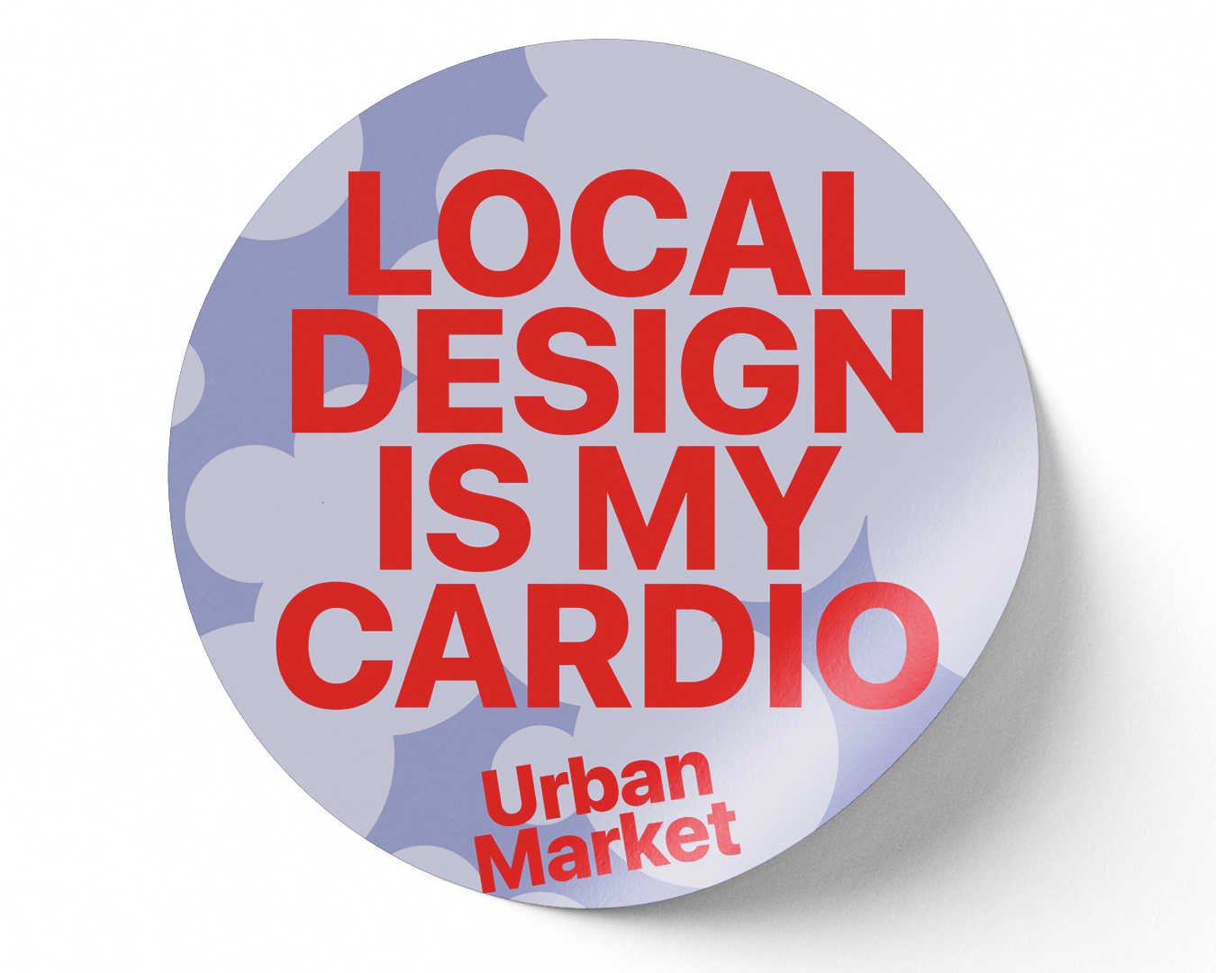
19
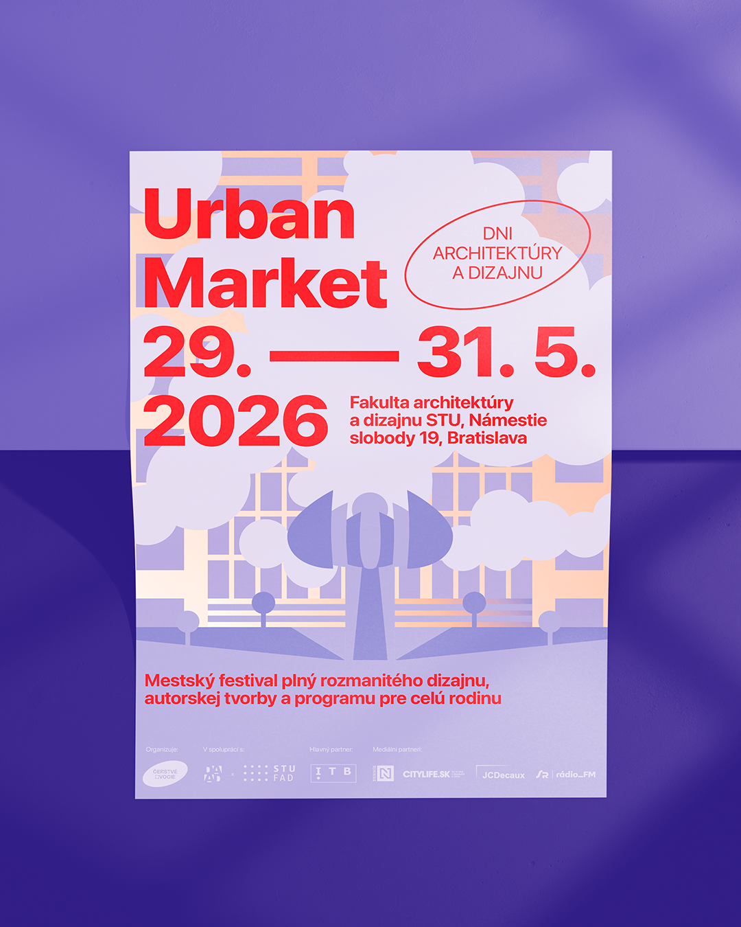
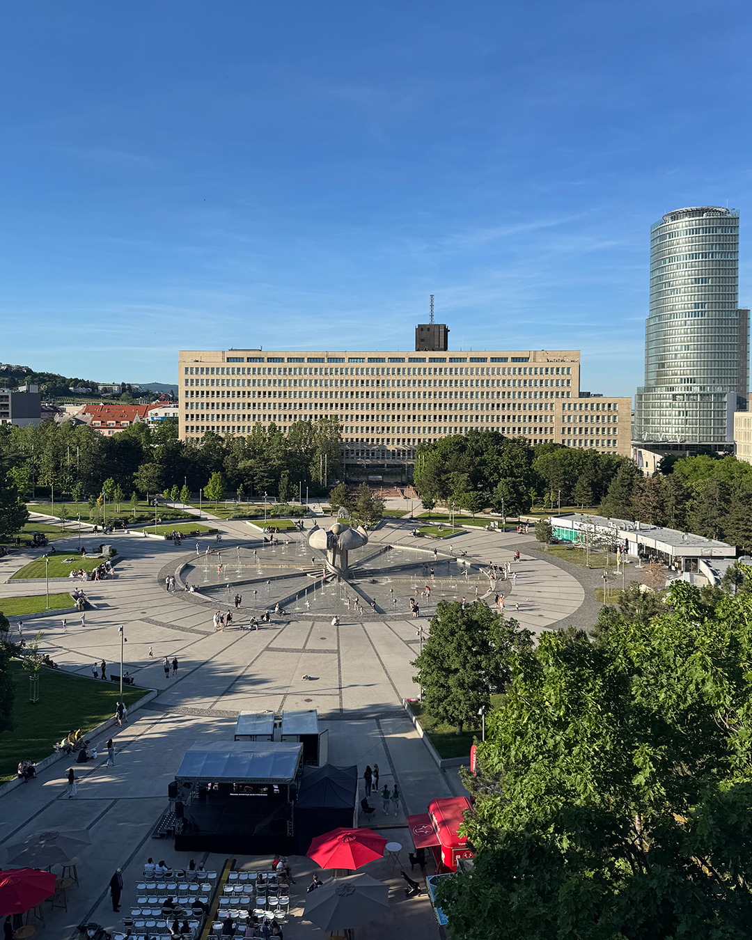
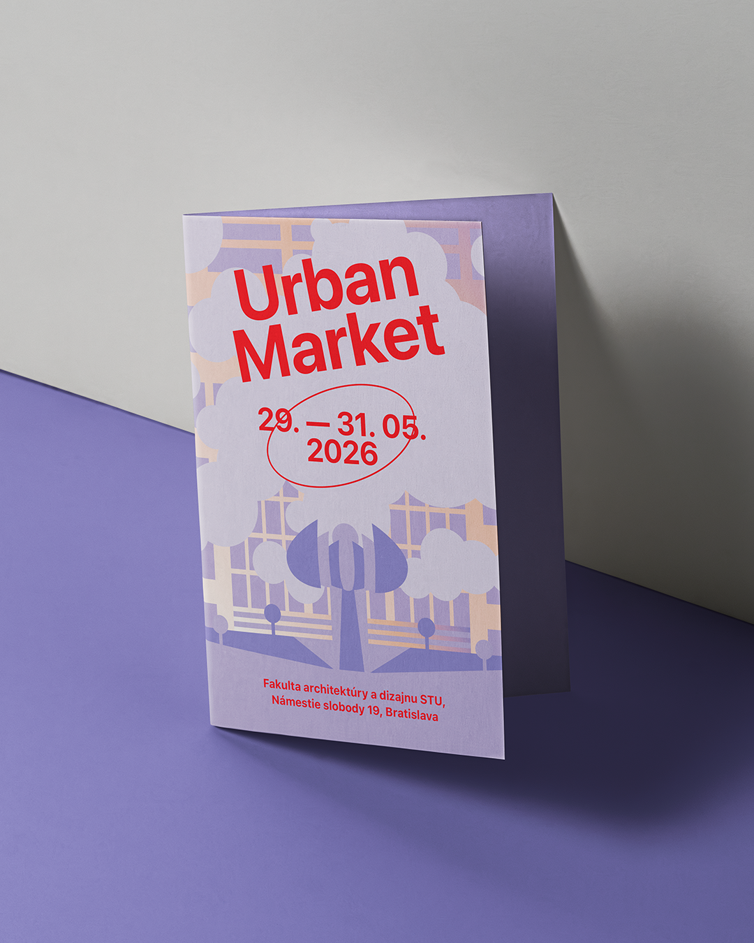
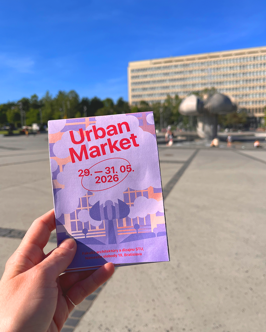
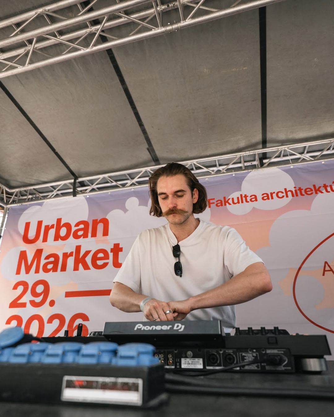
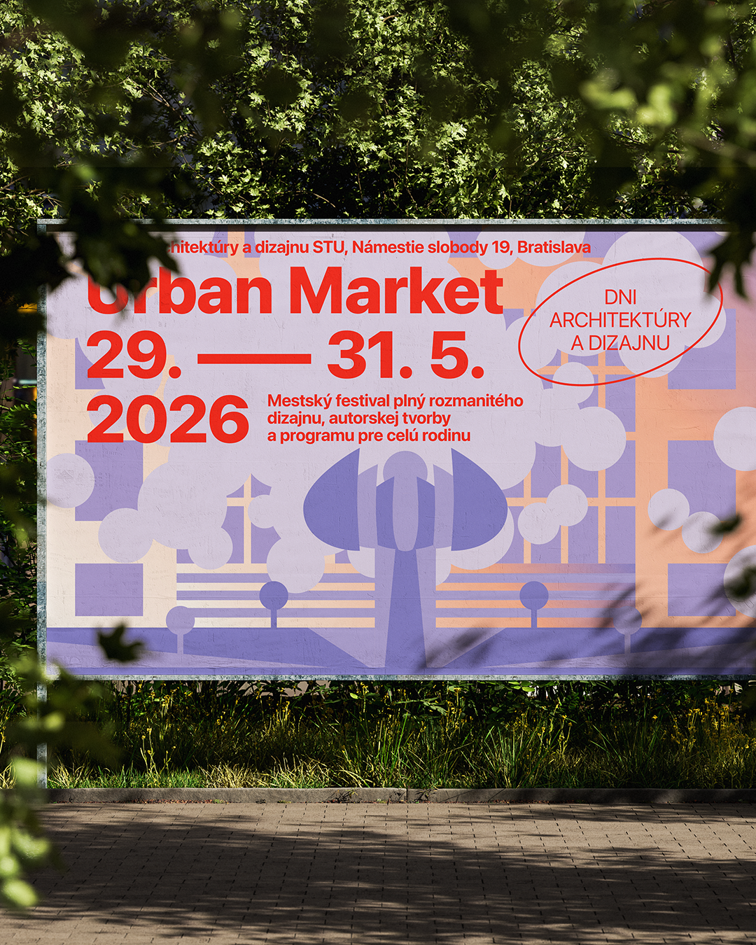
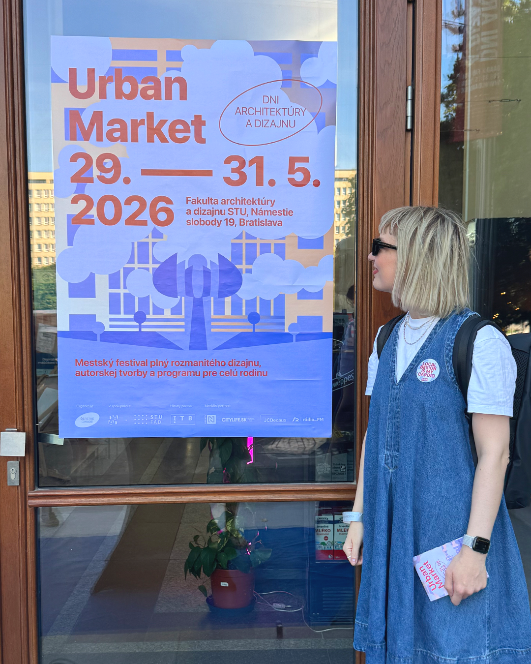
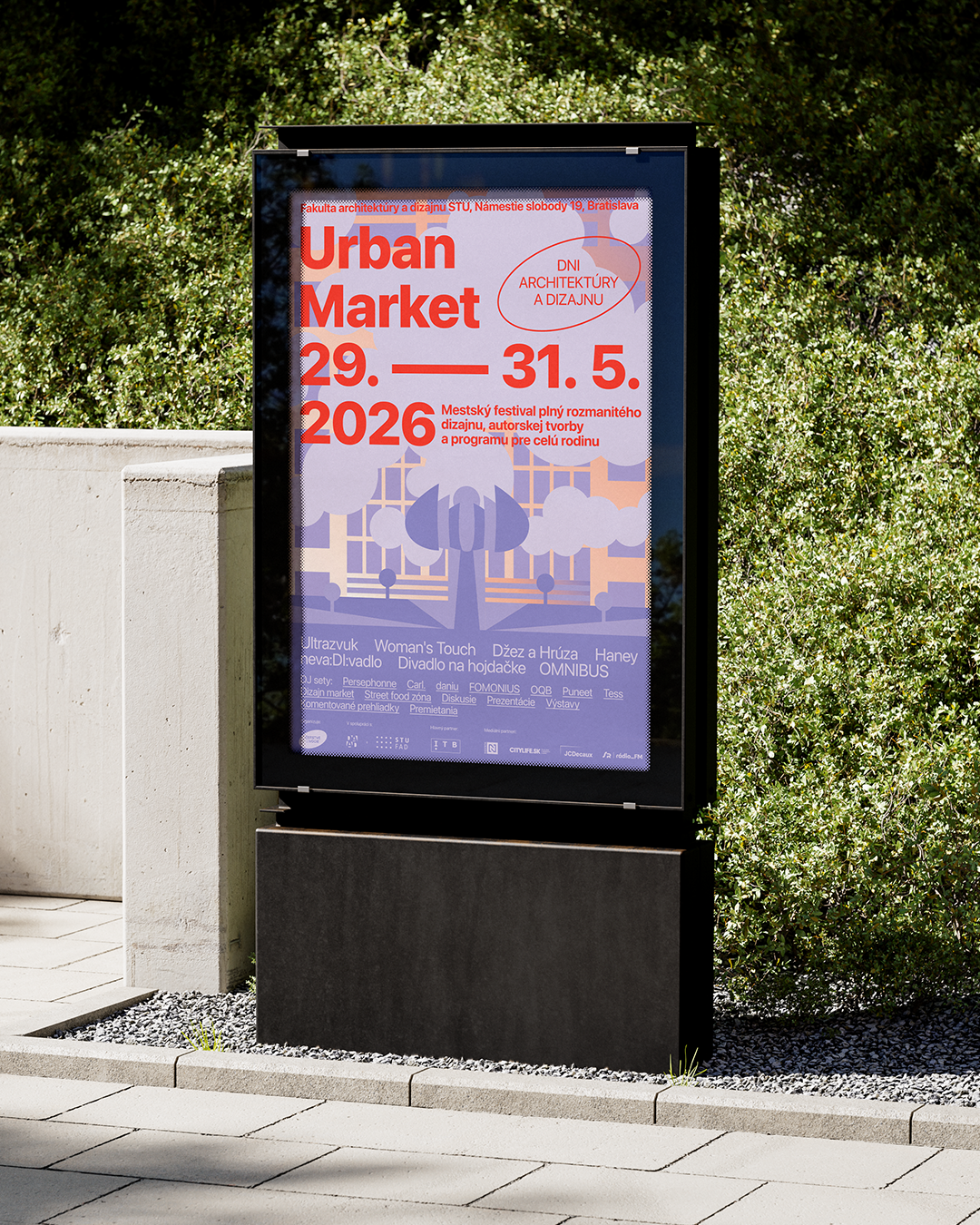
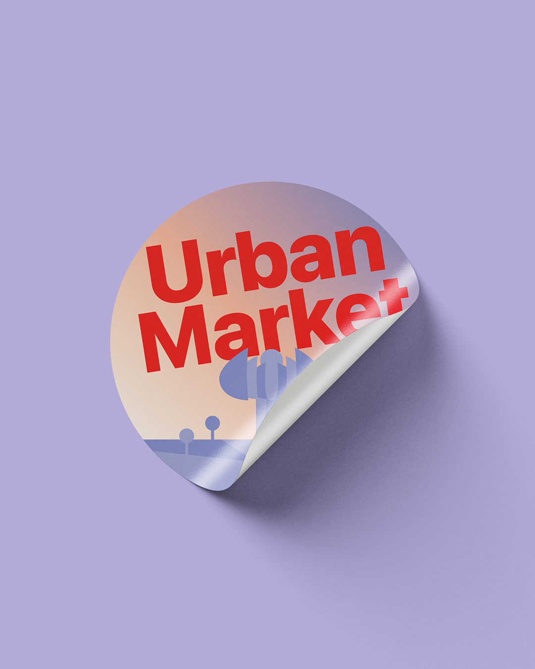
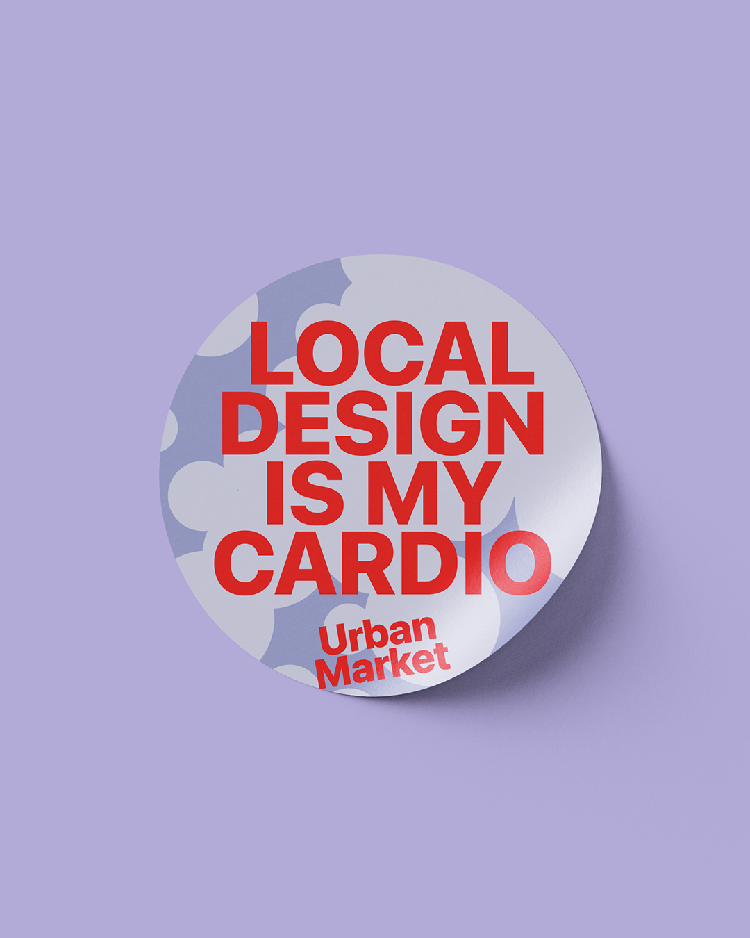
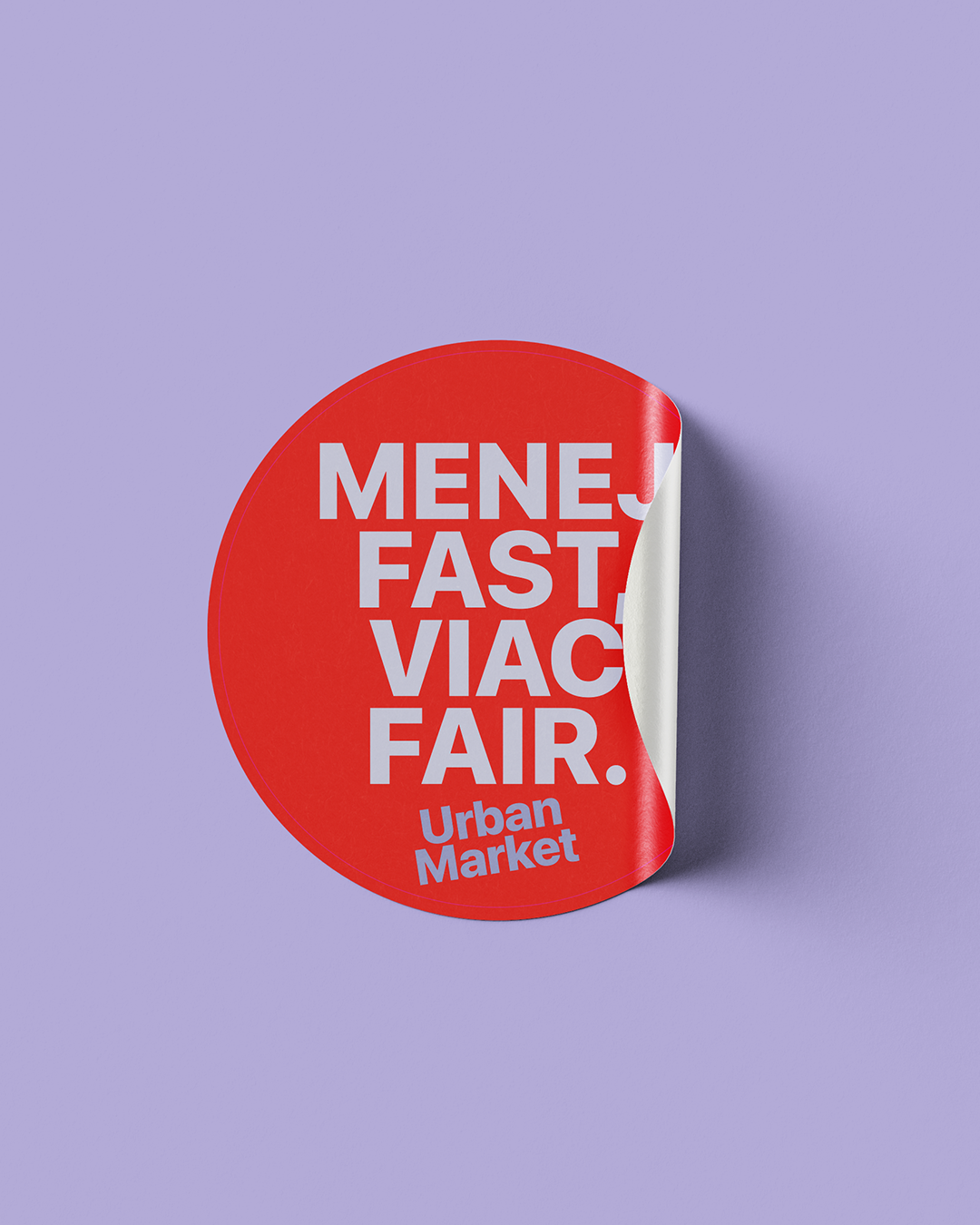
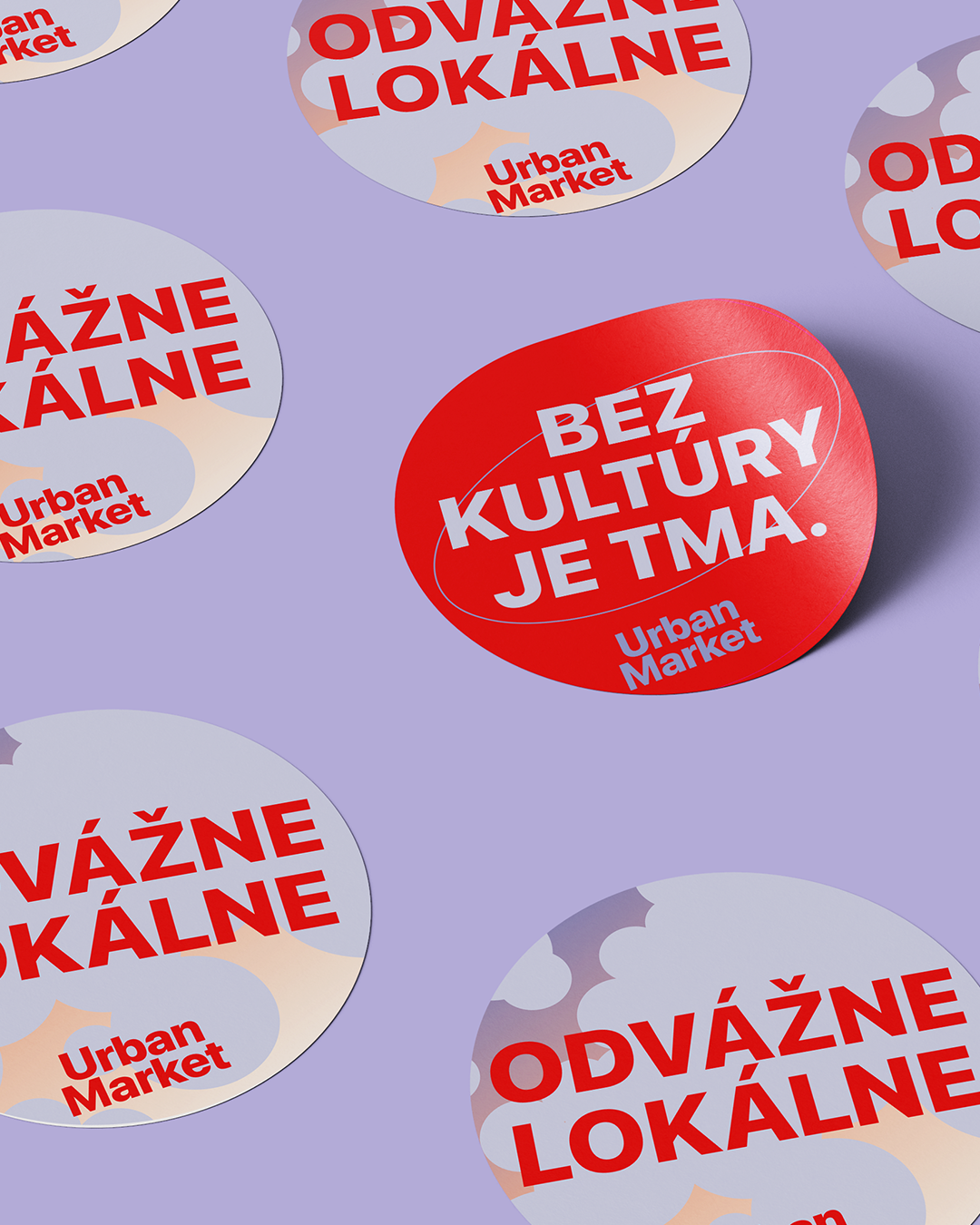
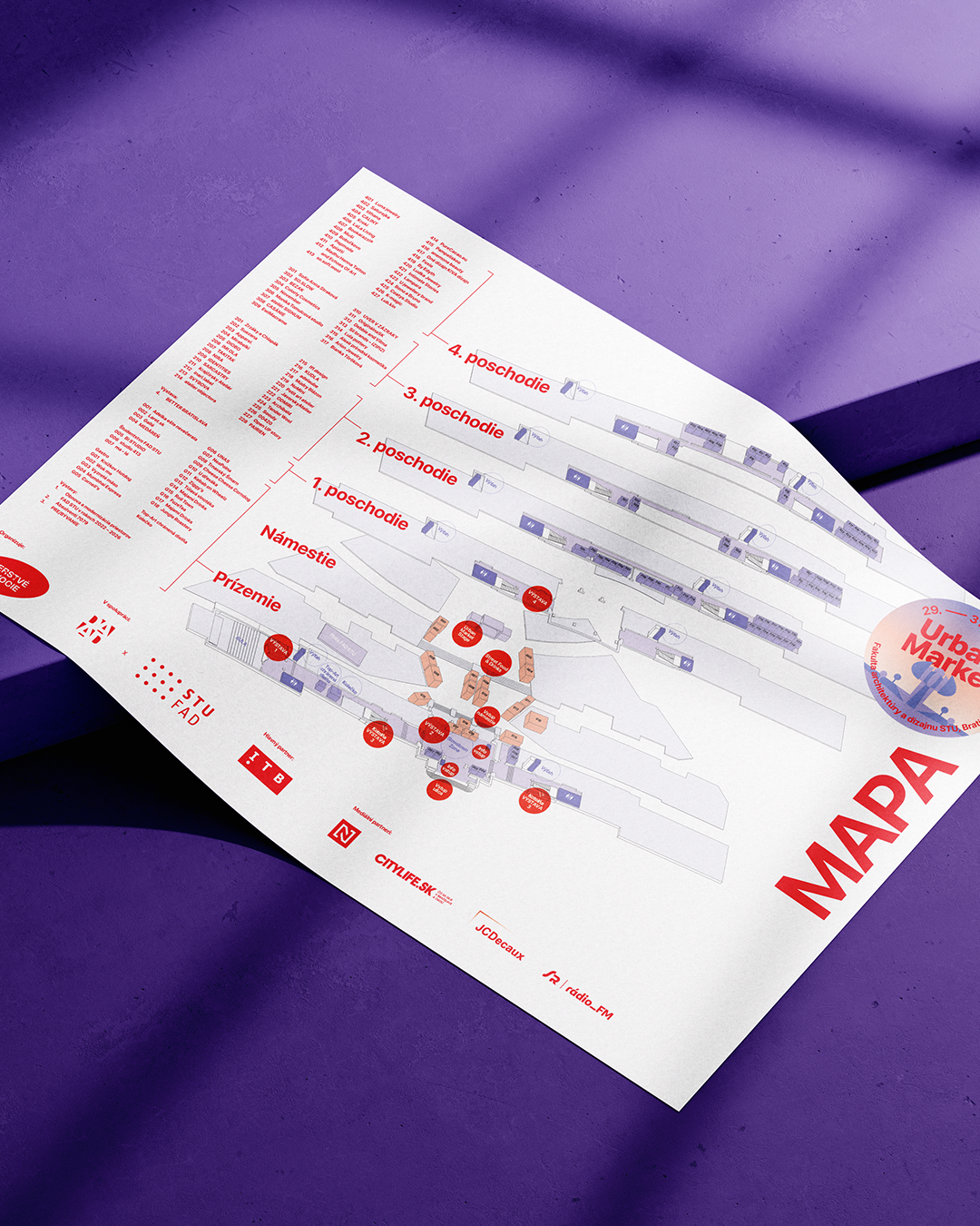
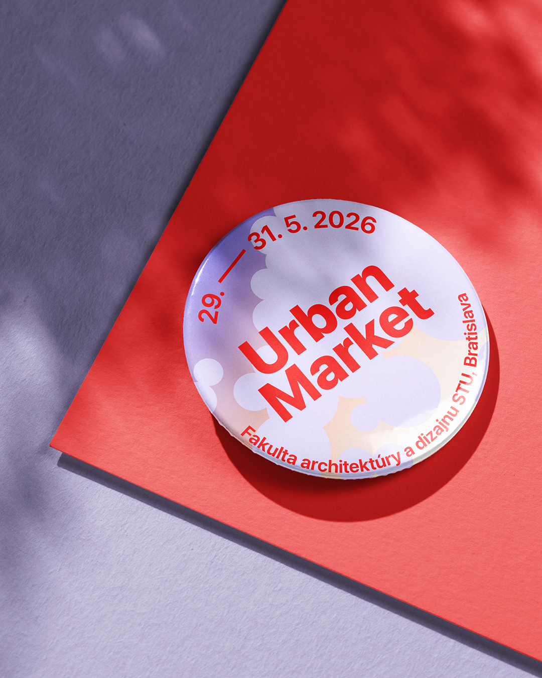
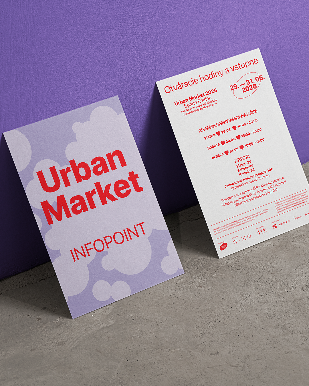
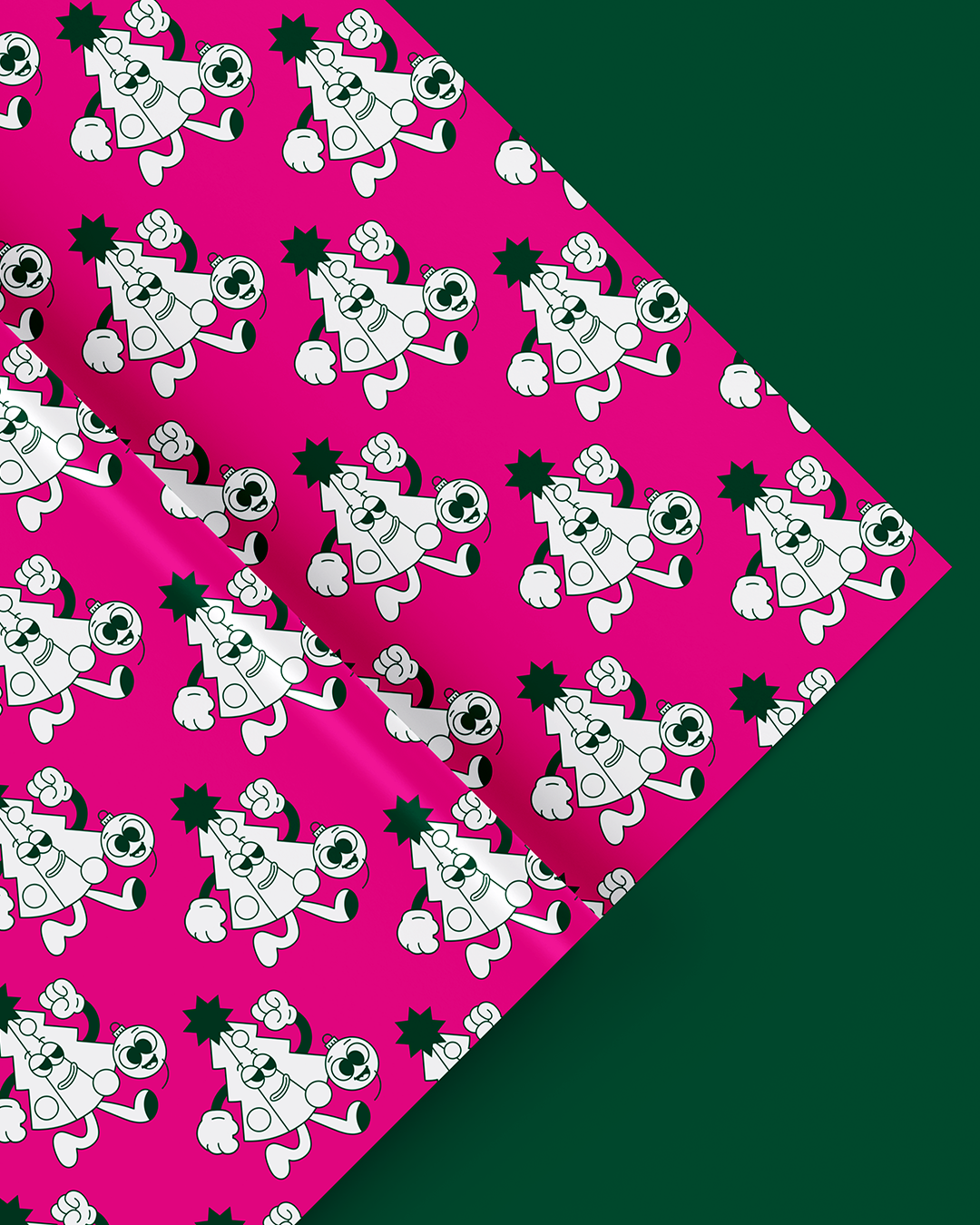
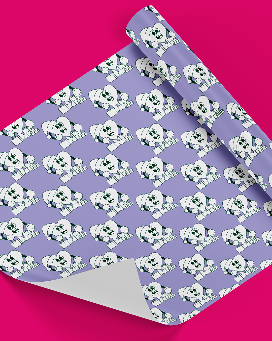
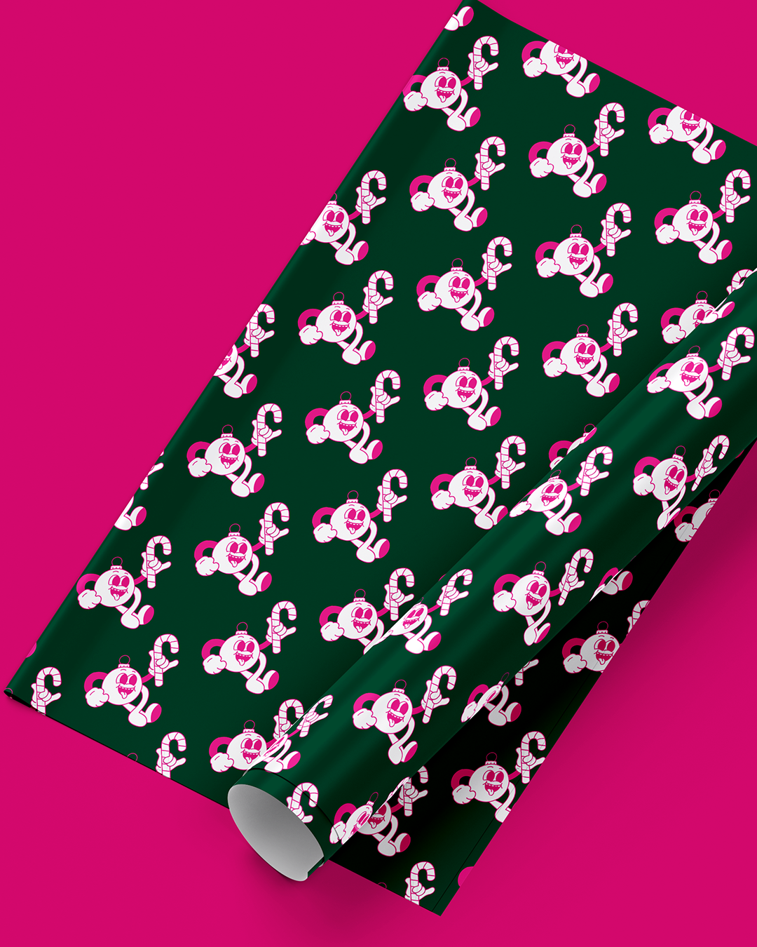
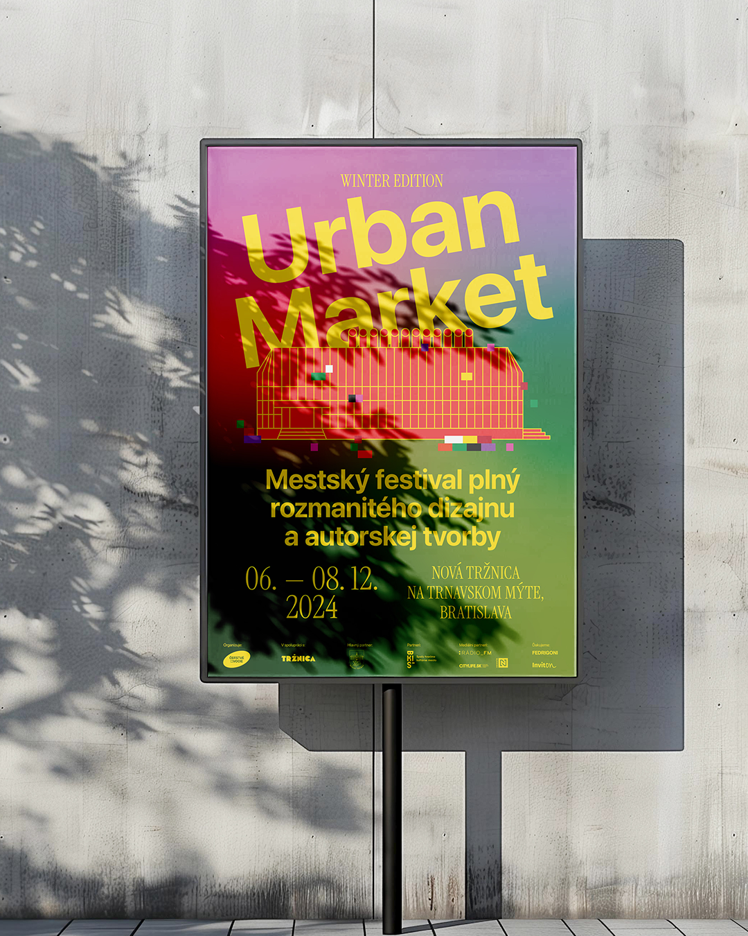
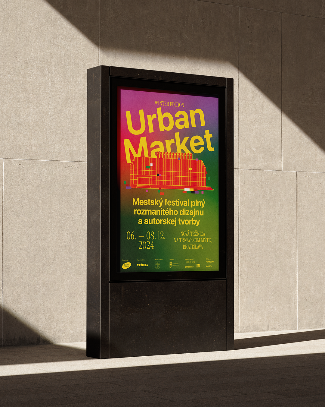
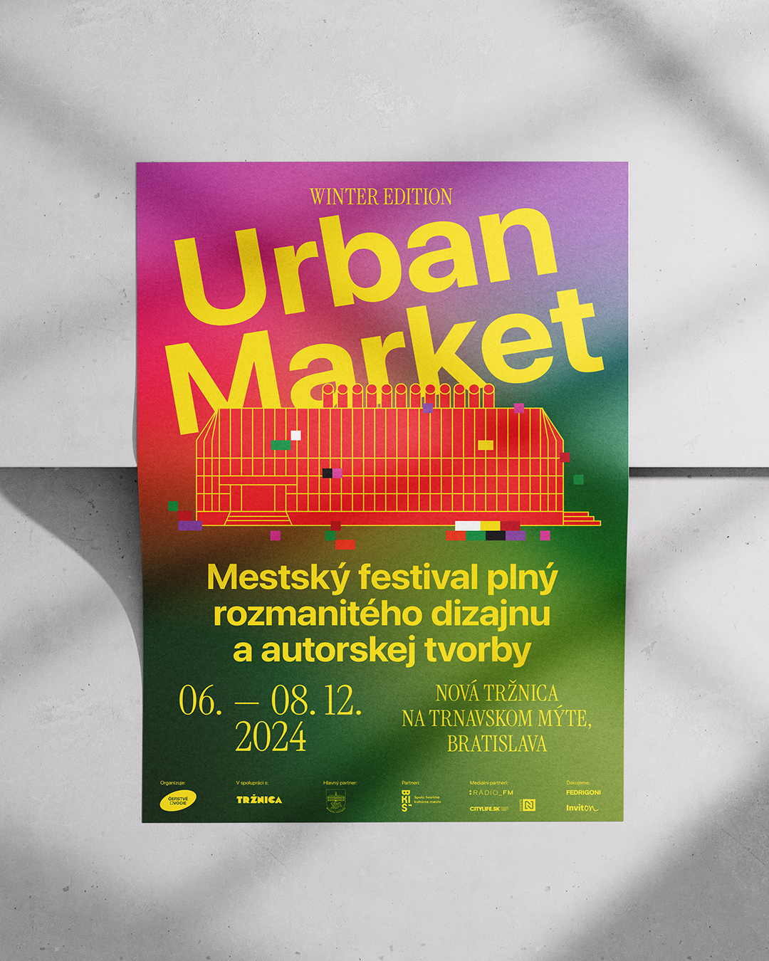
Urban Market Spring 2026
8
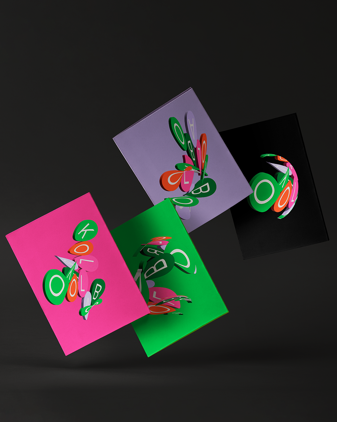
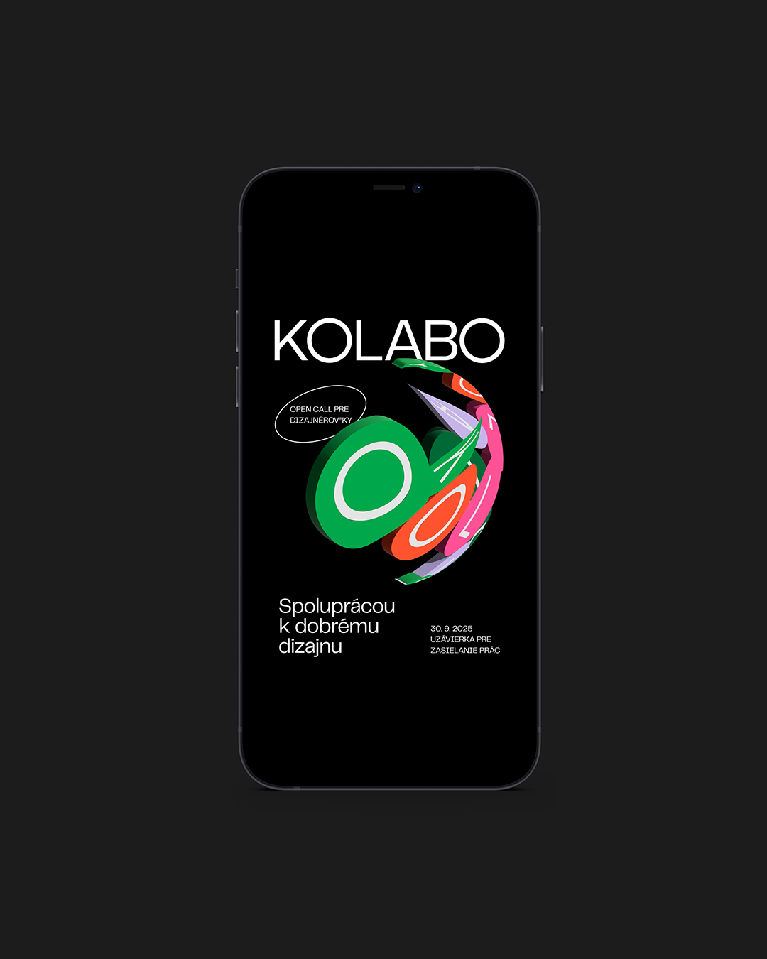
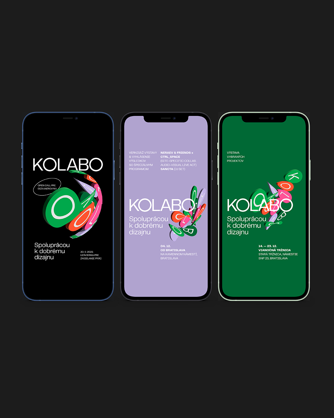
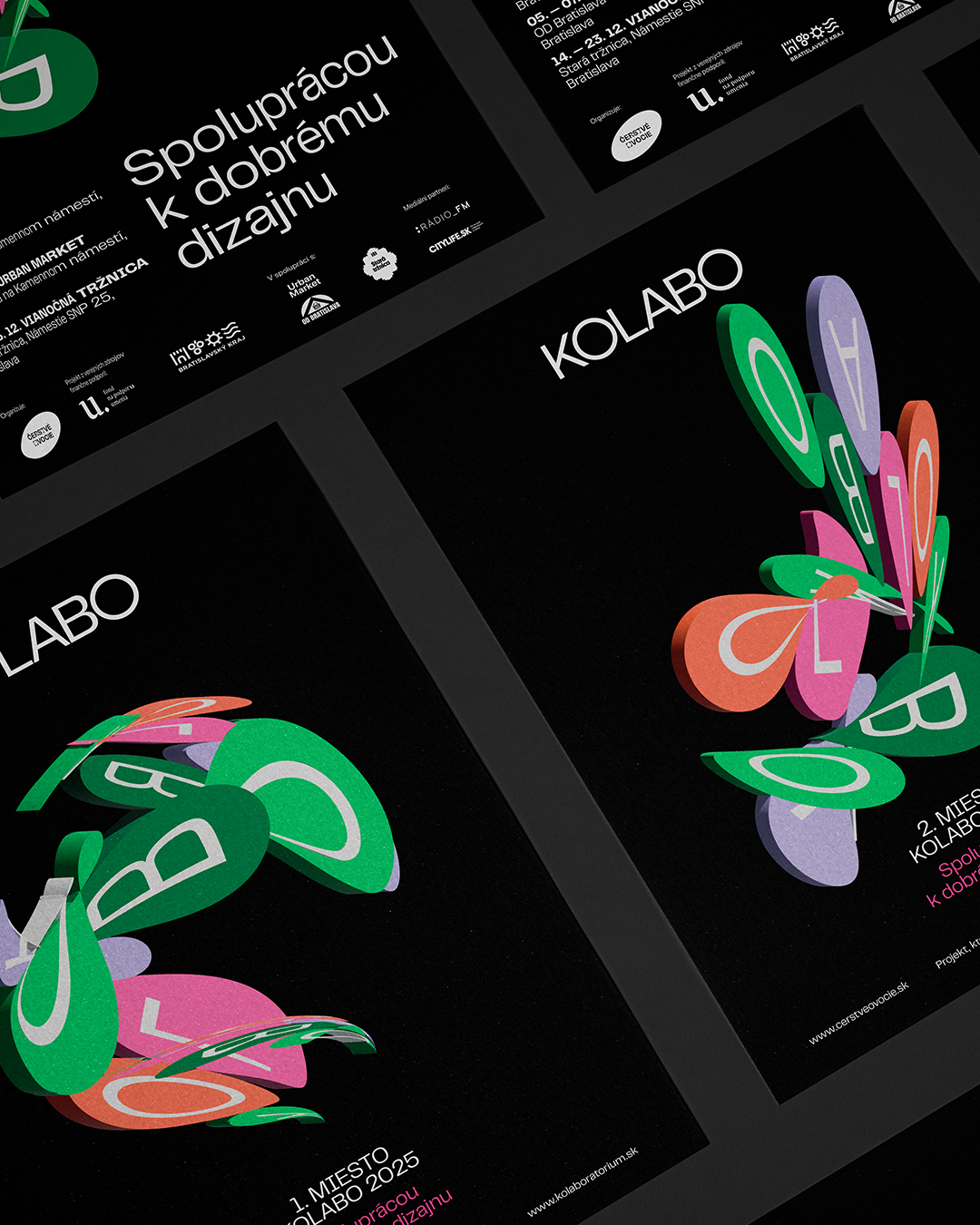
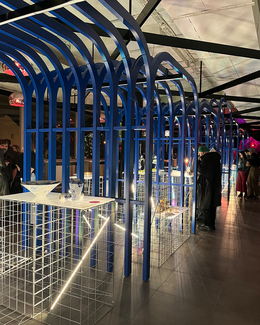
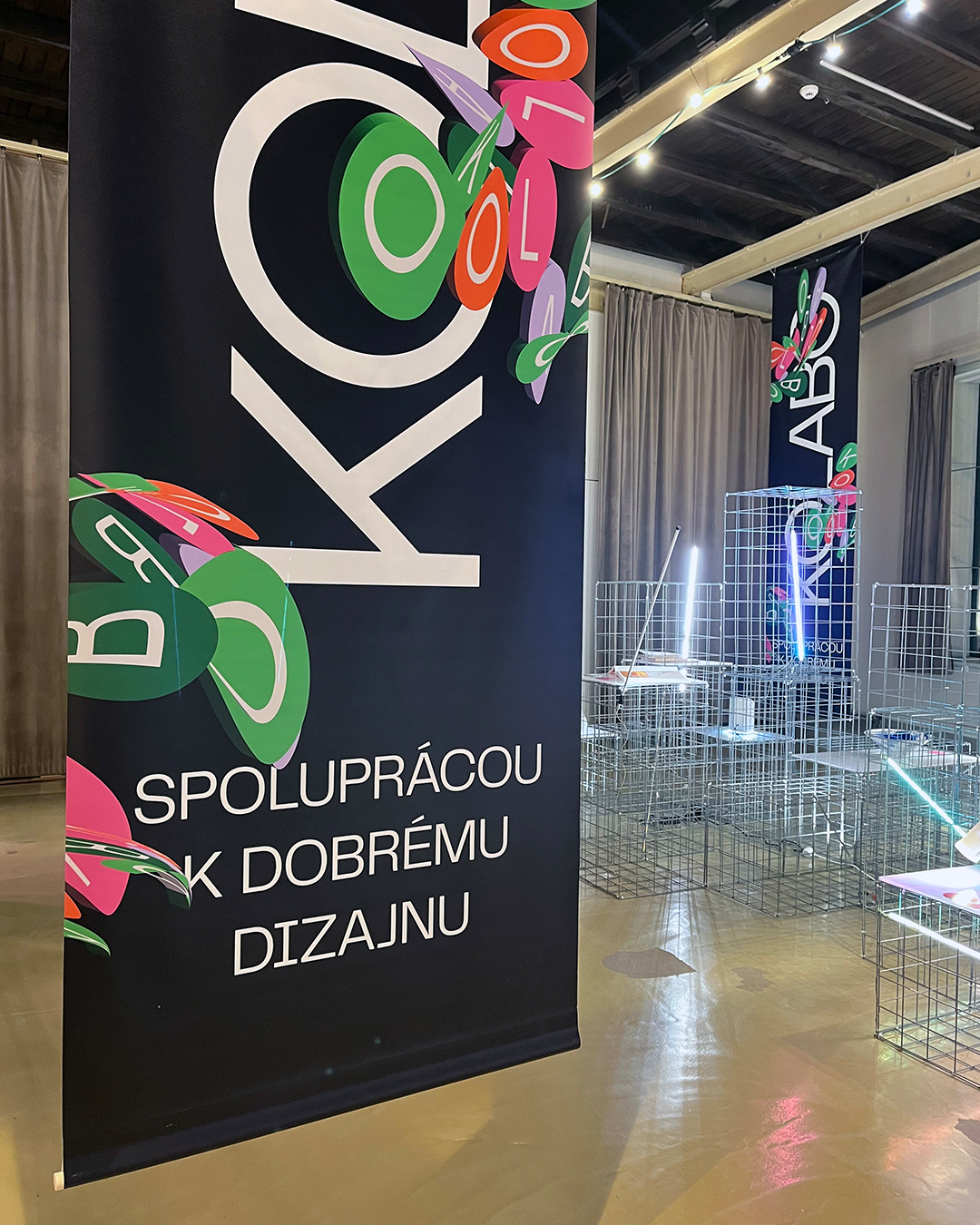
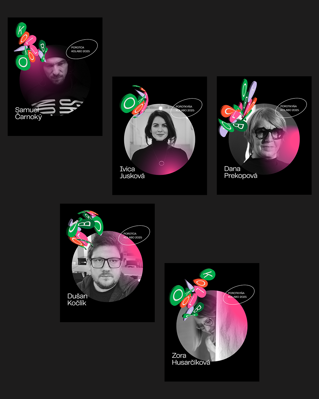
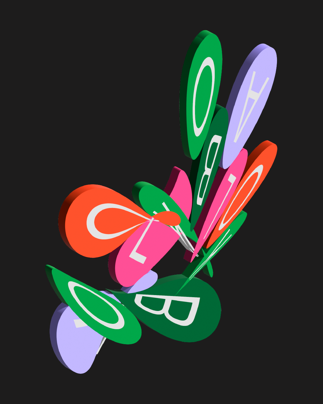
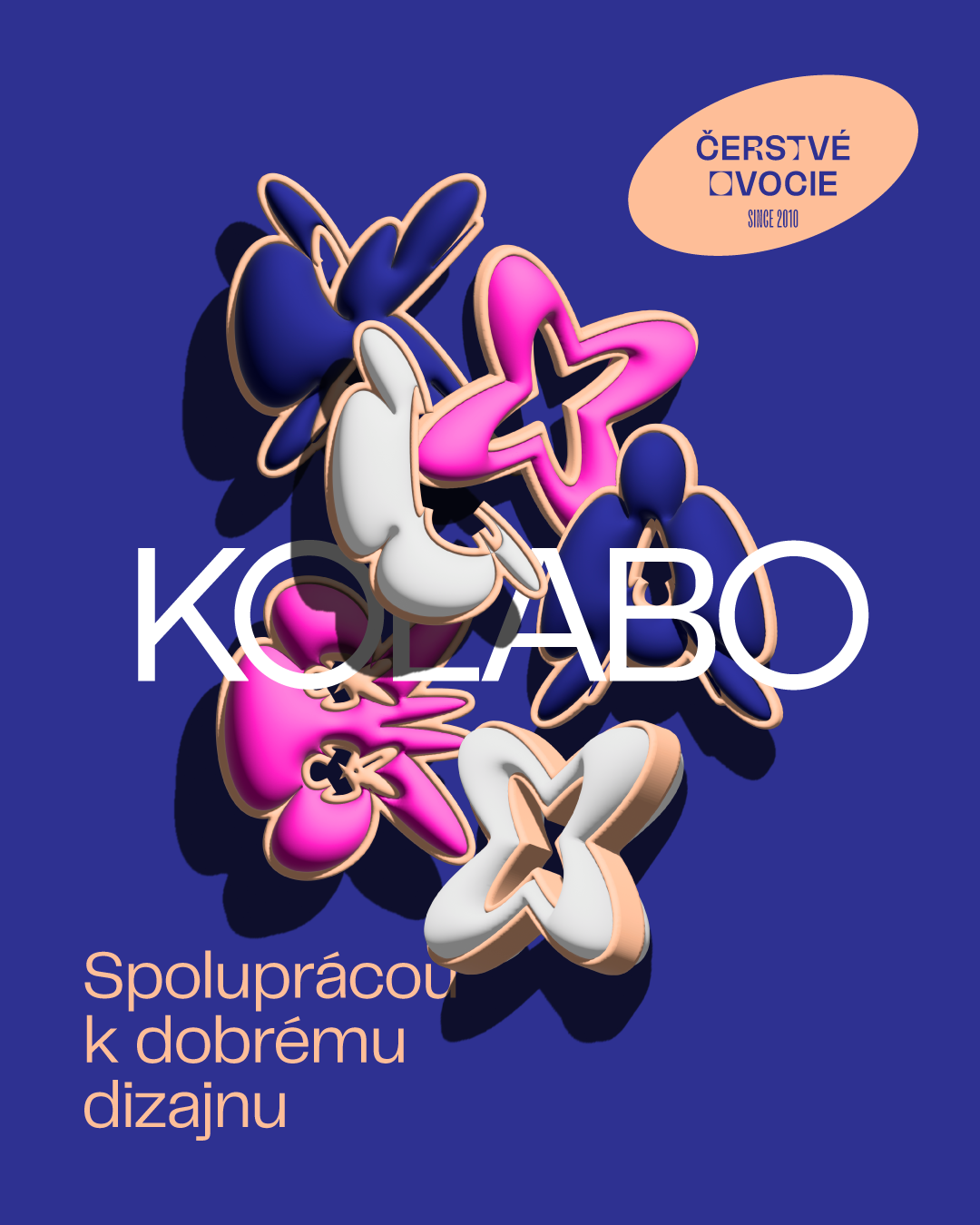
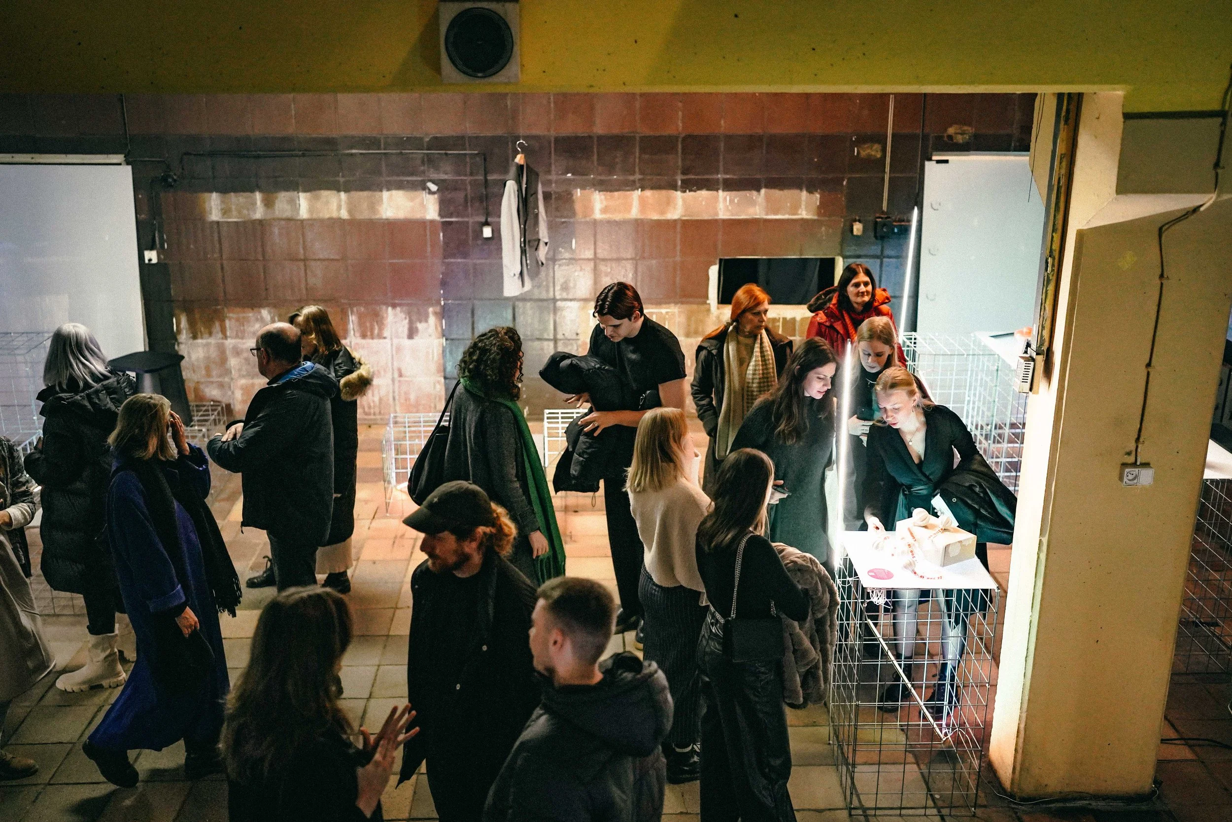
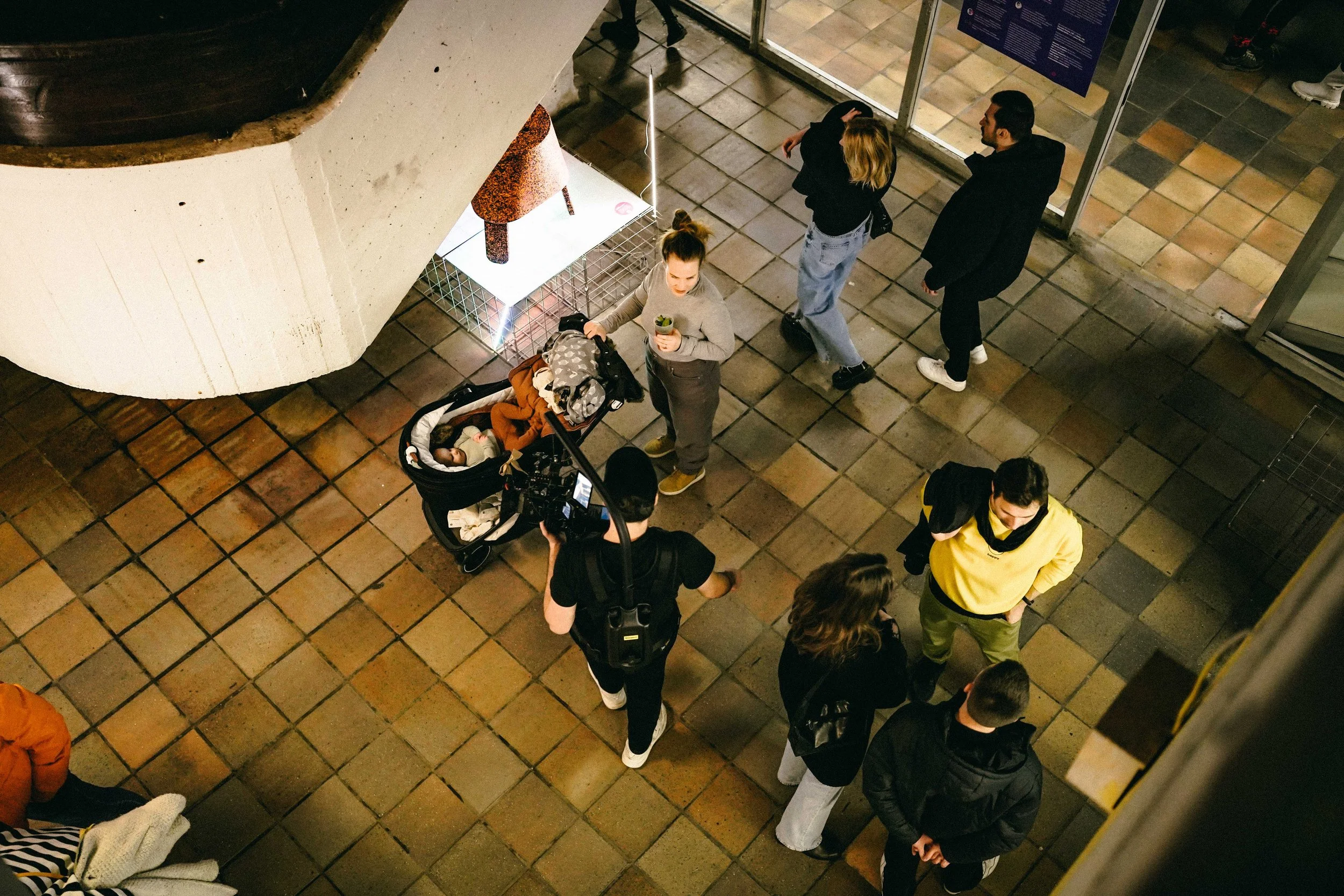
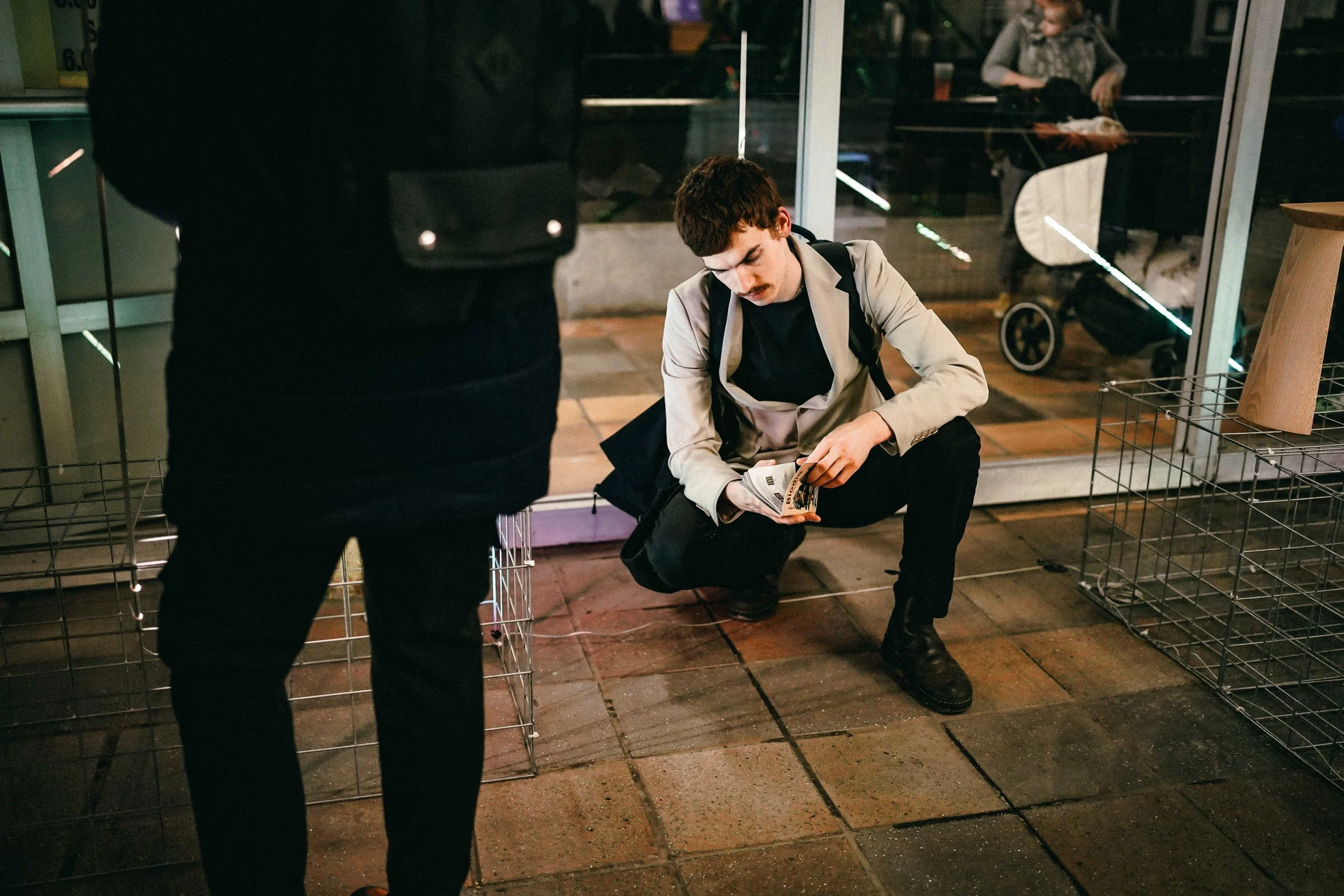
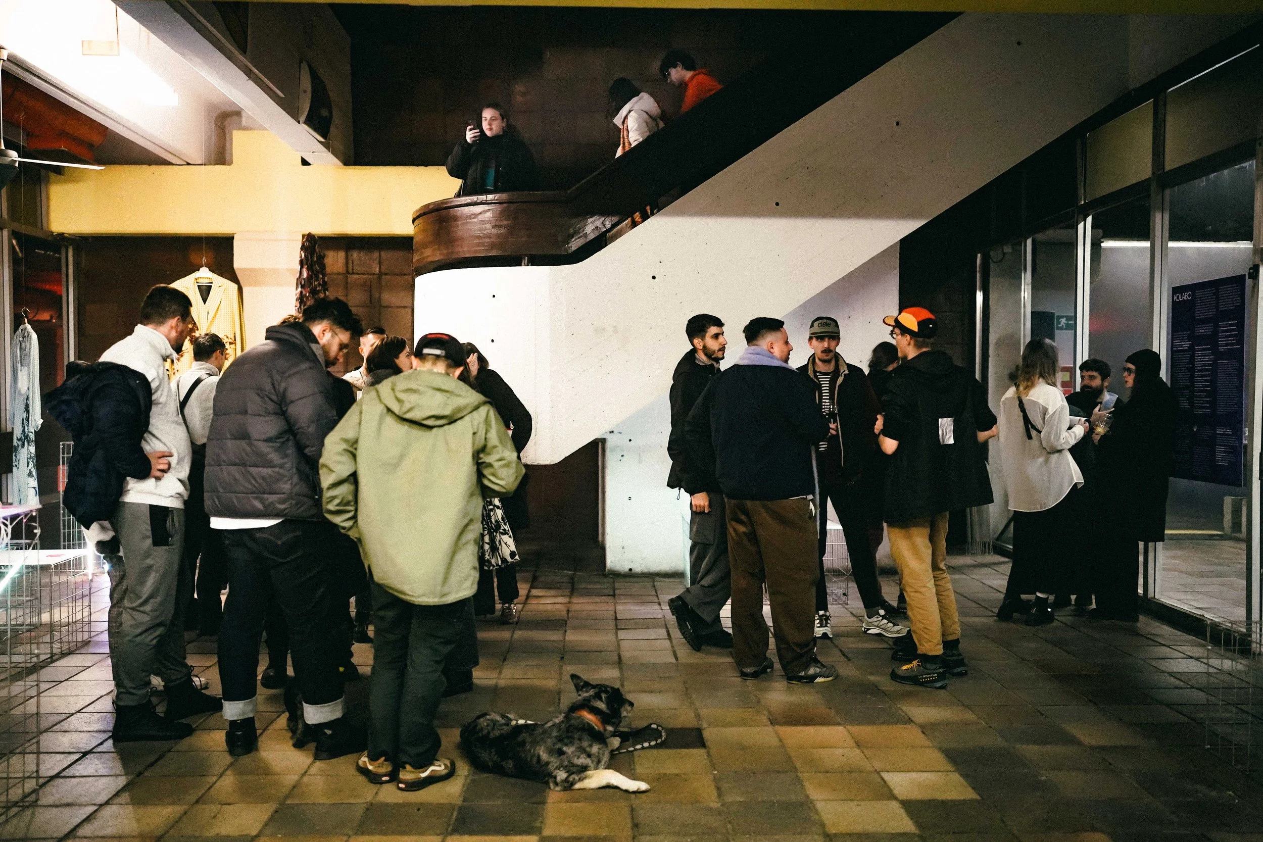
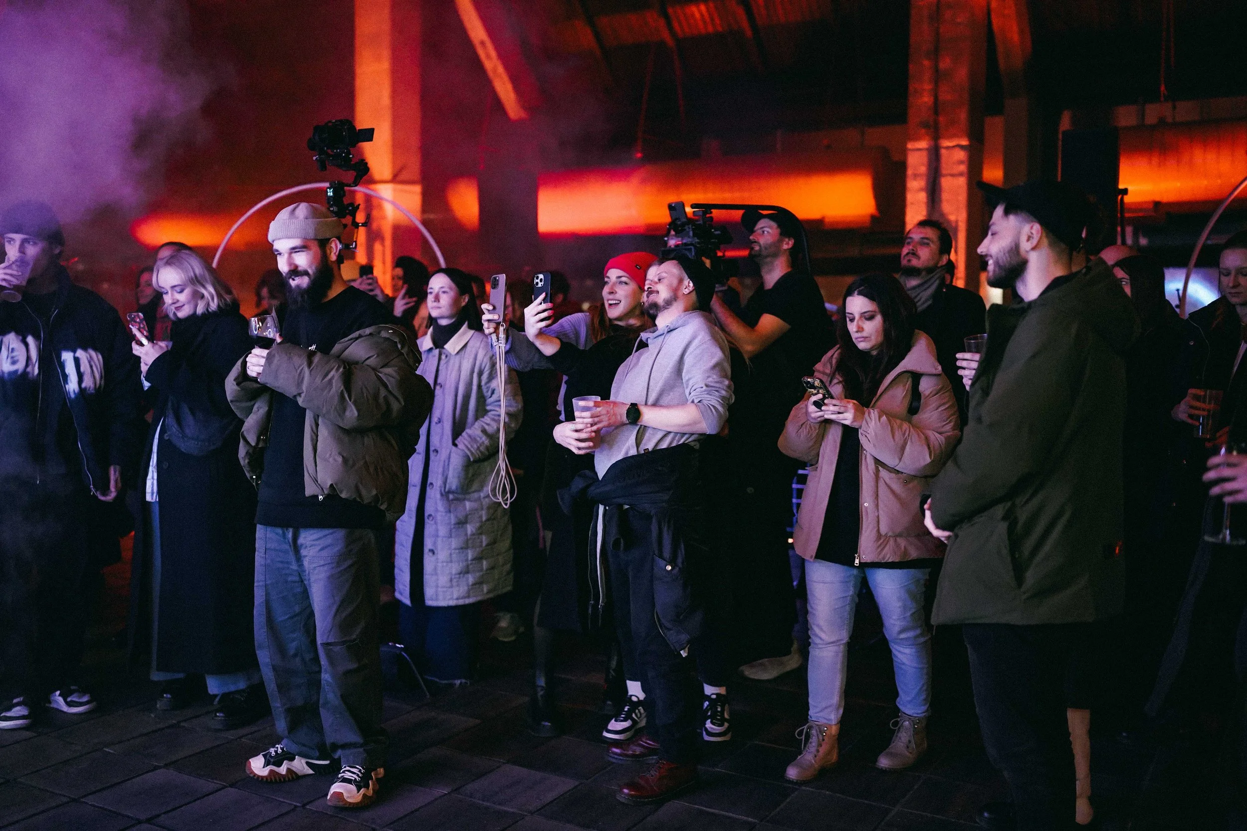
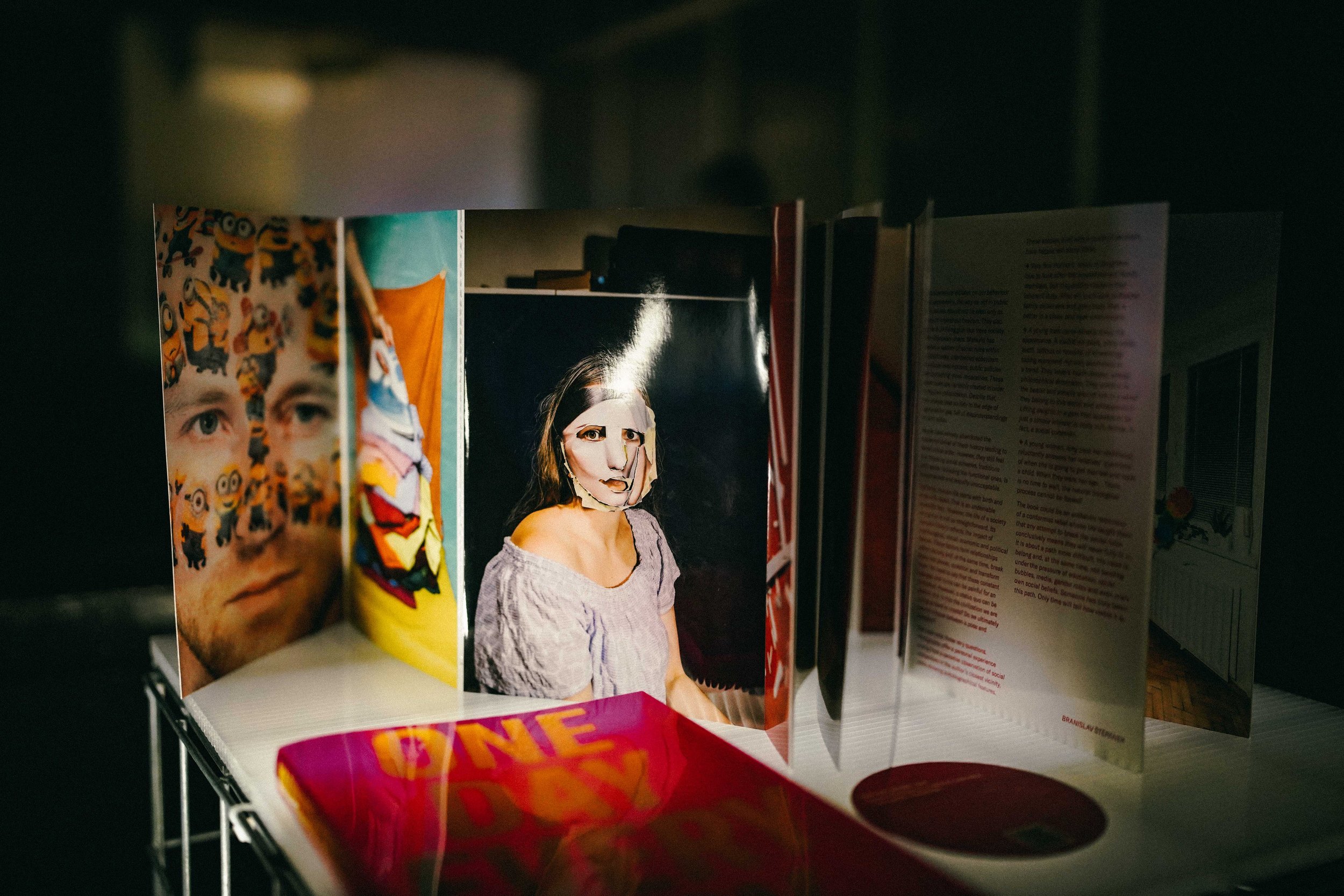
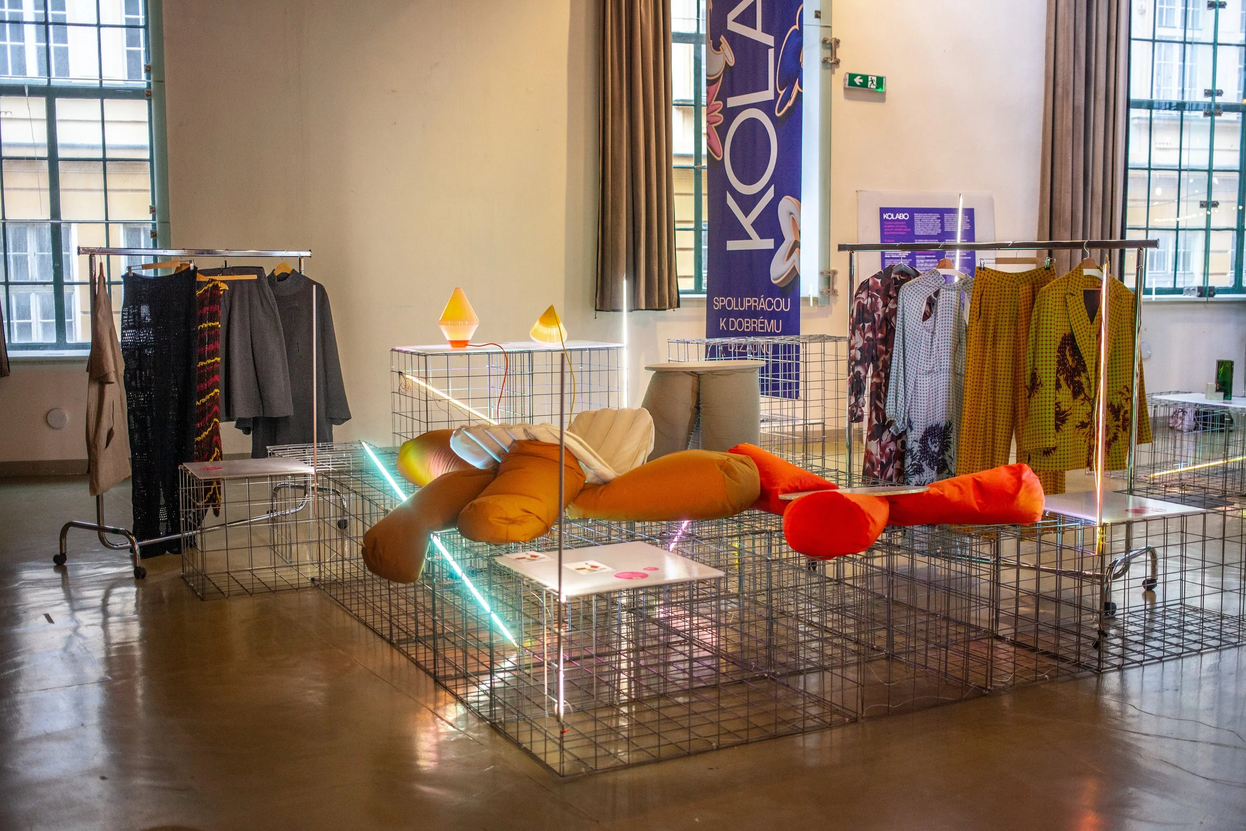
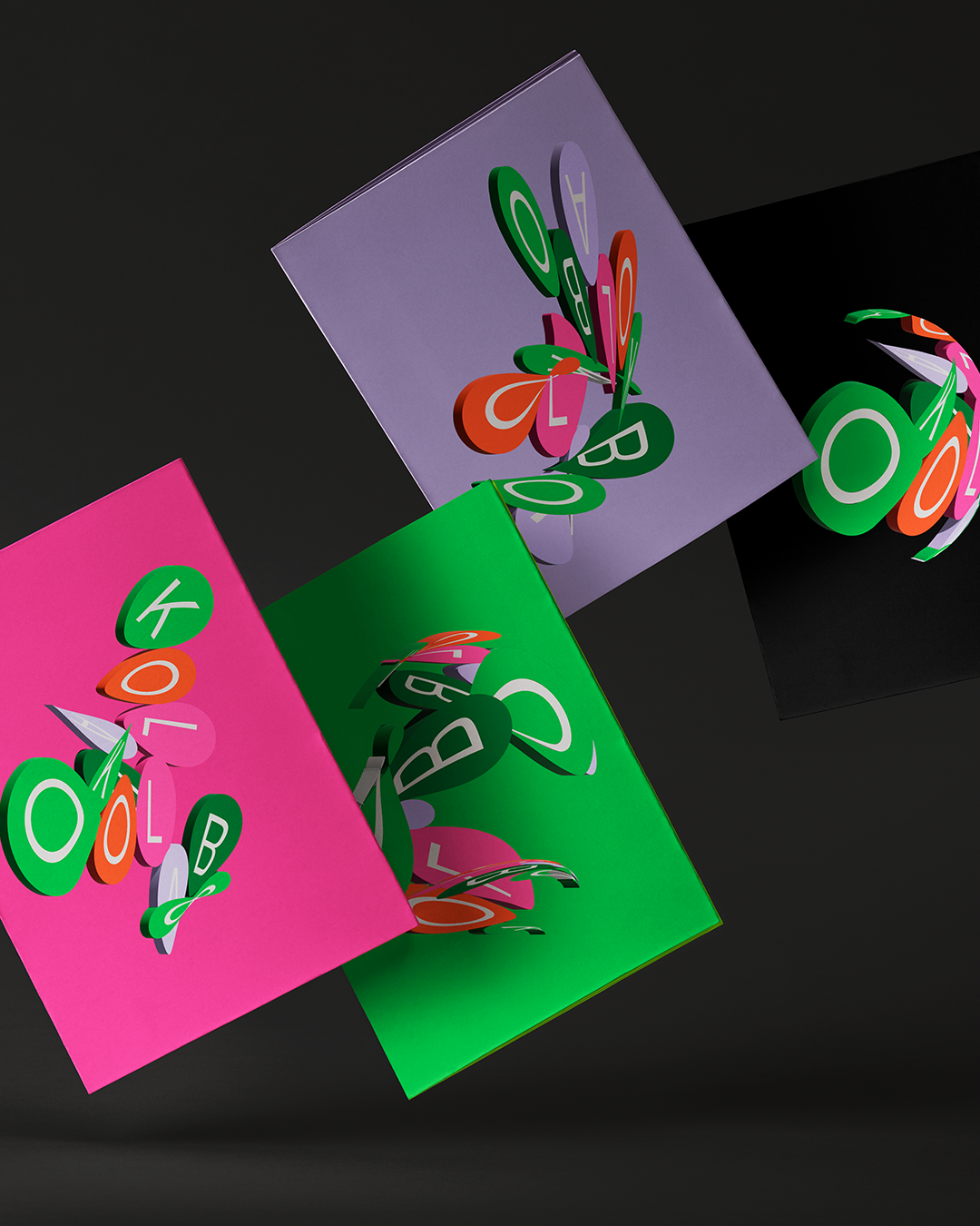
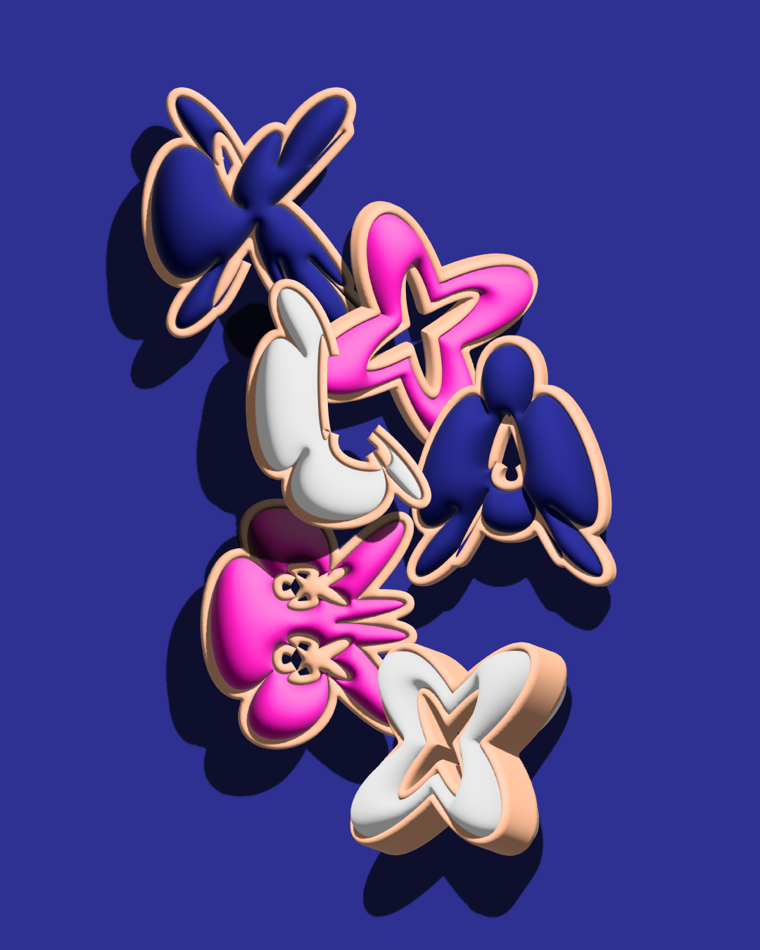
KOLABO 2025
5
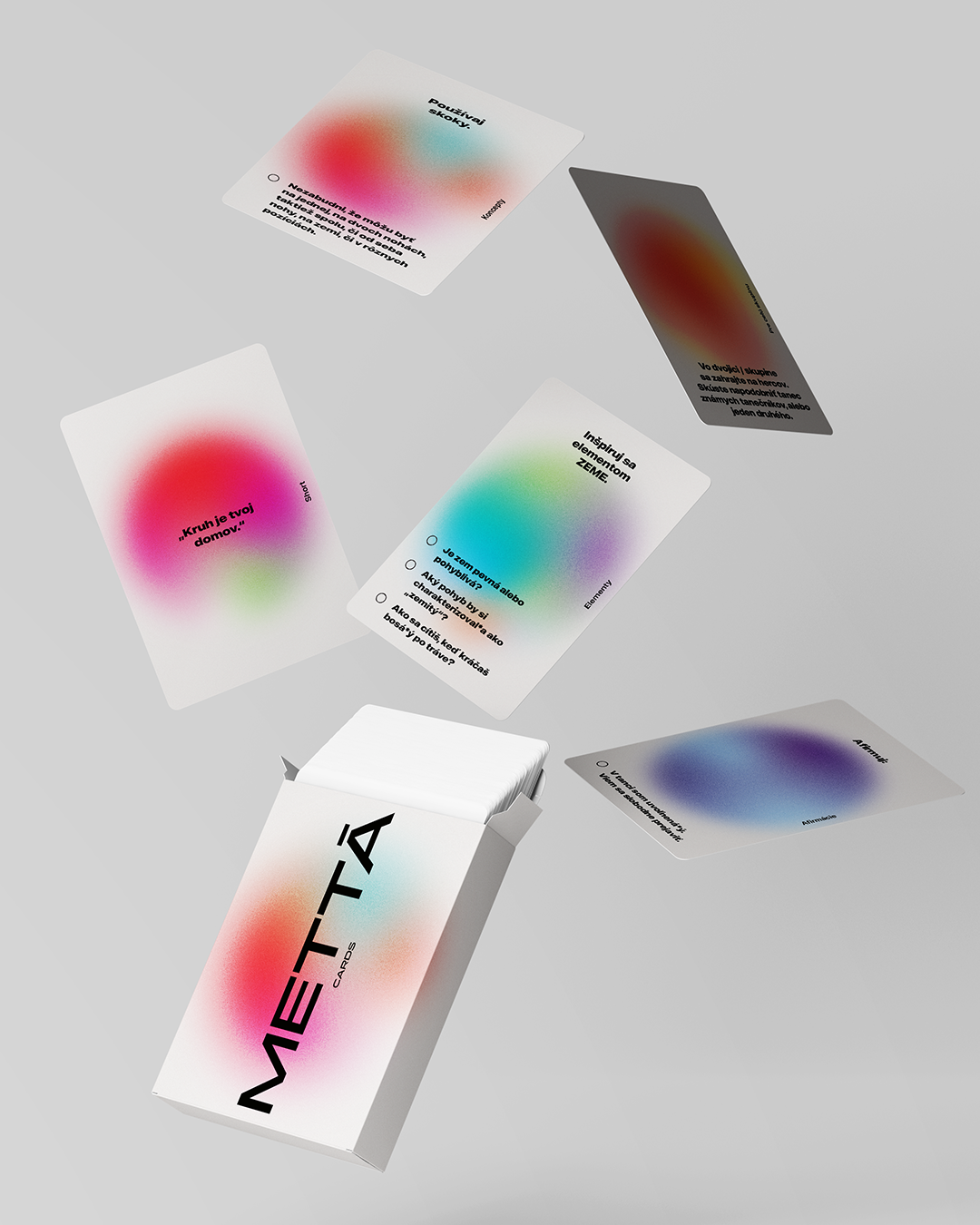
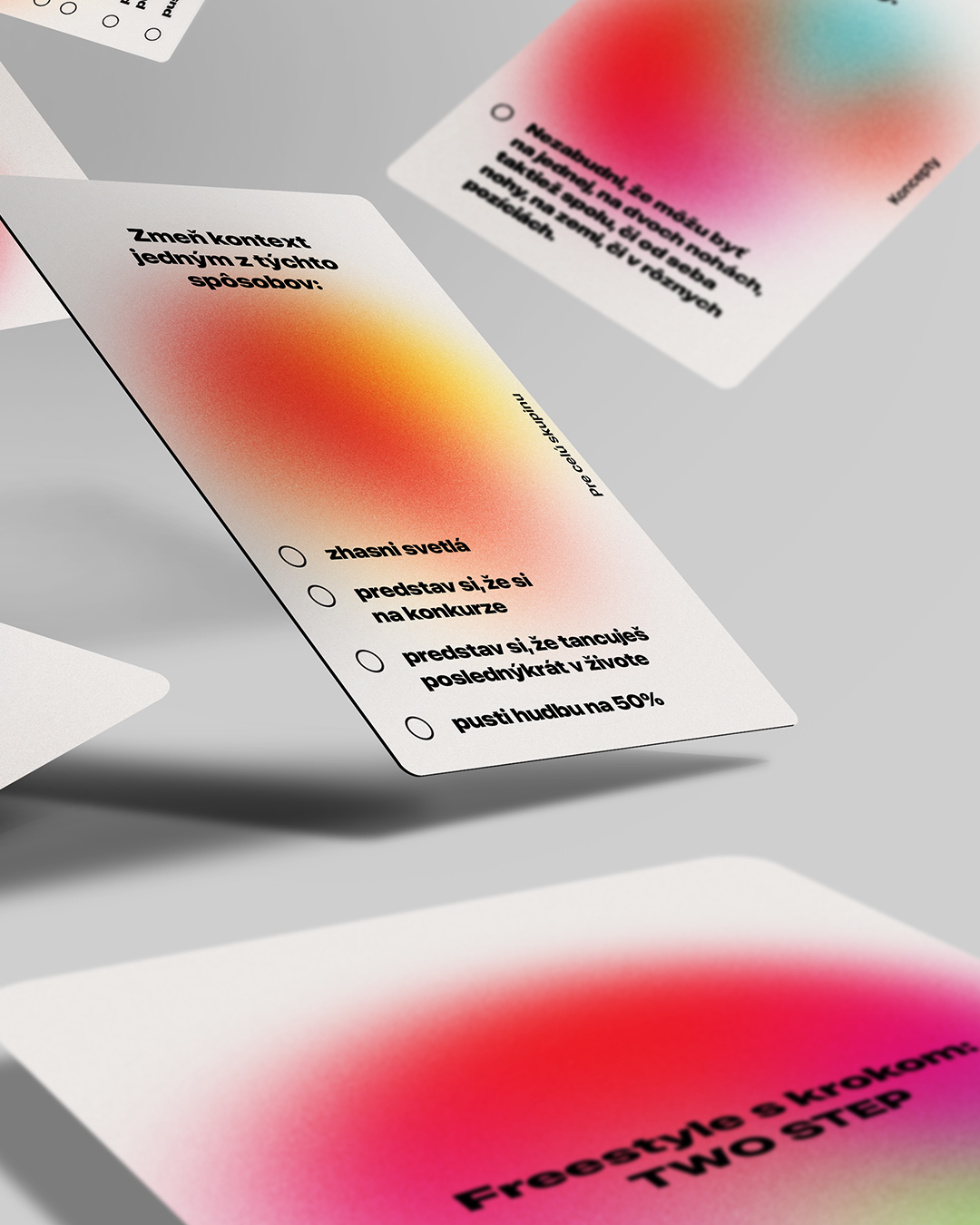
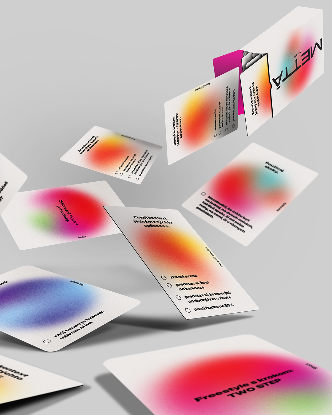
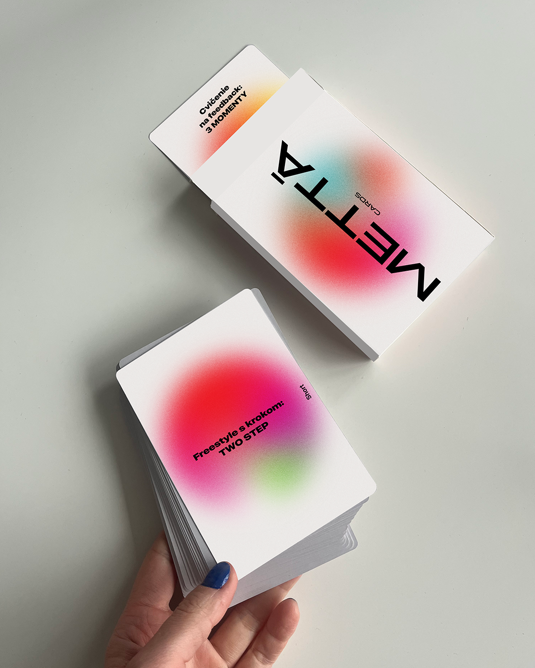
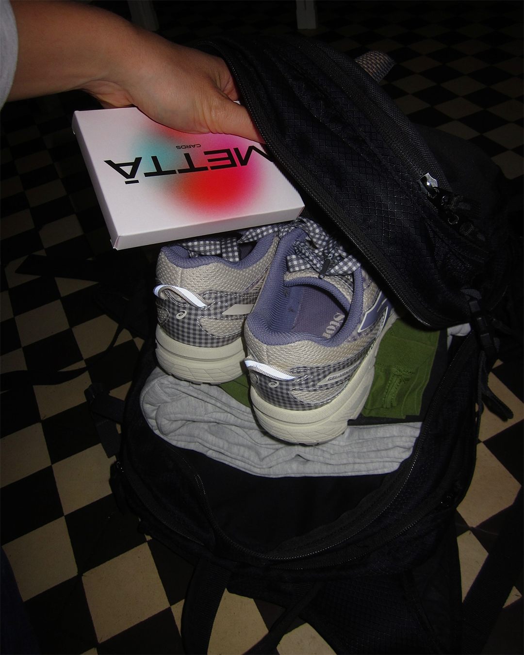
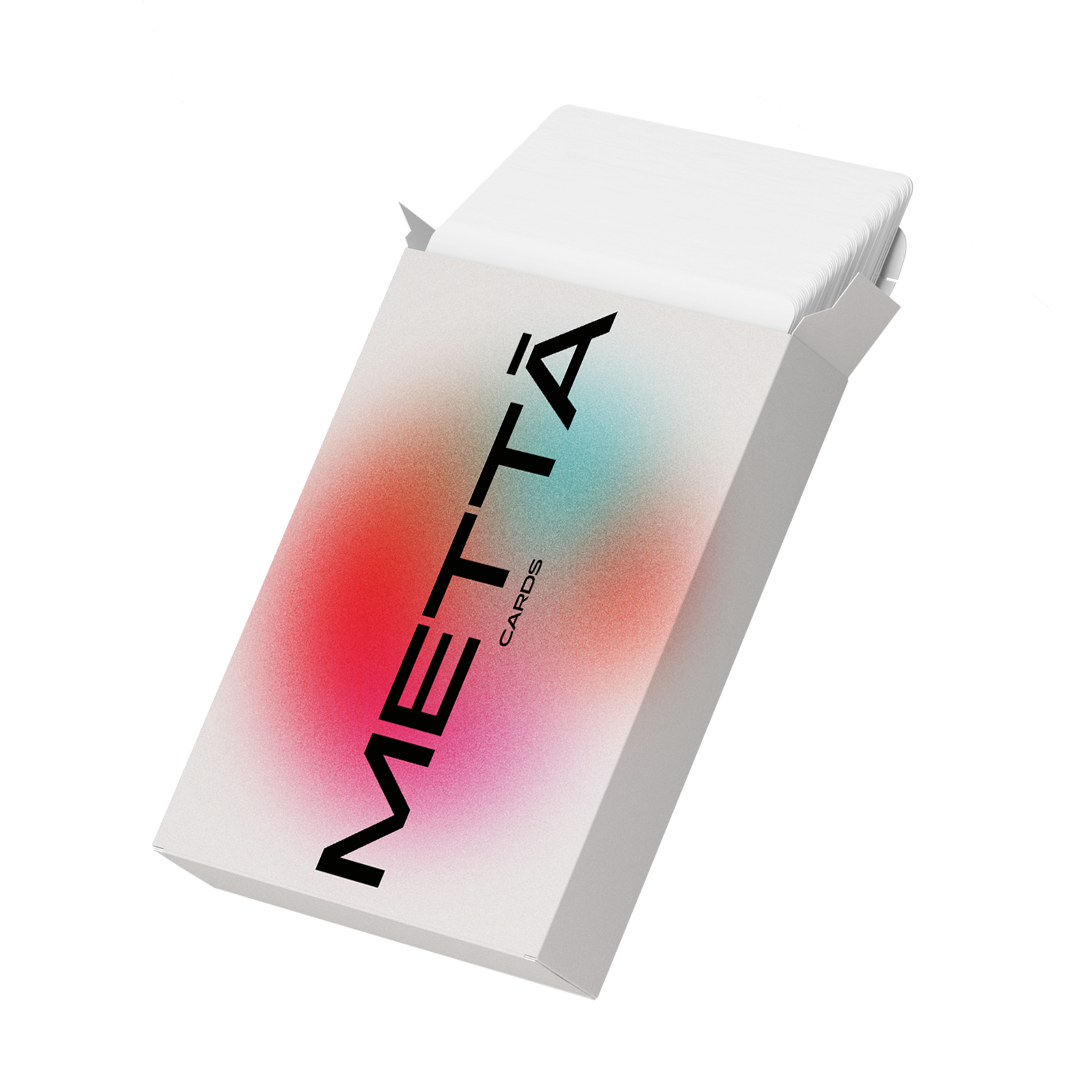
METTĀ Cards
11
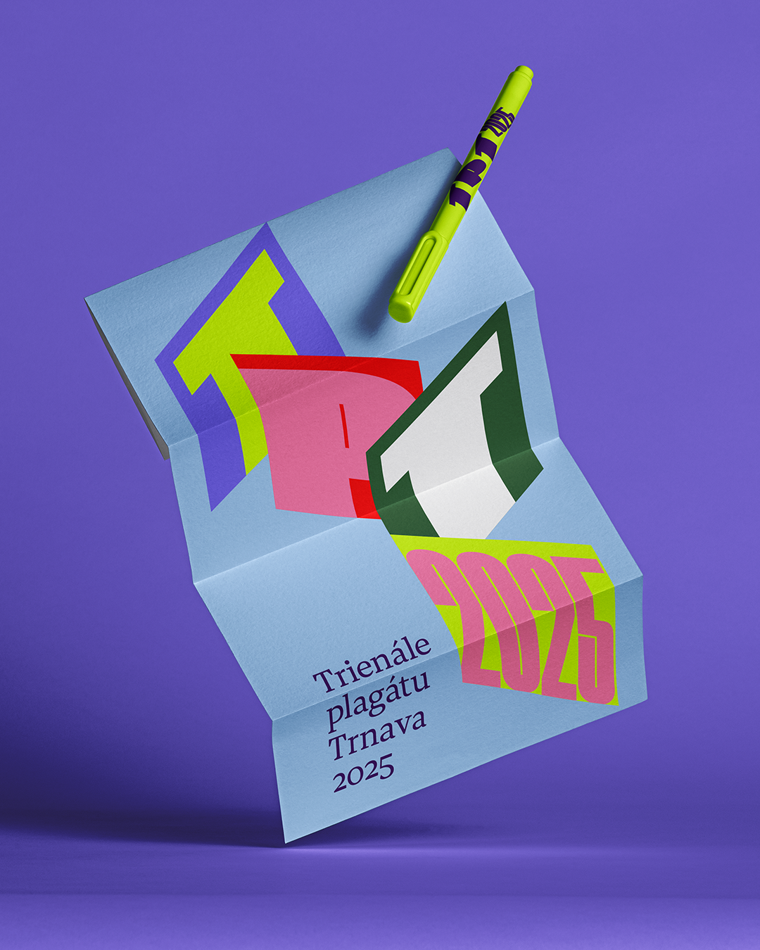
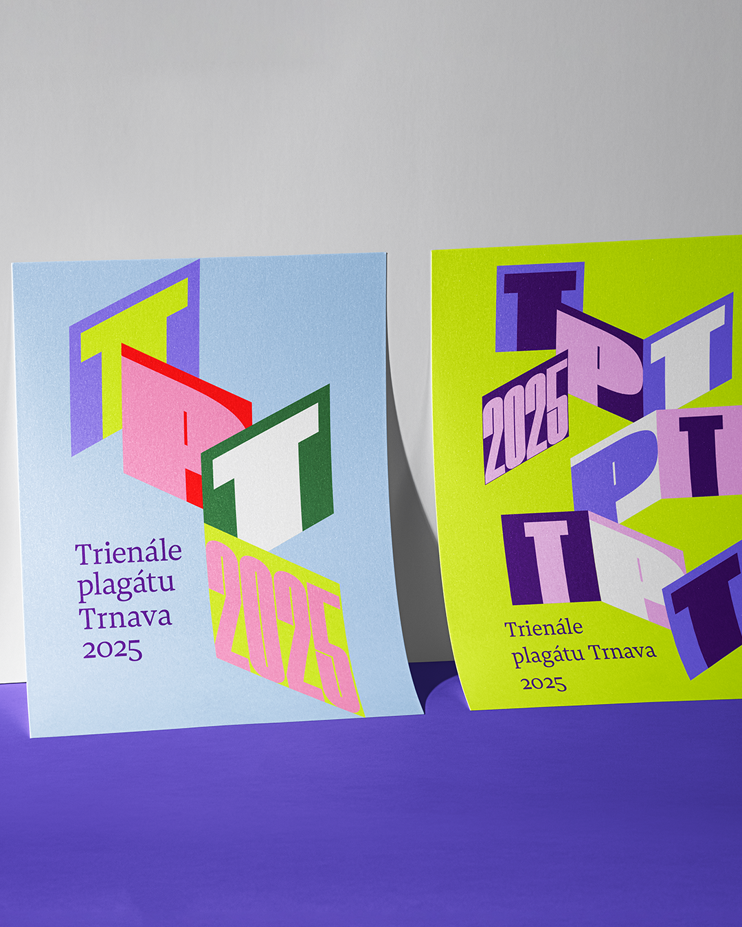
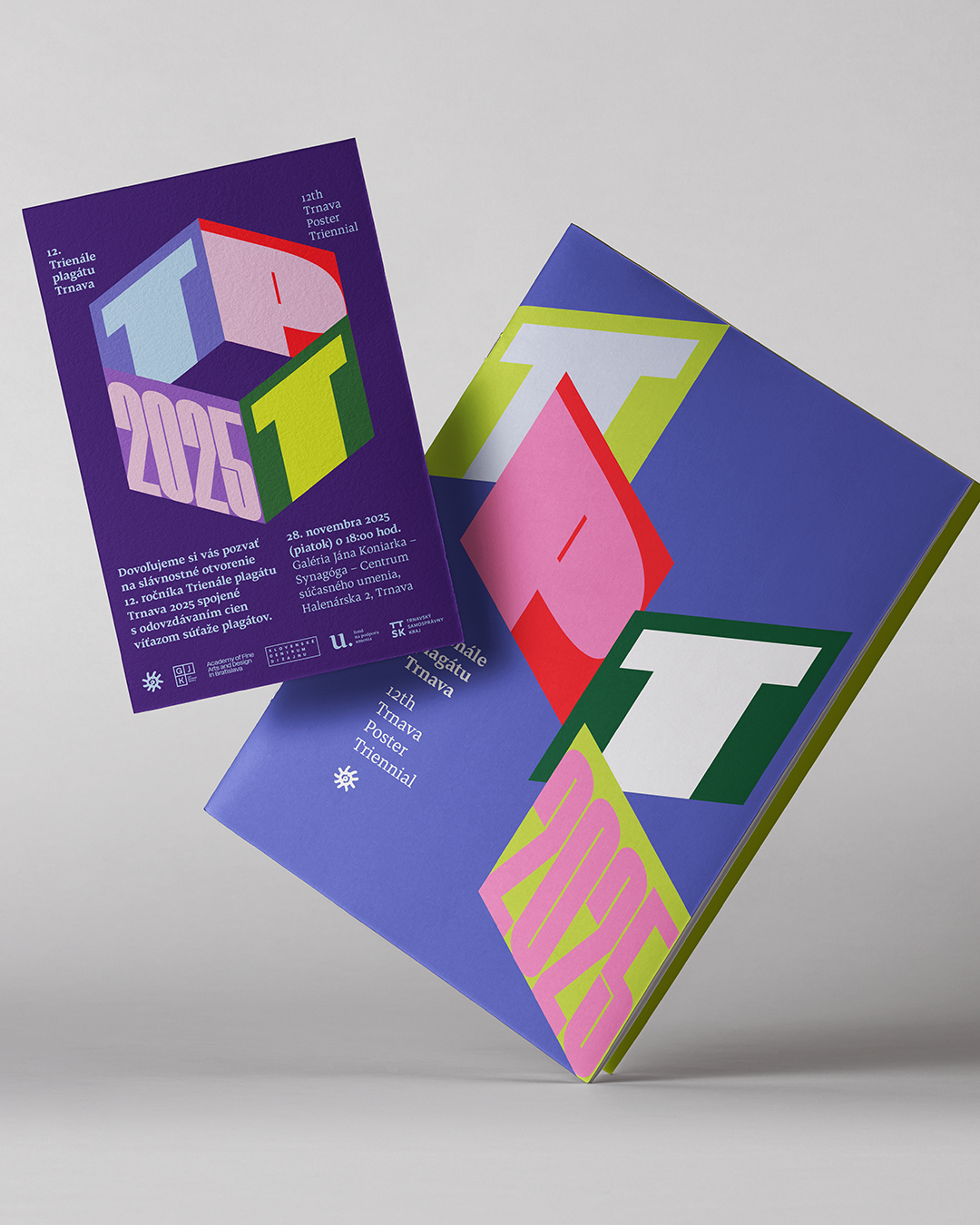
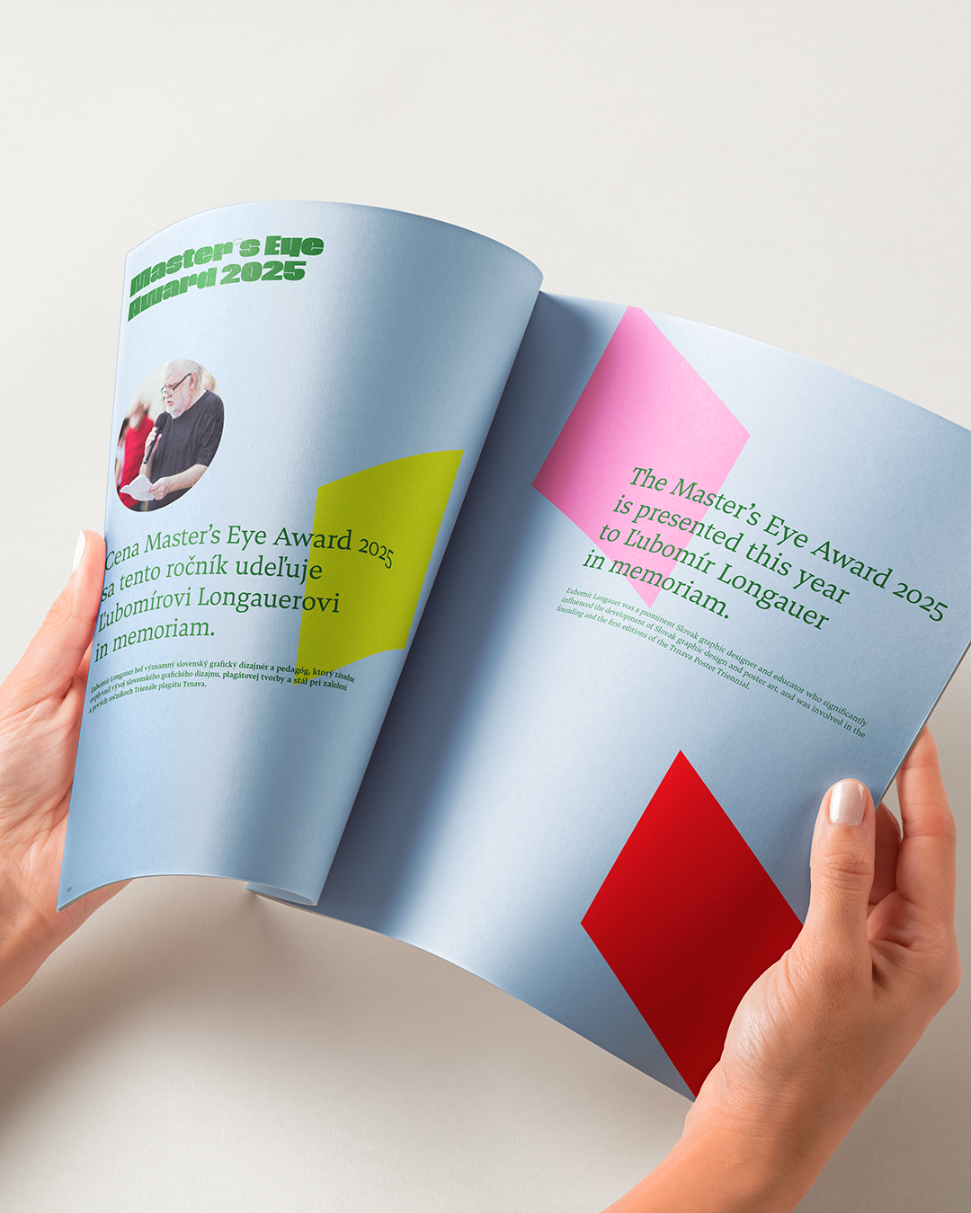
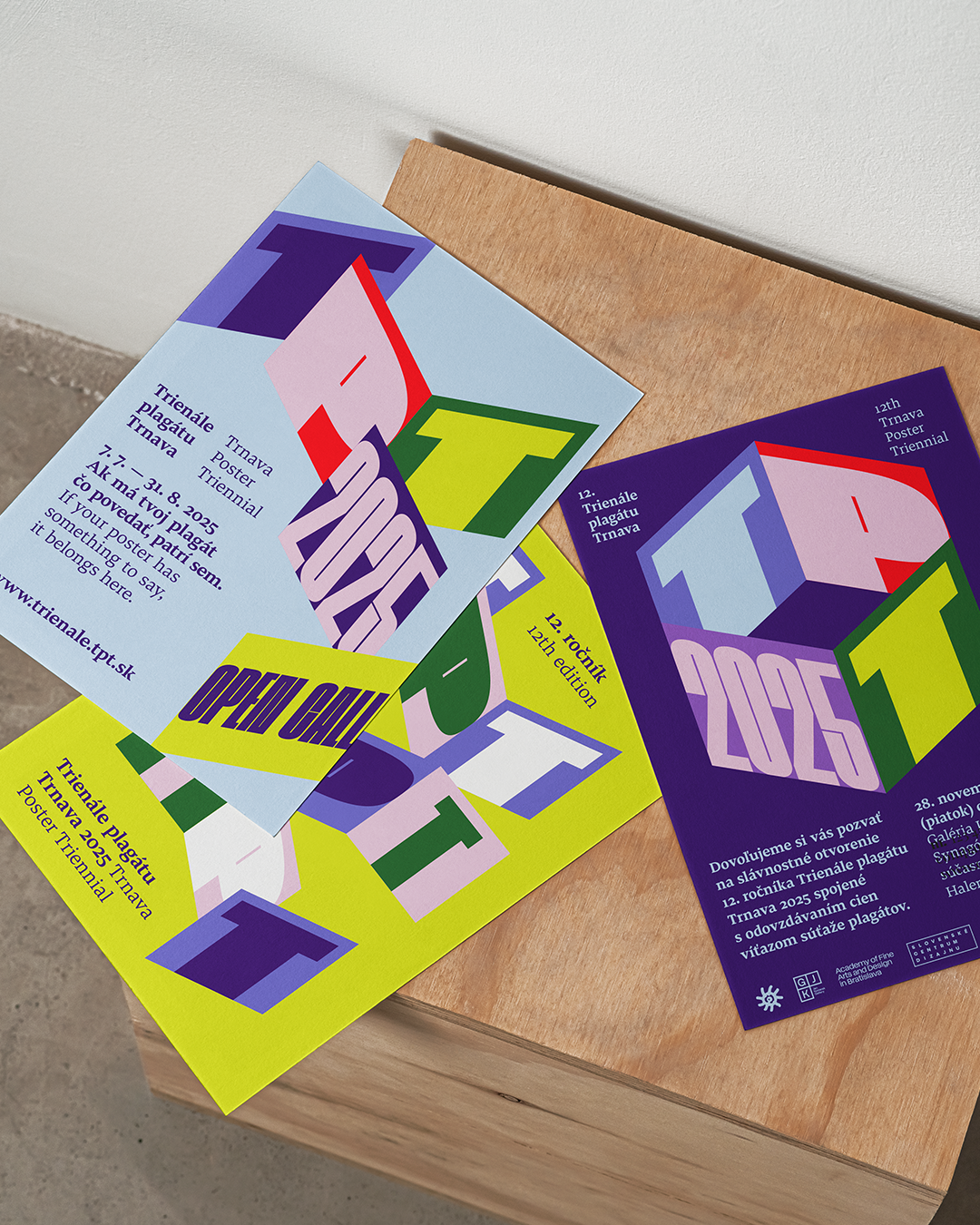
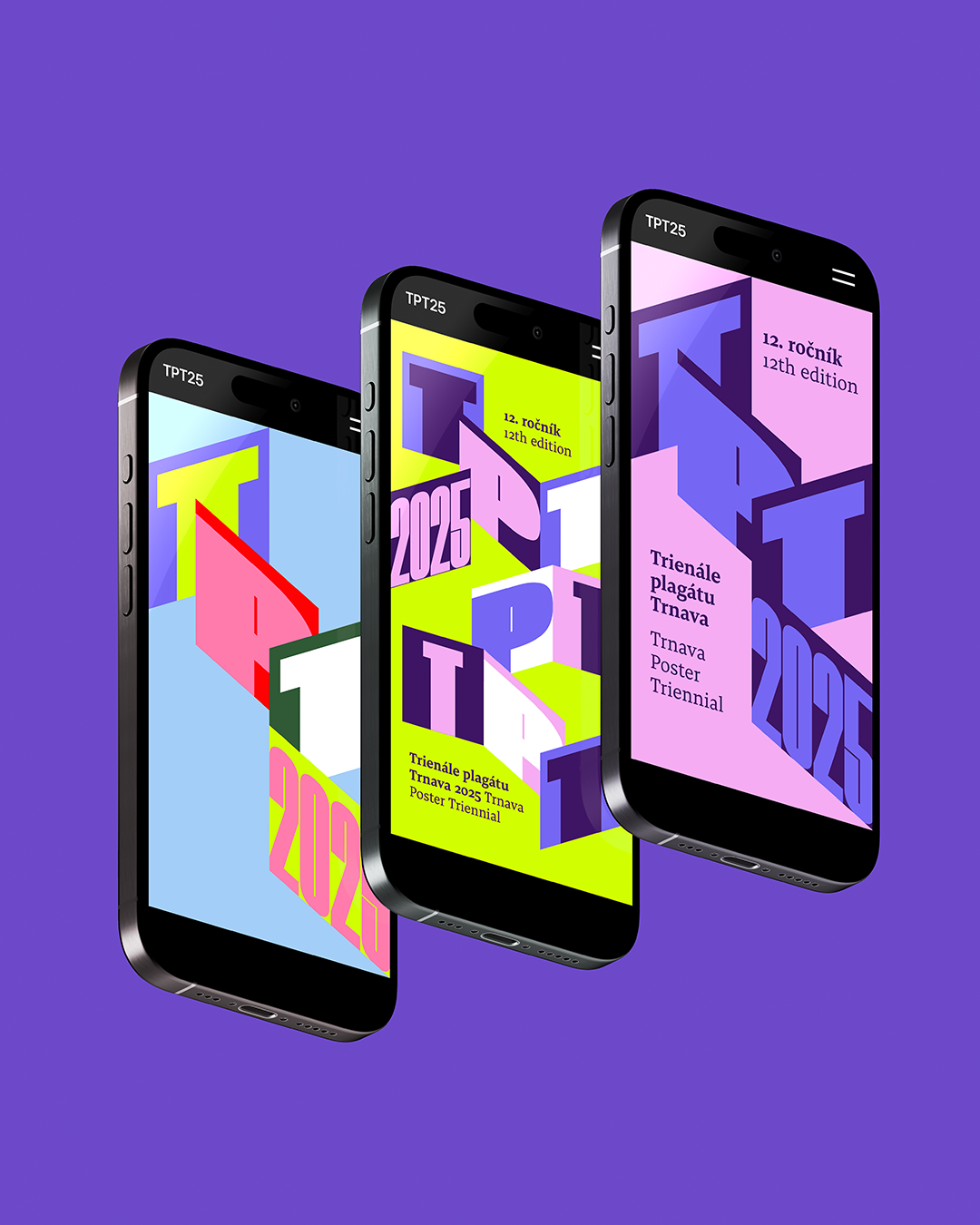
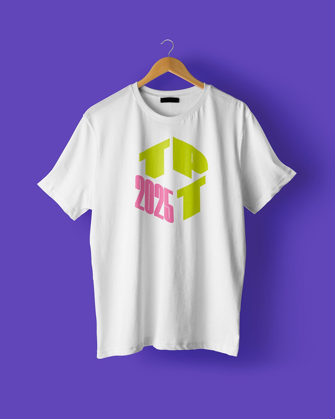
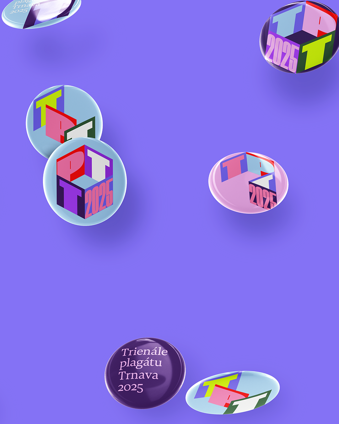
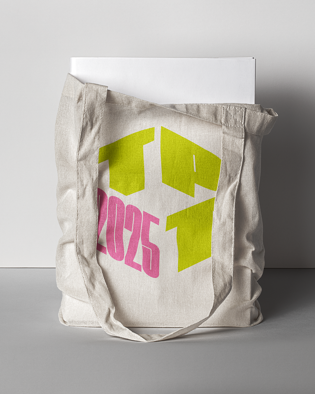
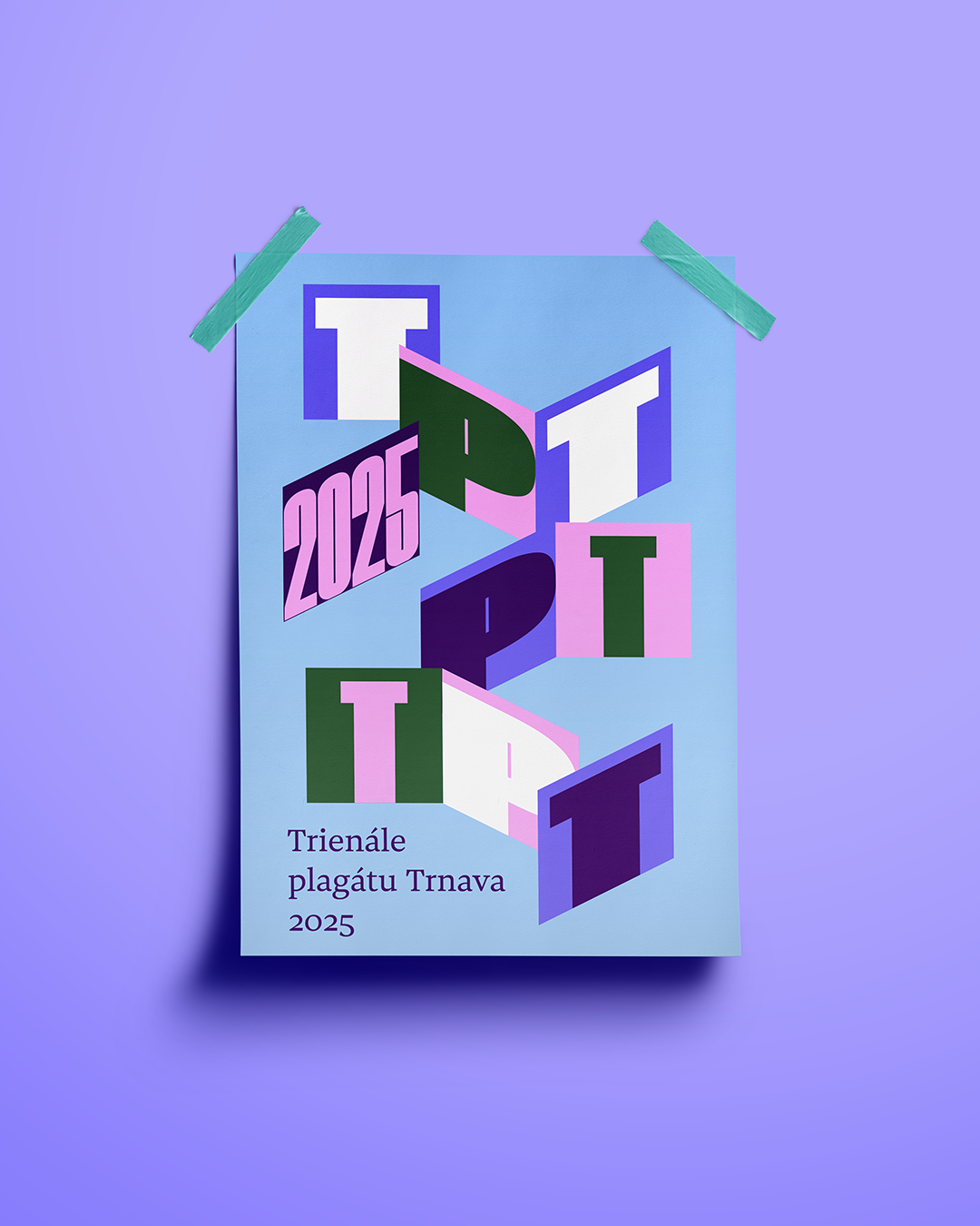
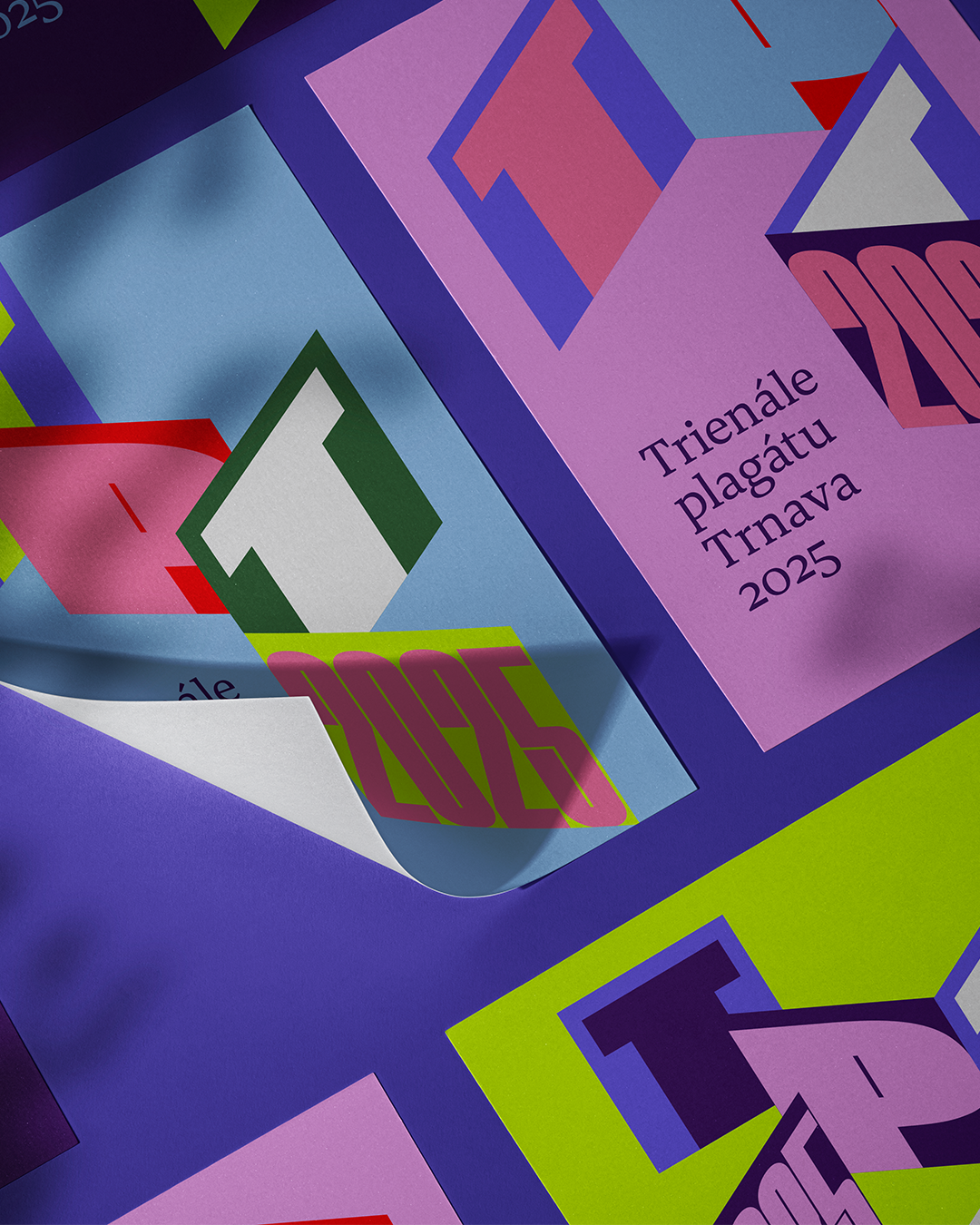
Trnava Poster Triennial

10
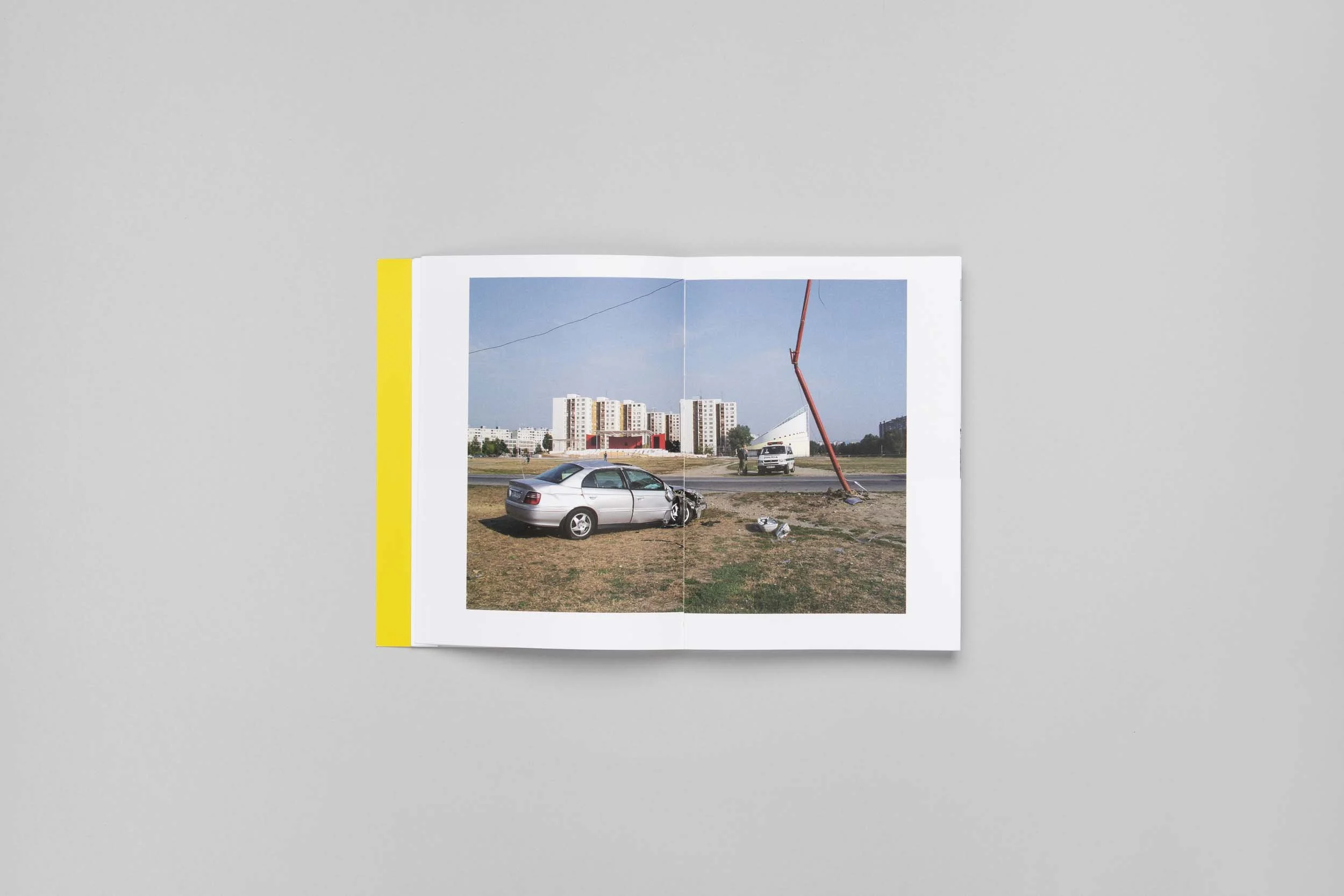
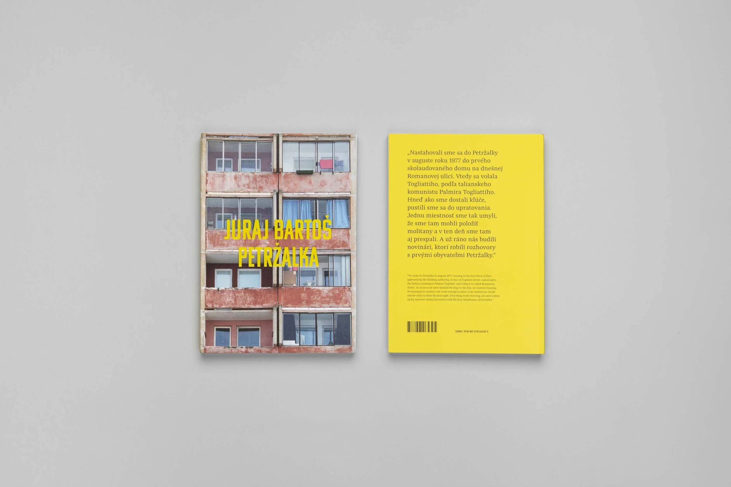
Juraj Bartoš – Petržalka

11
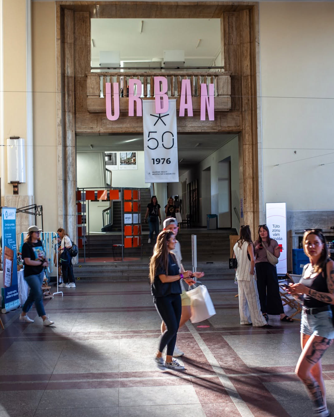
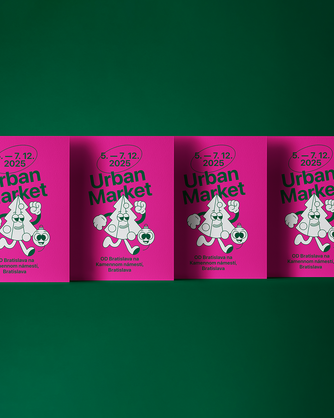
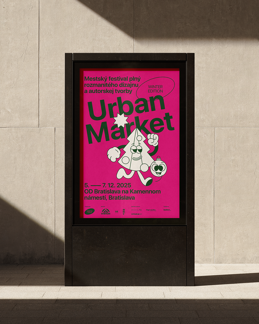
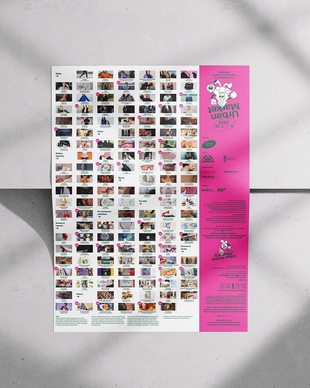
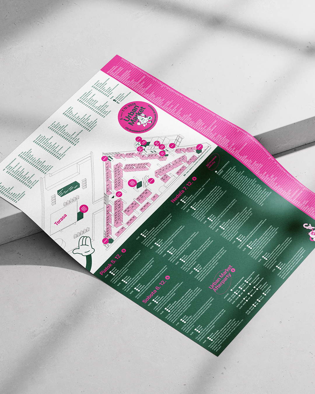
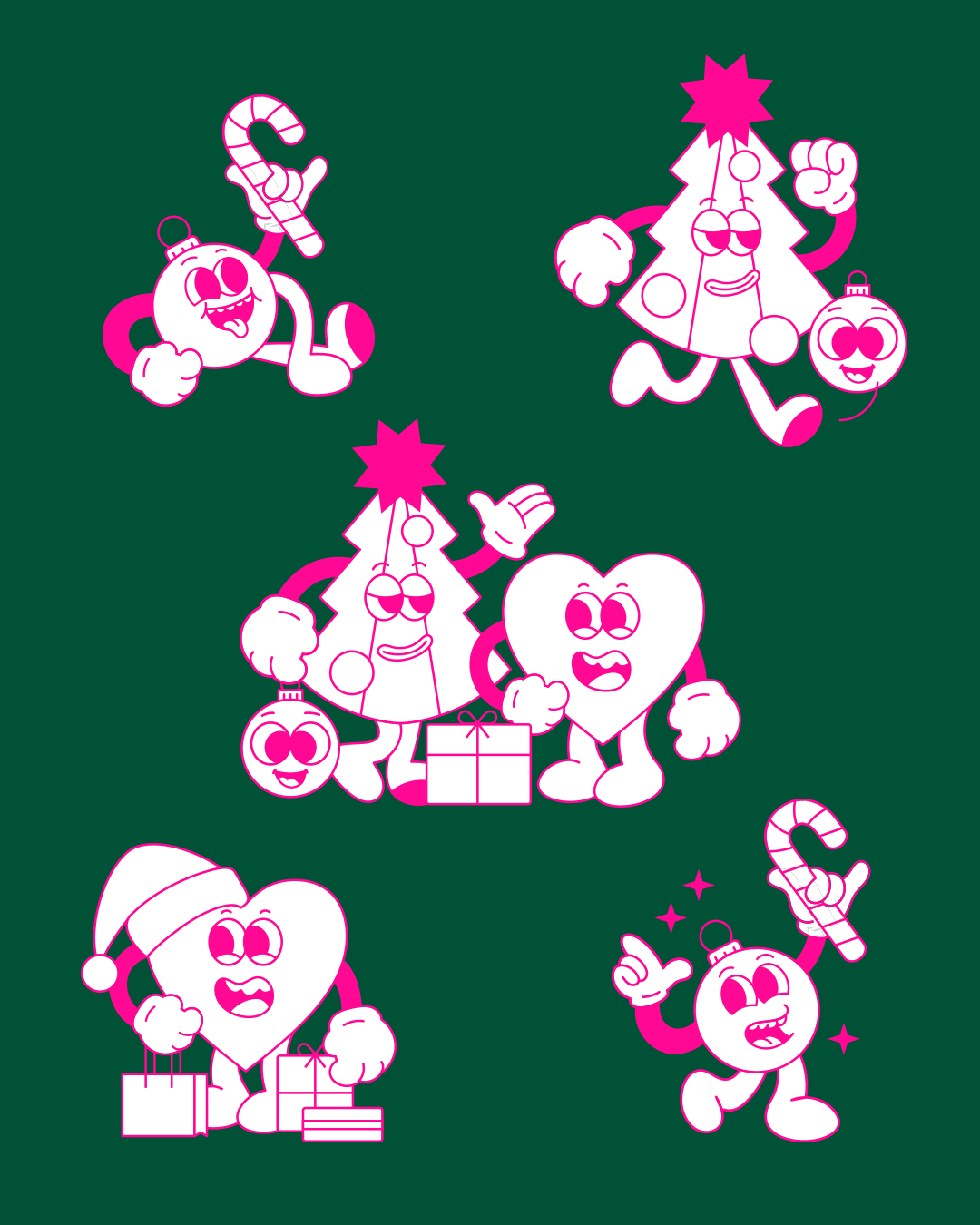
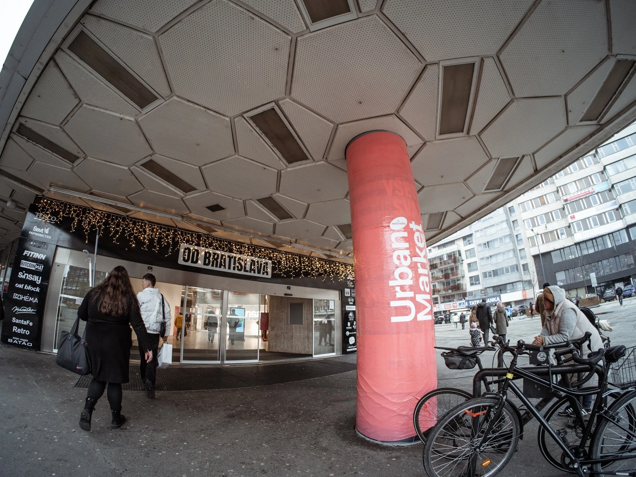
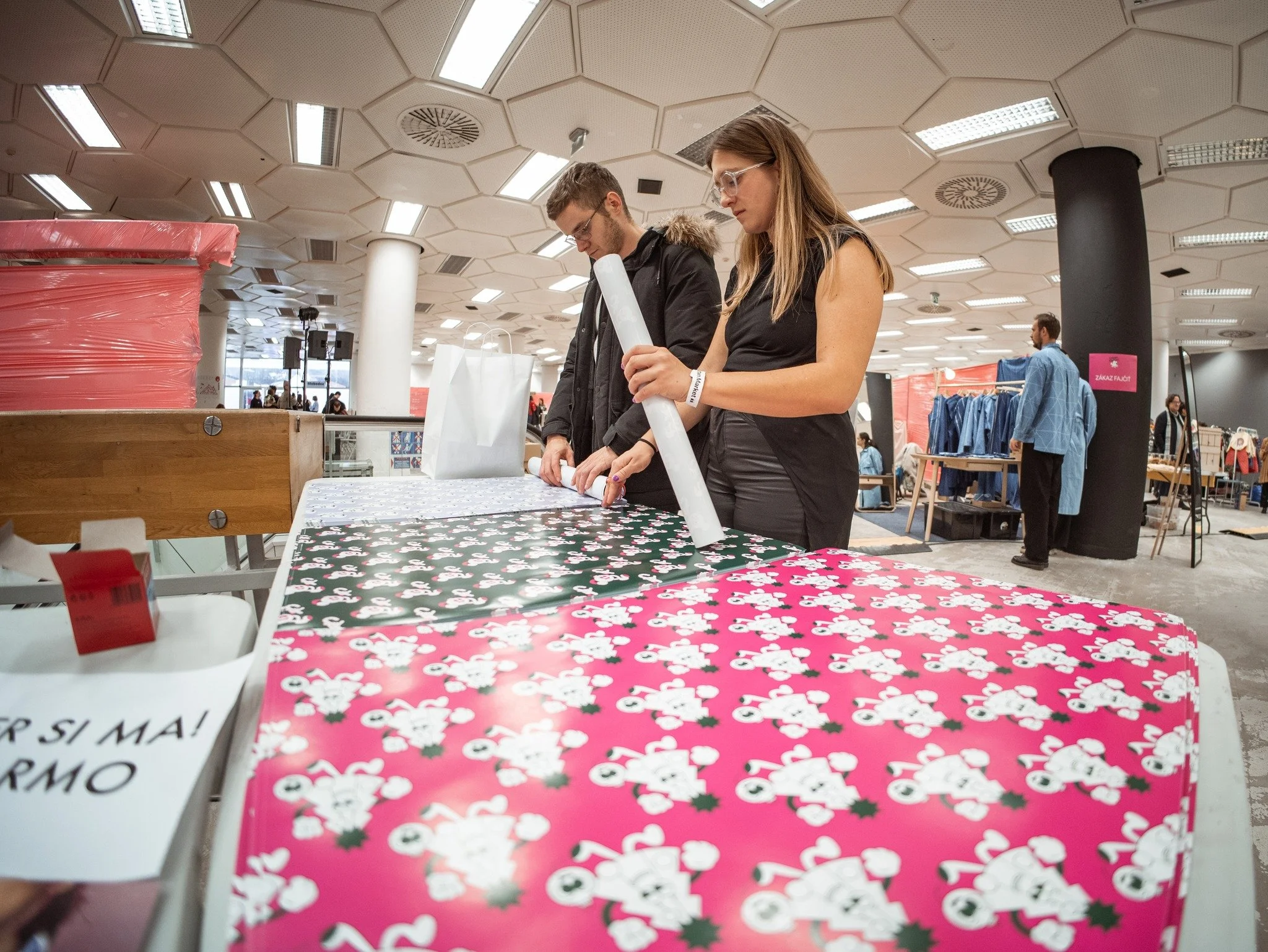
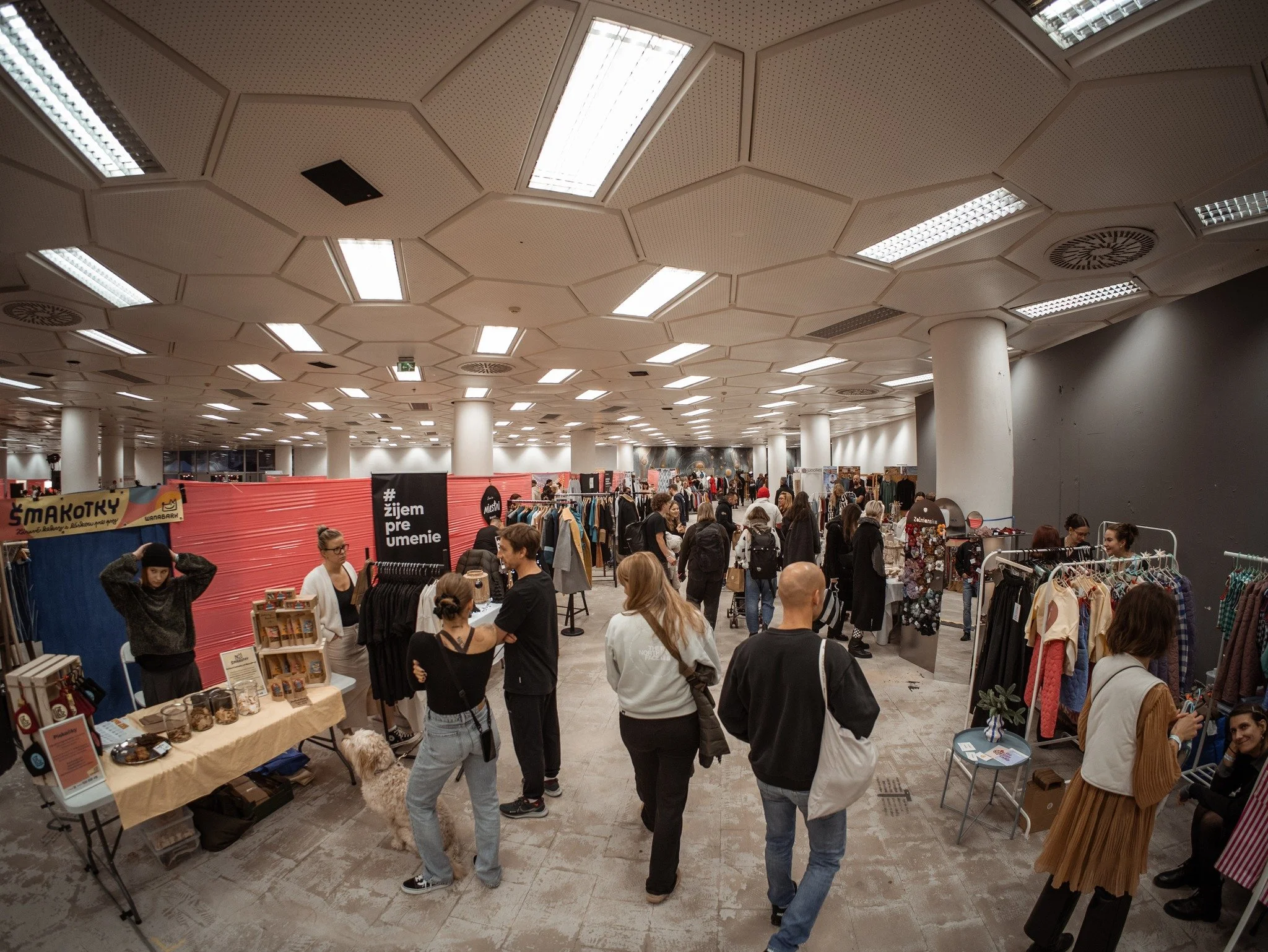
Urban Market 2025
7
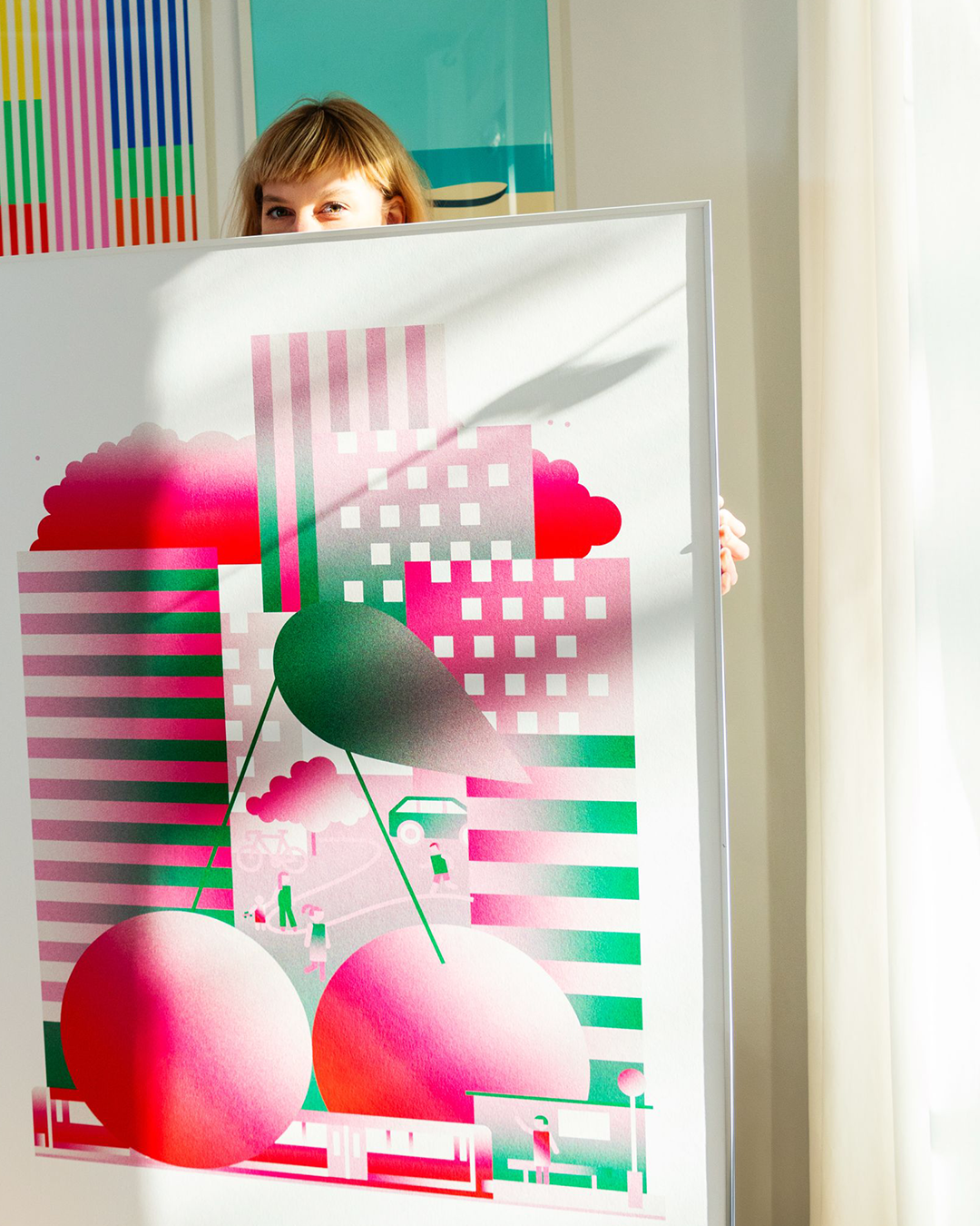
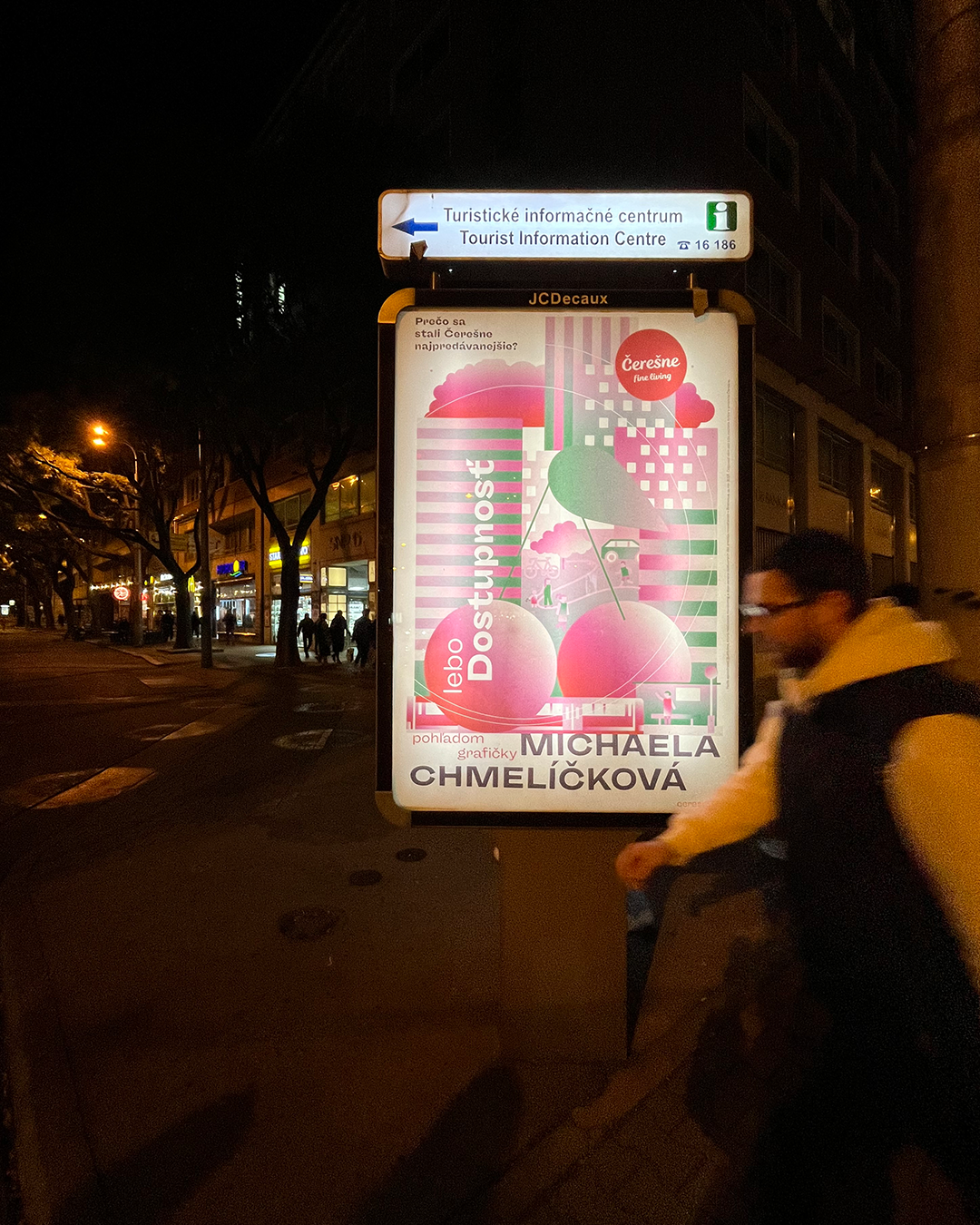
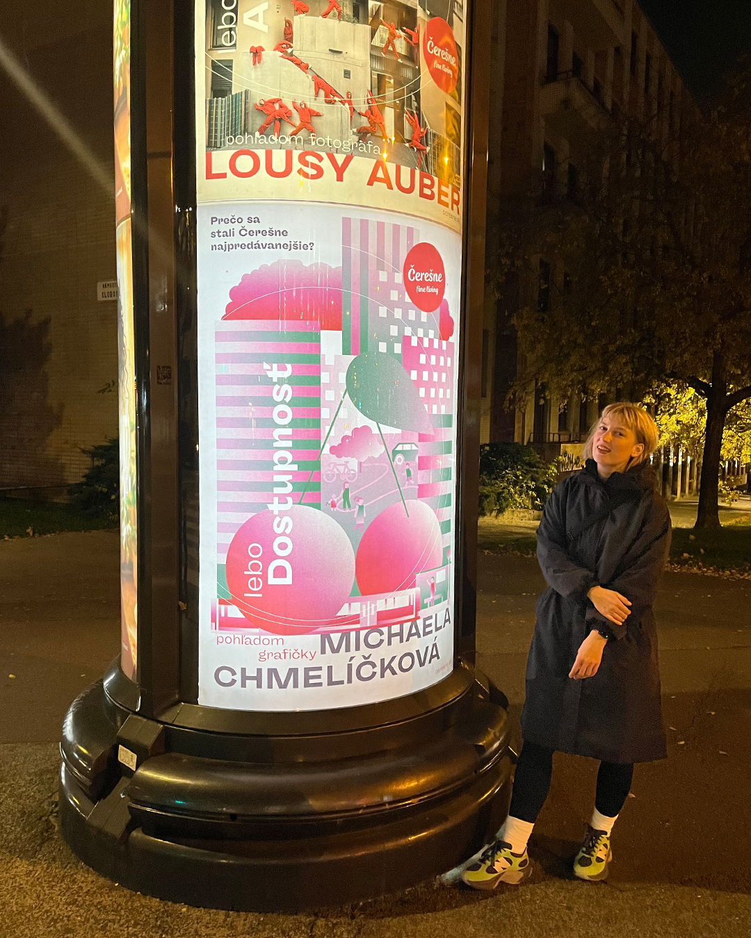
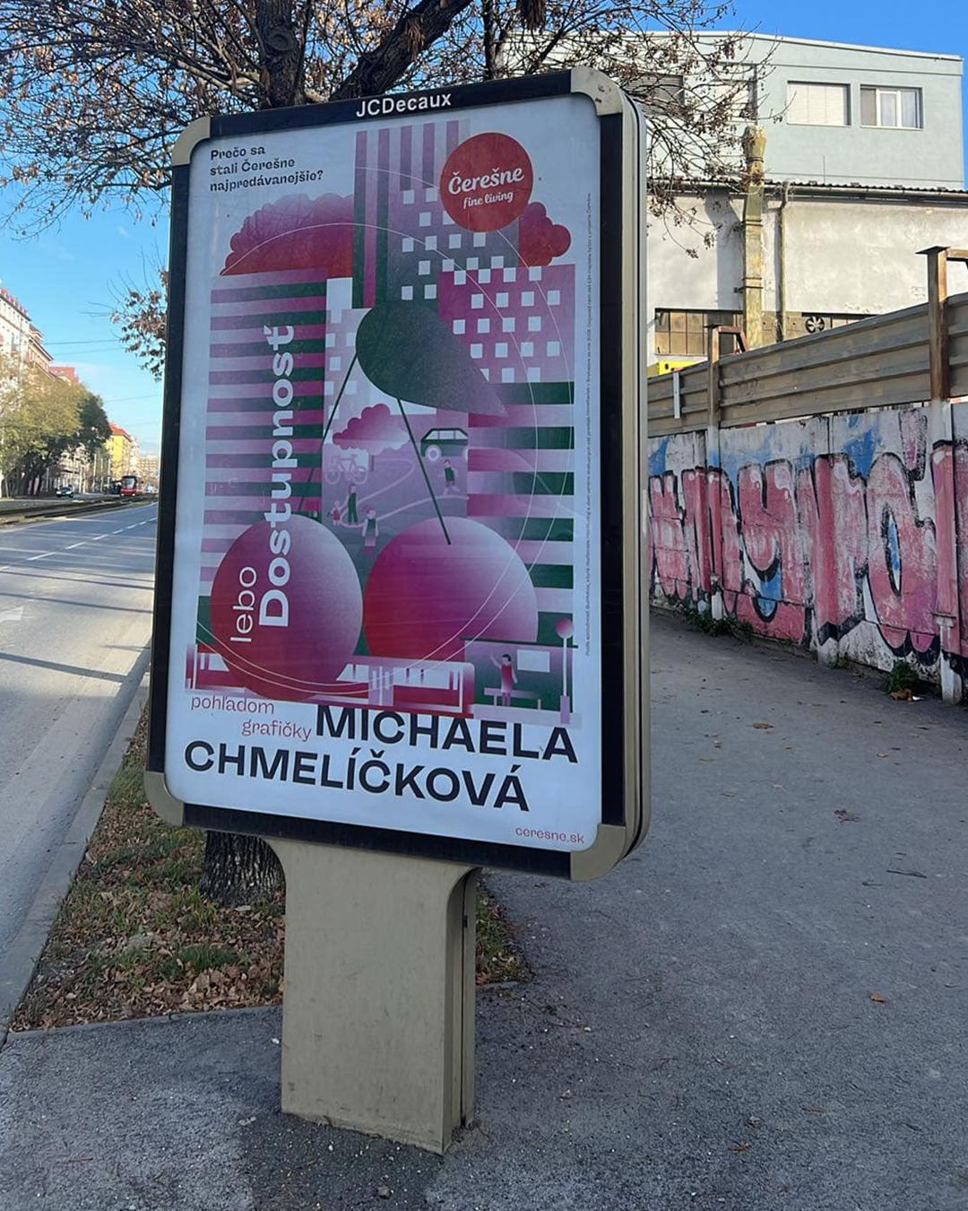
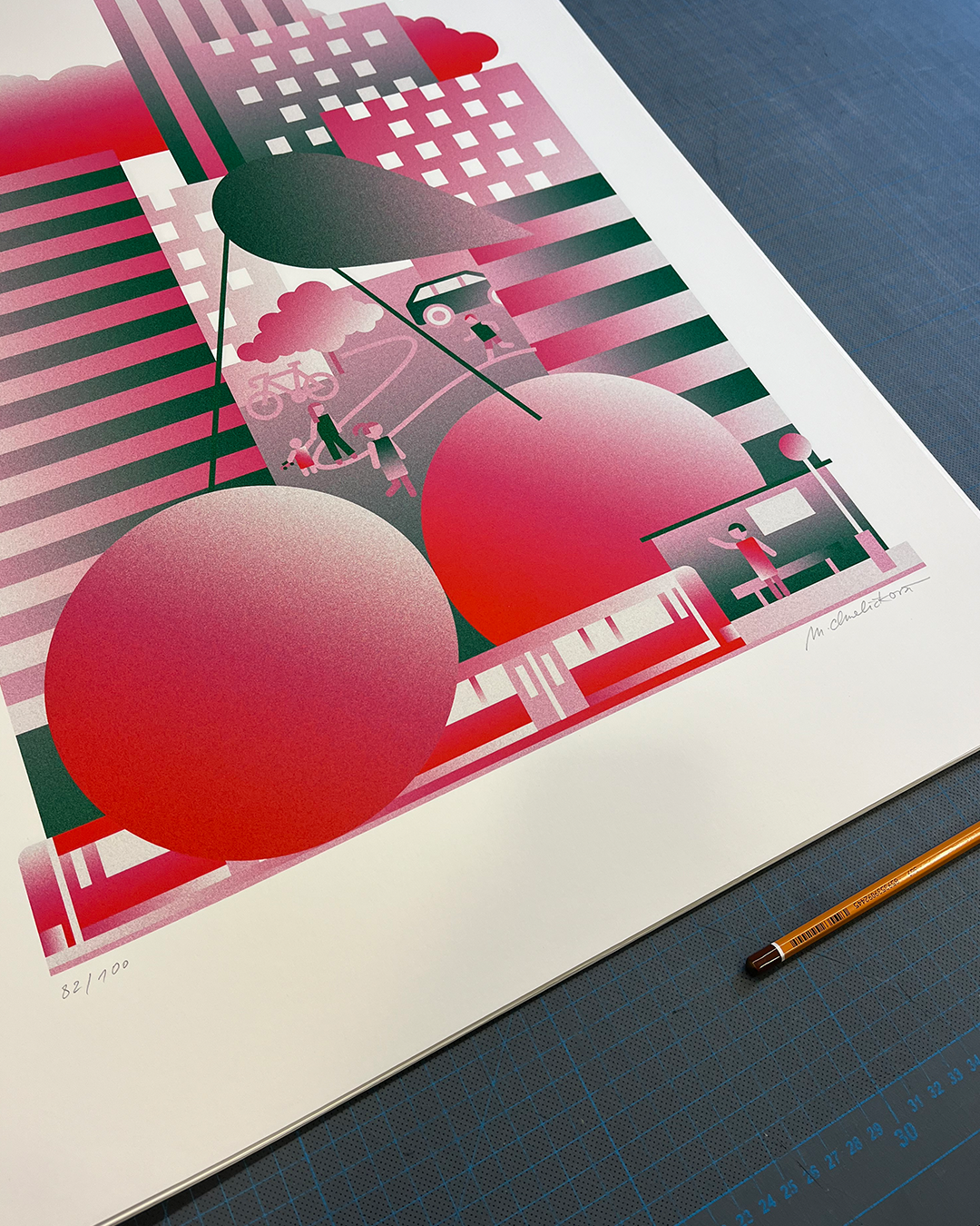
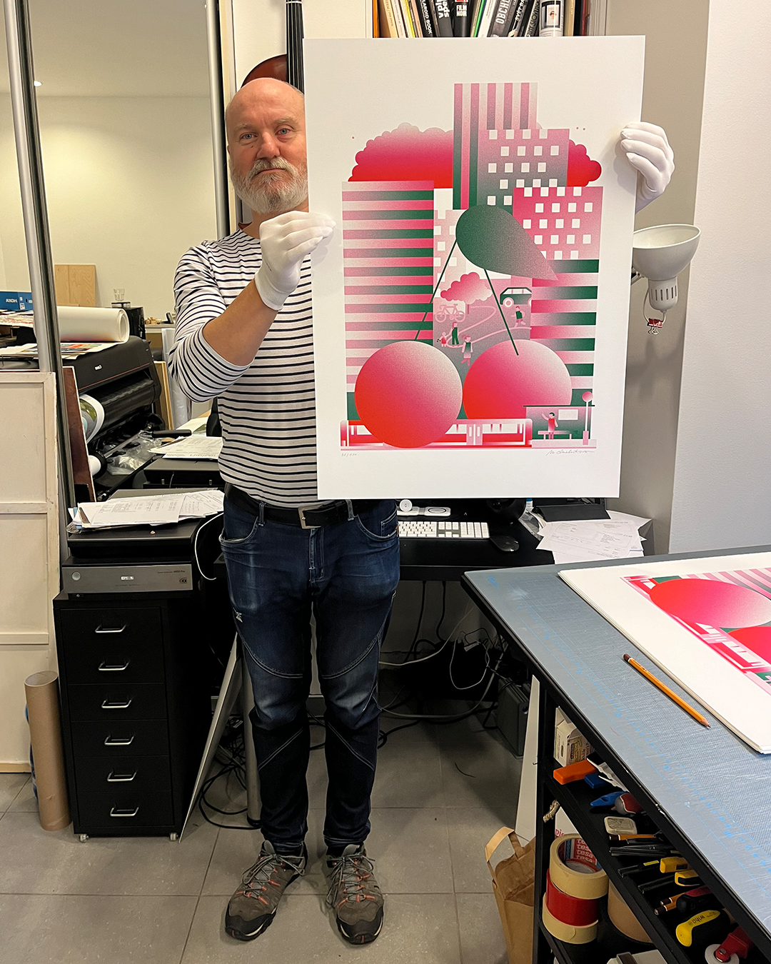
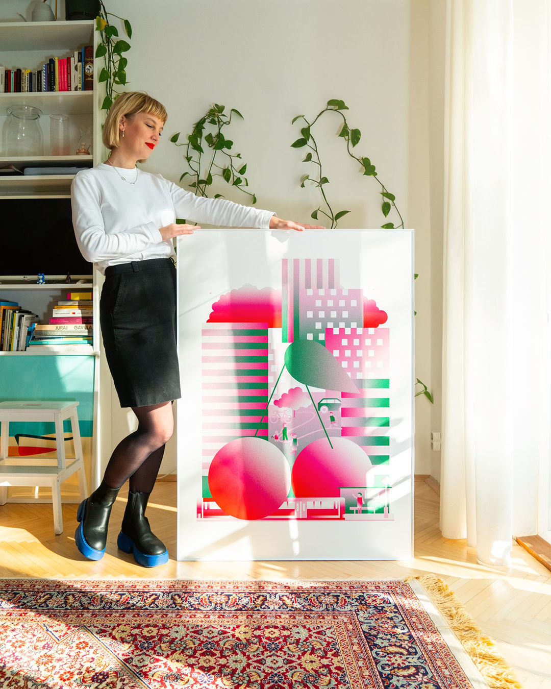
Čerešne
15
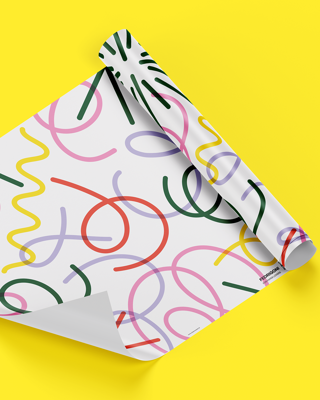
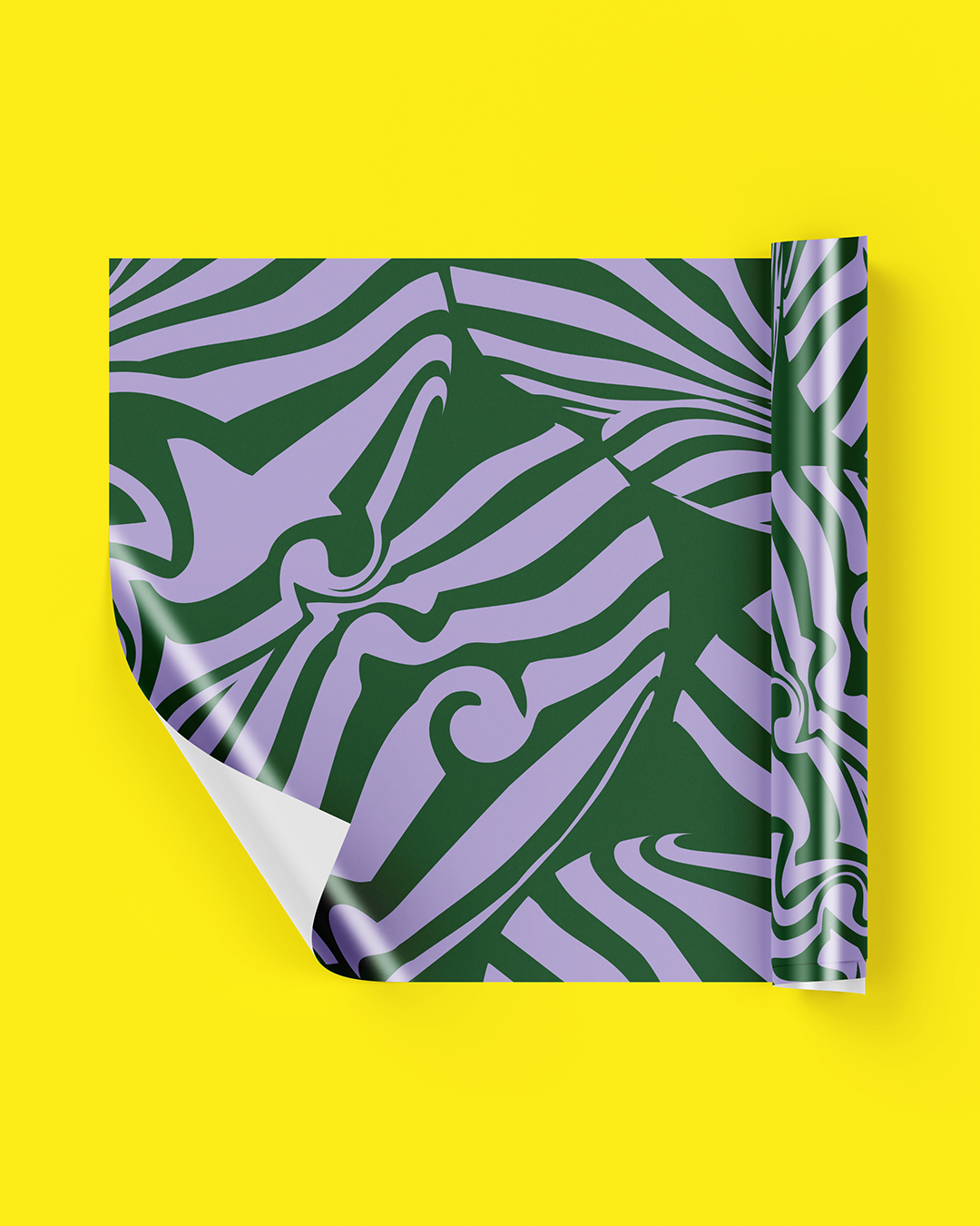
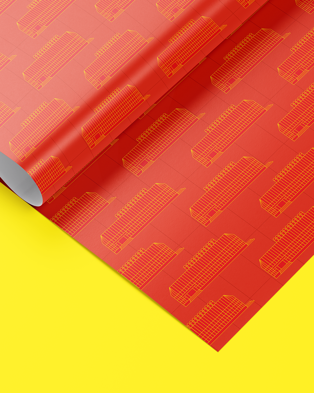
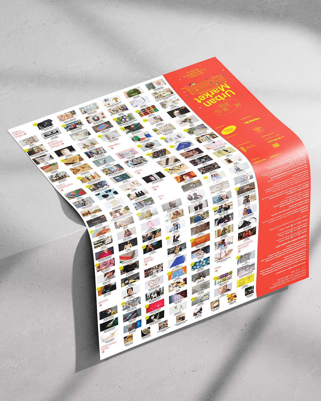
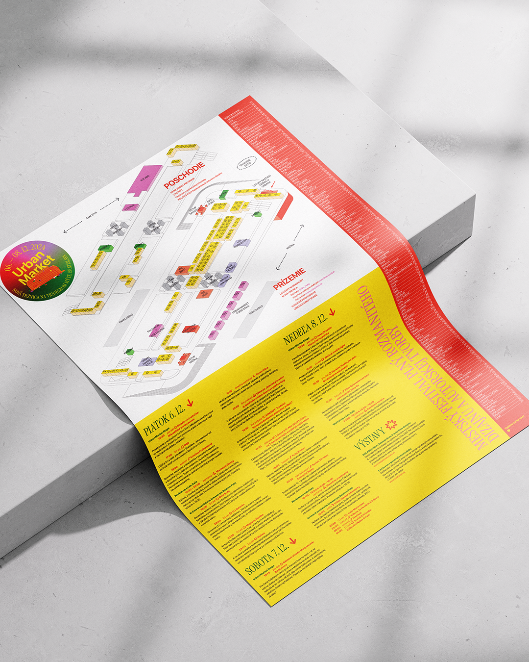
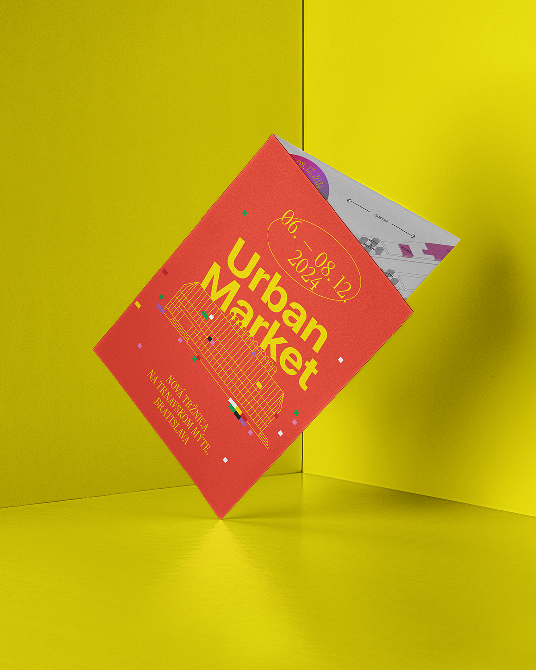
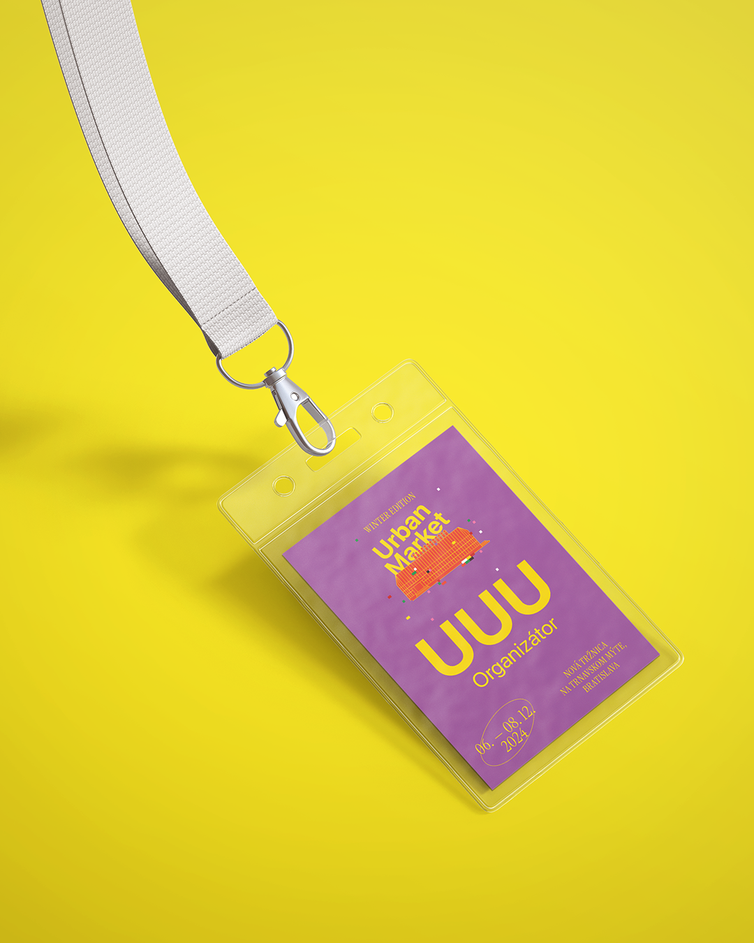
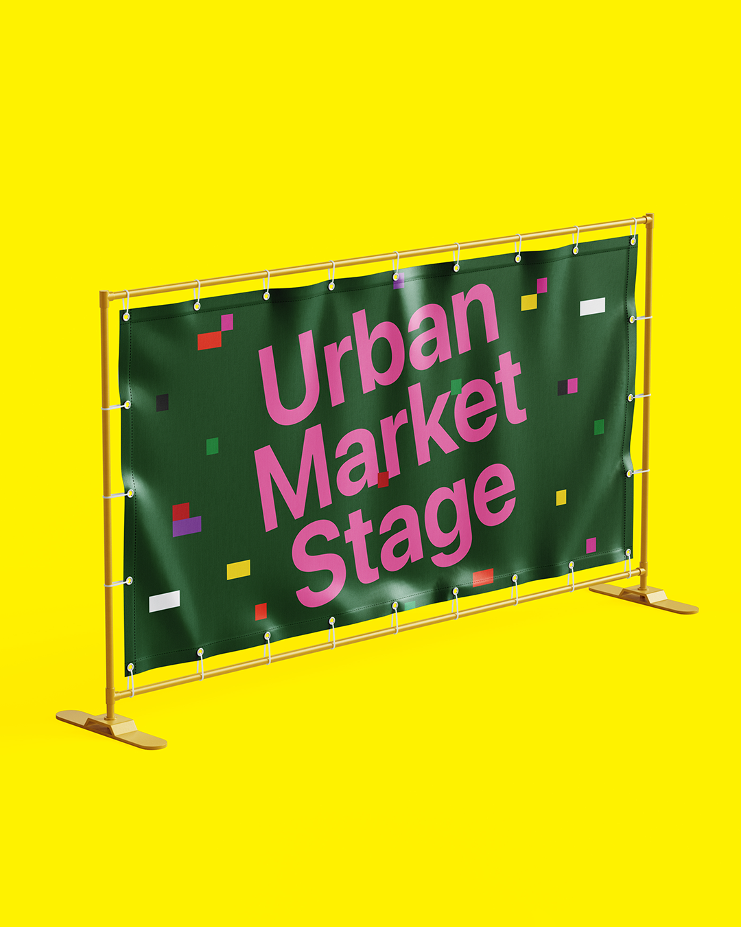
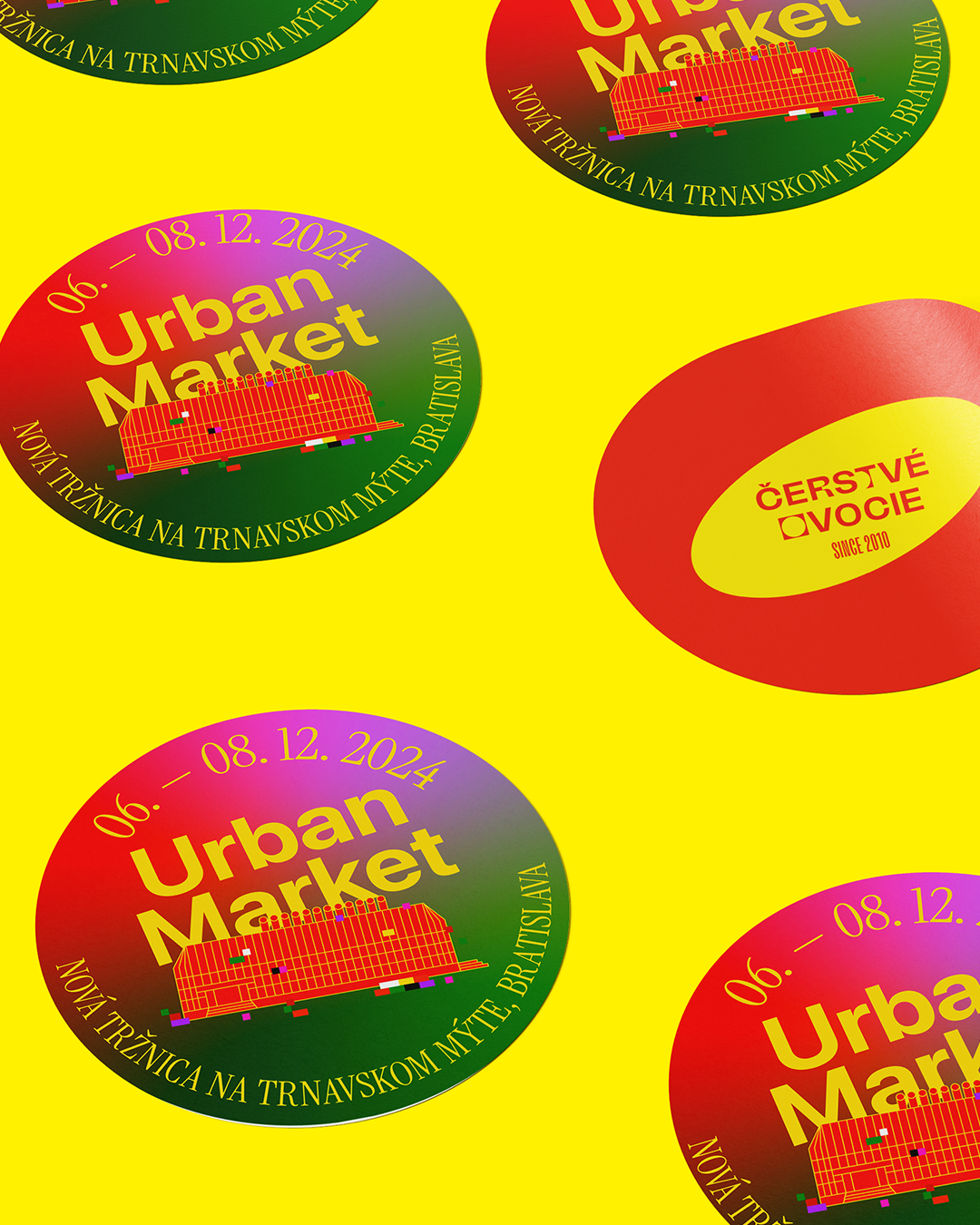
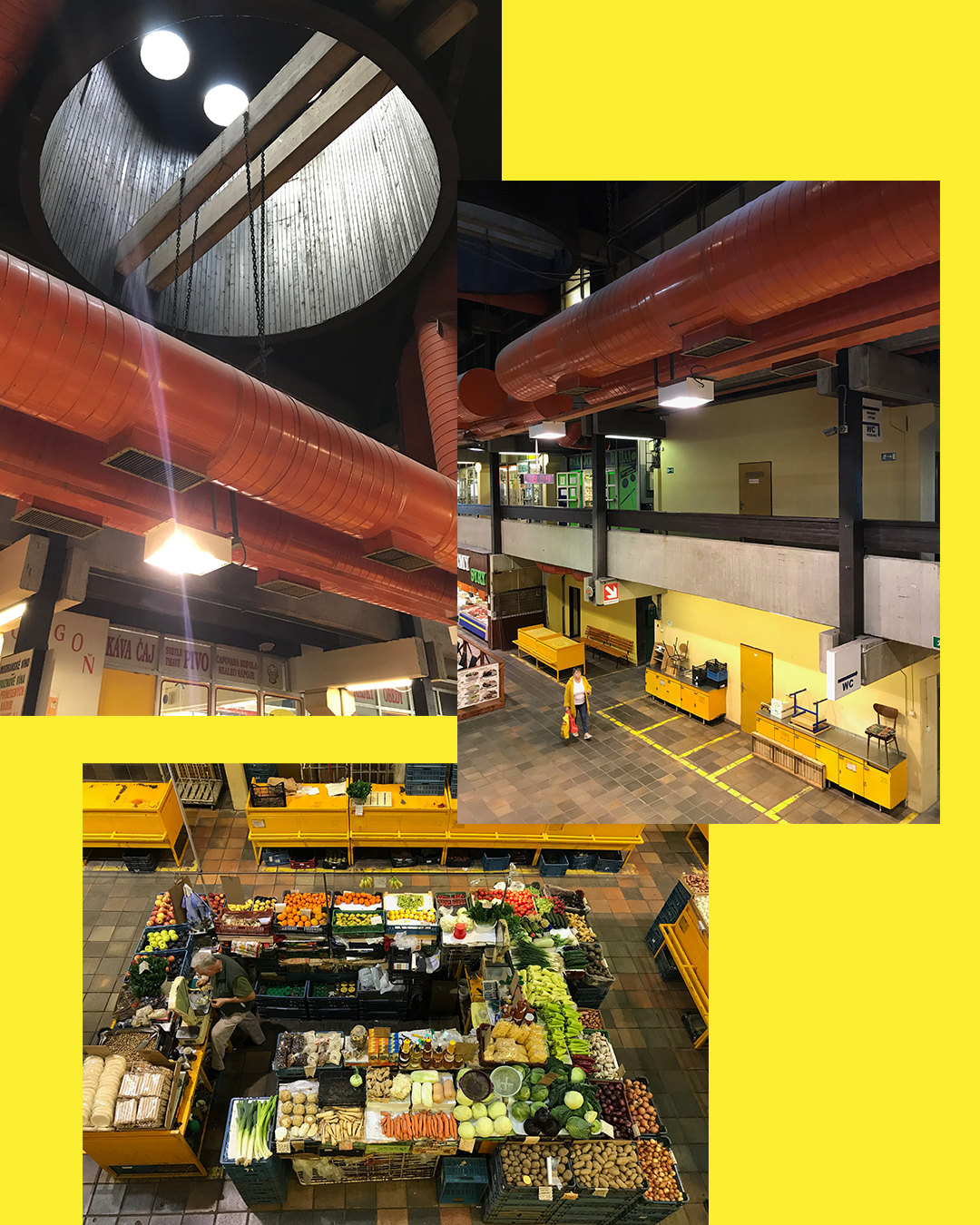
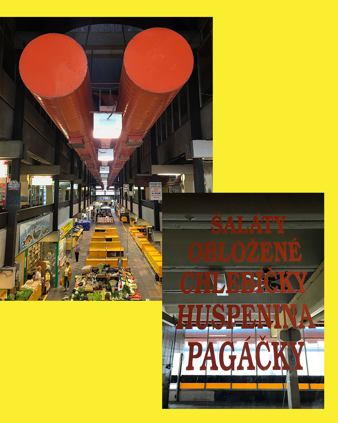
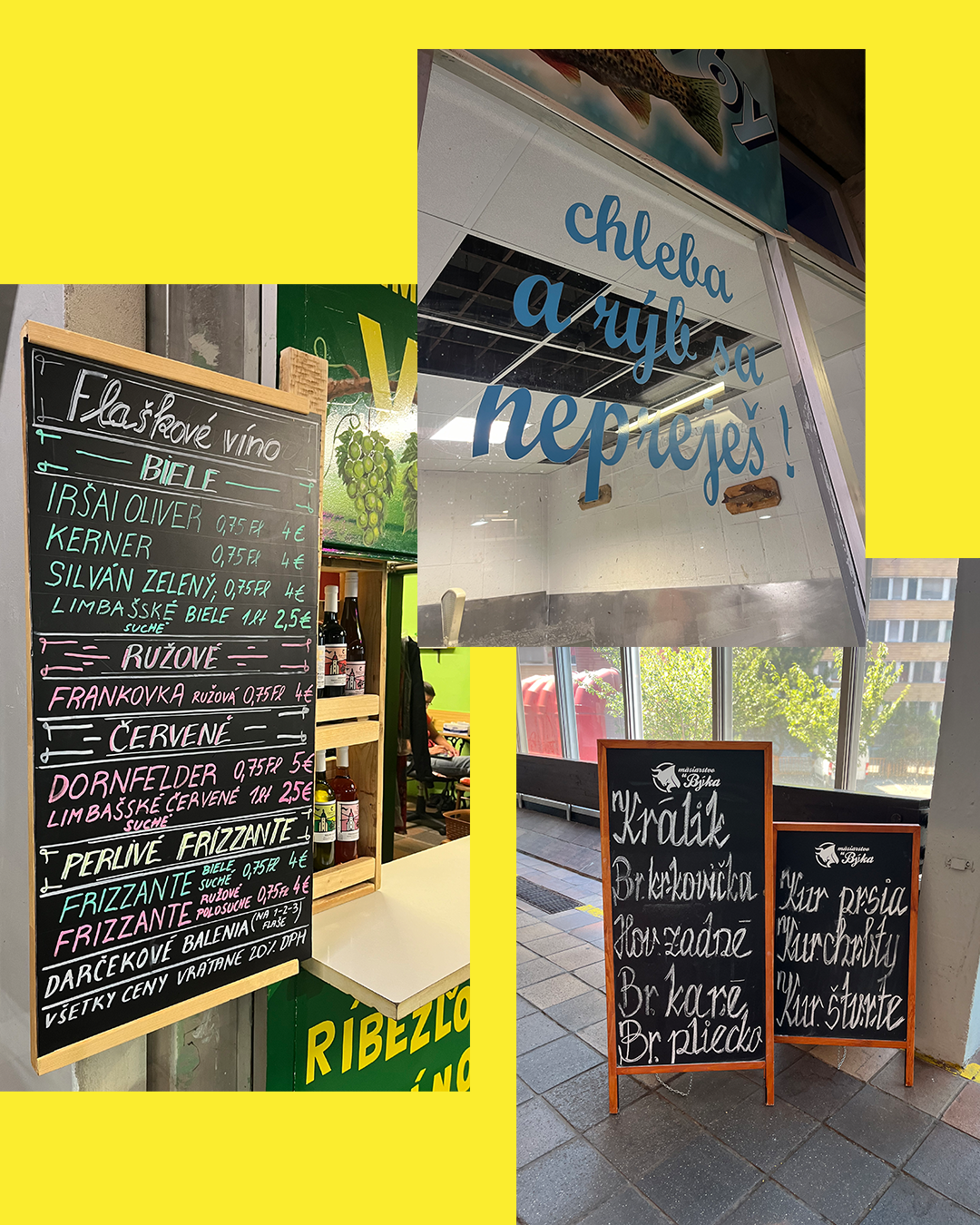
Urban Market 2024
19
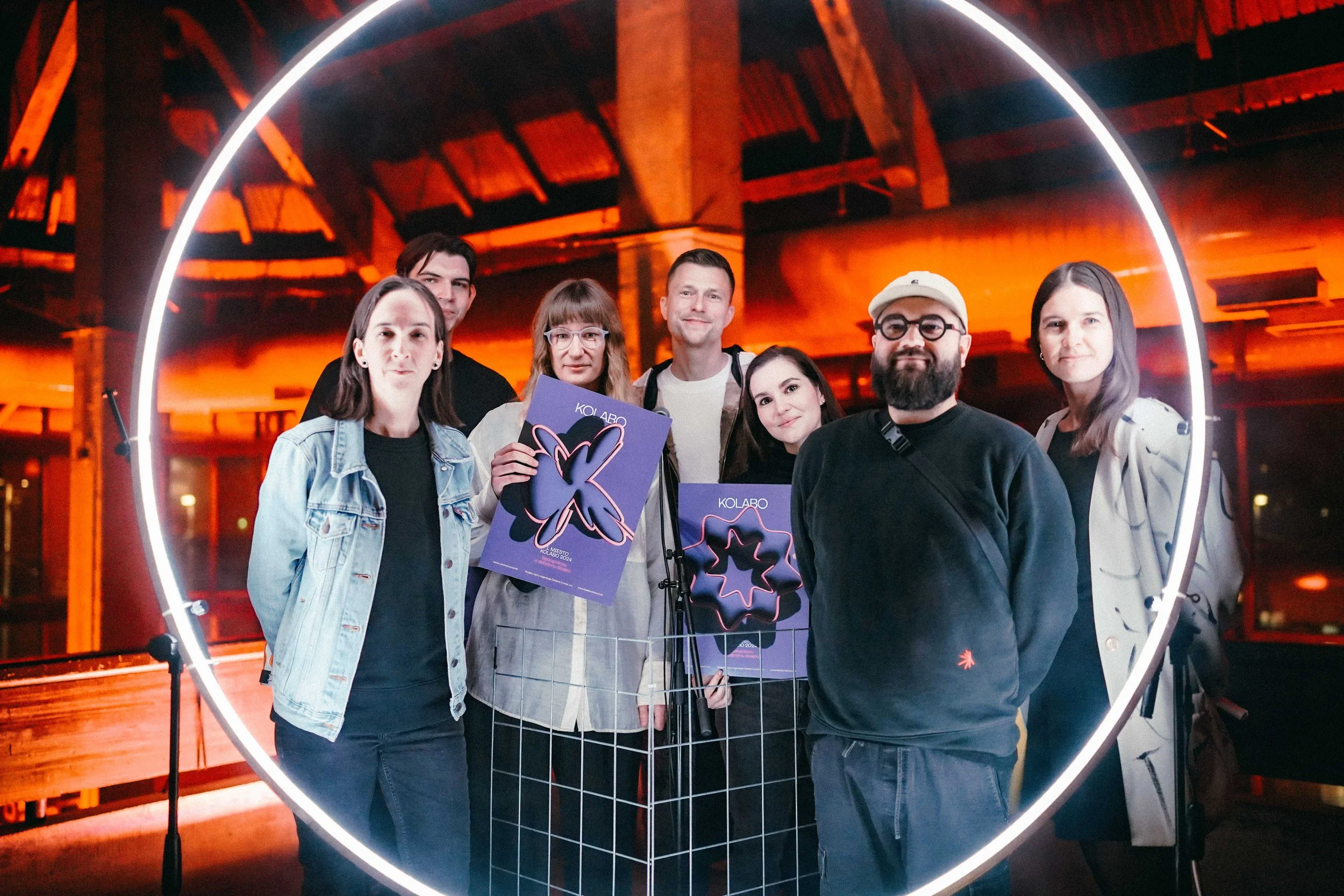
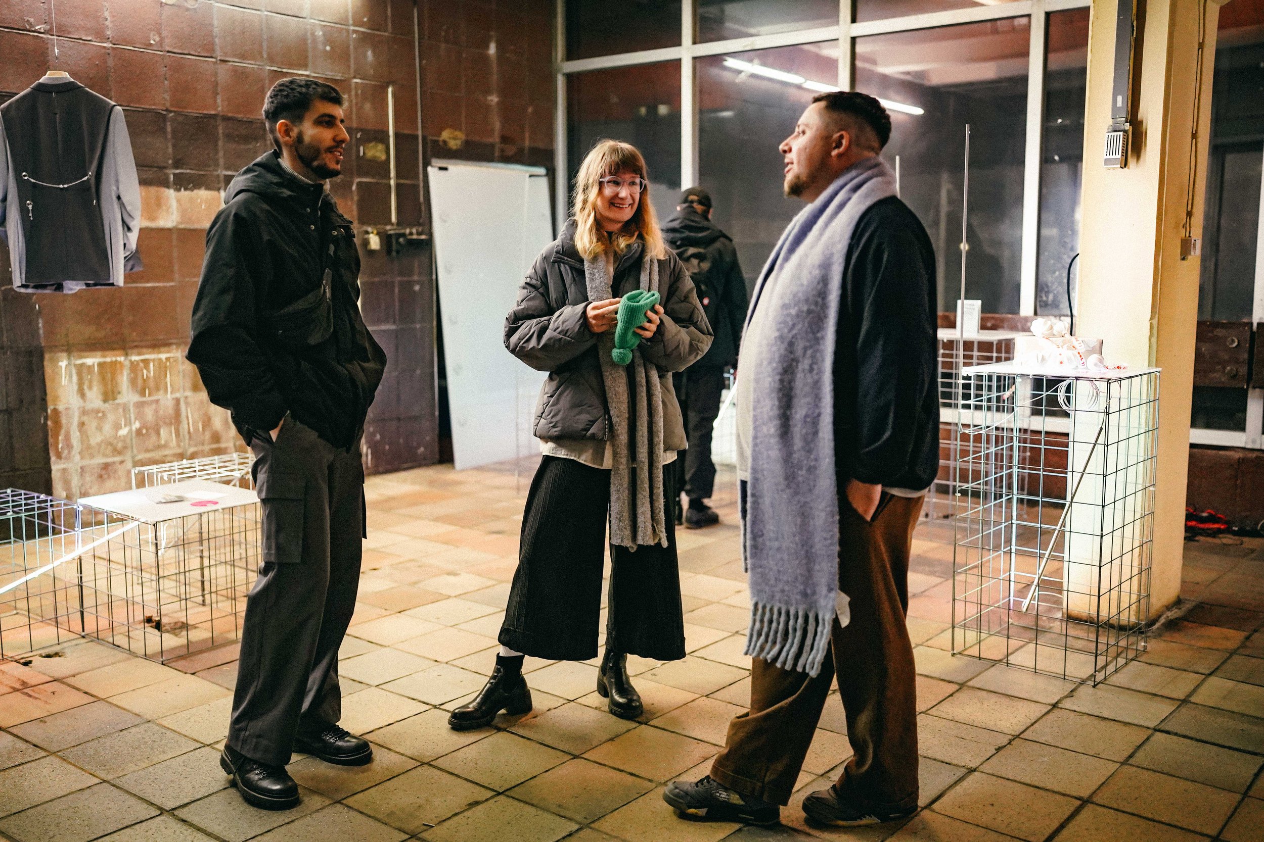
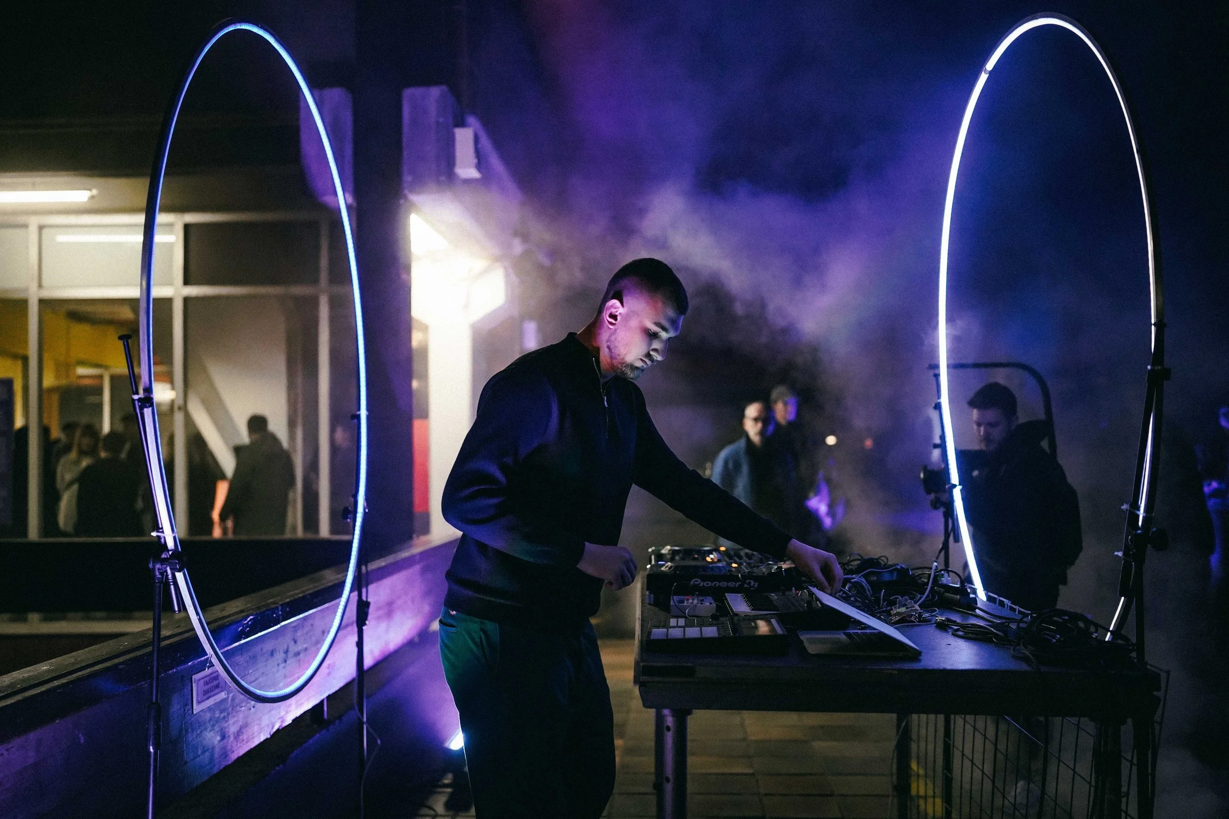
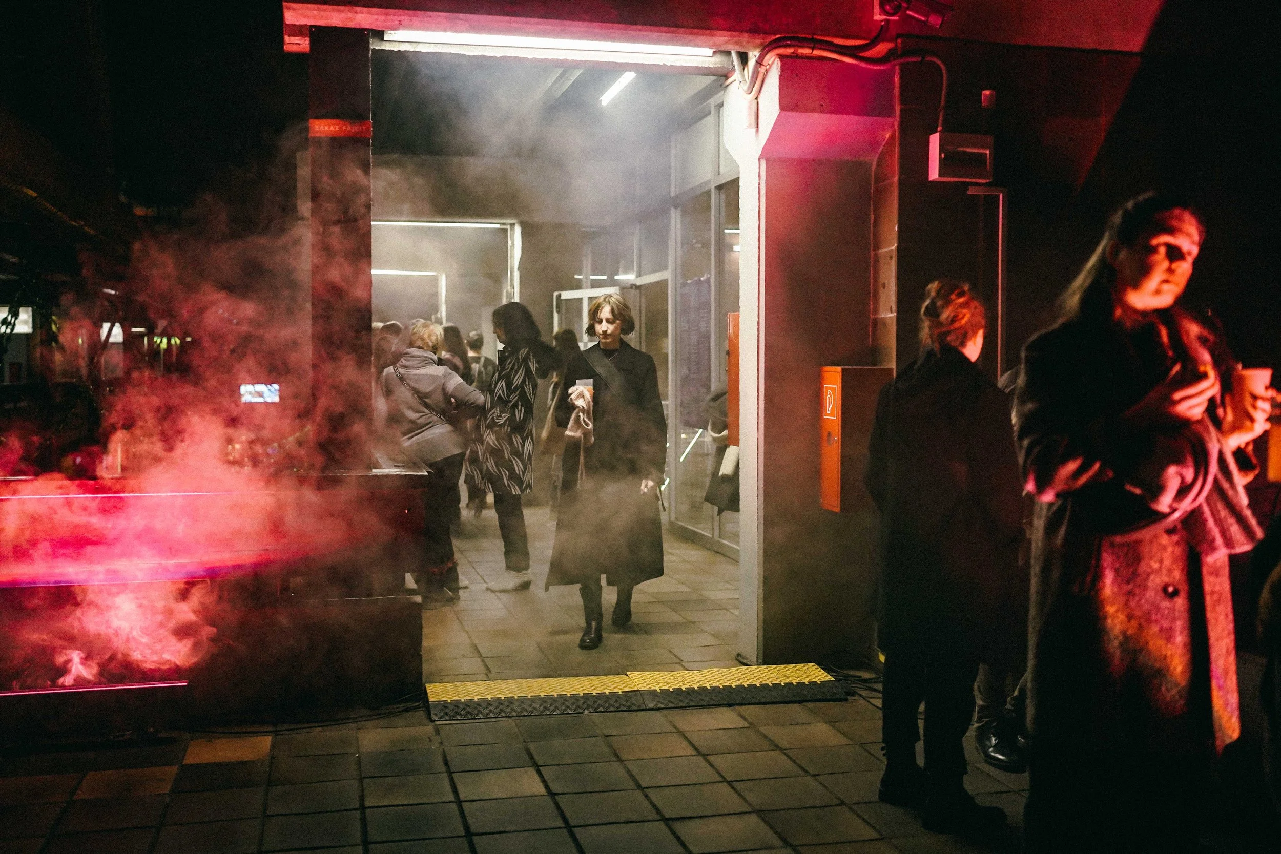
KOLABO 2024

10
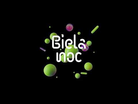
Biela noc 2023

10
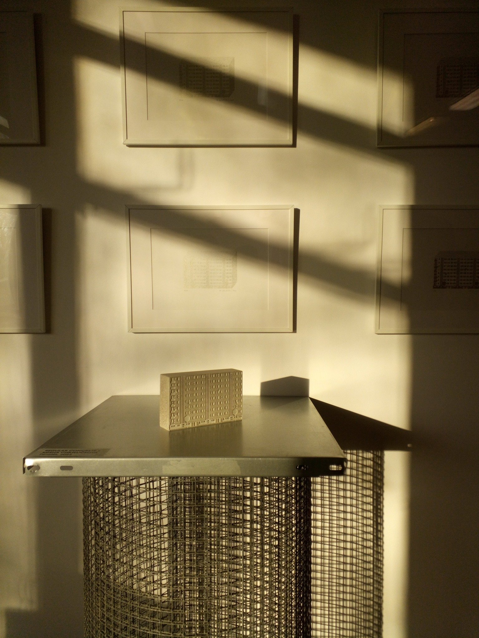
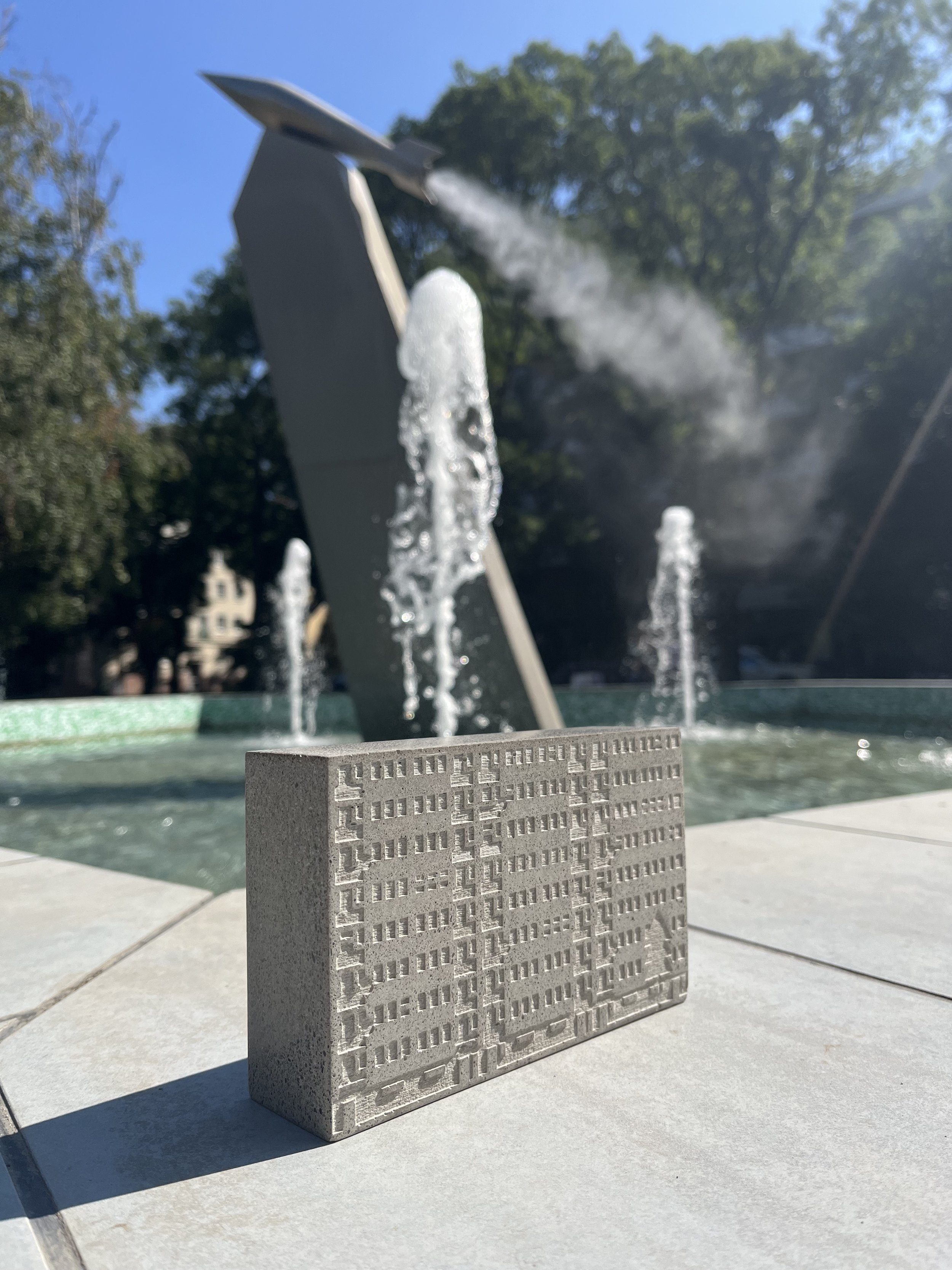
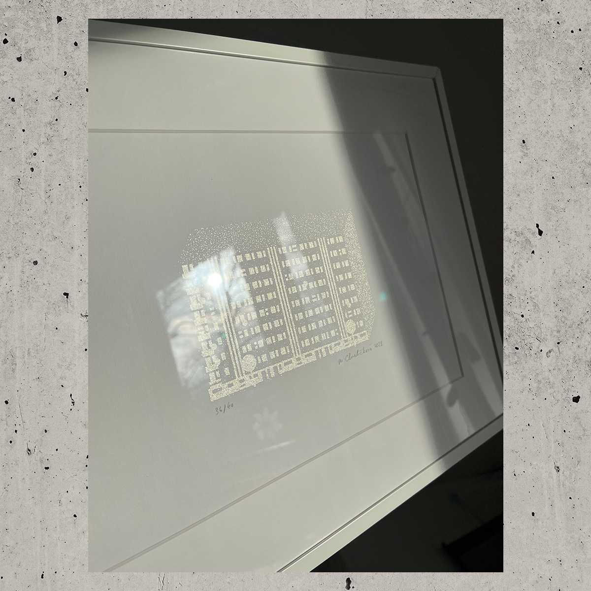
Panelák x Regular Concrete

10
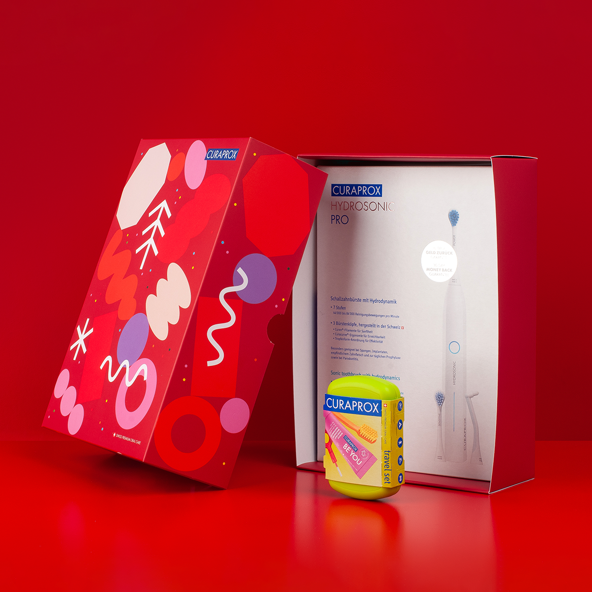
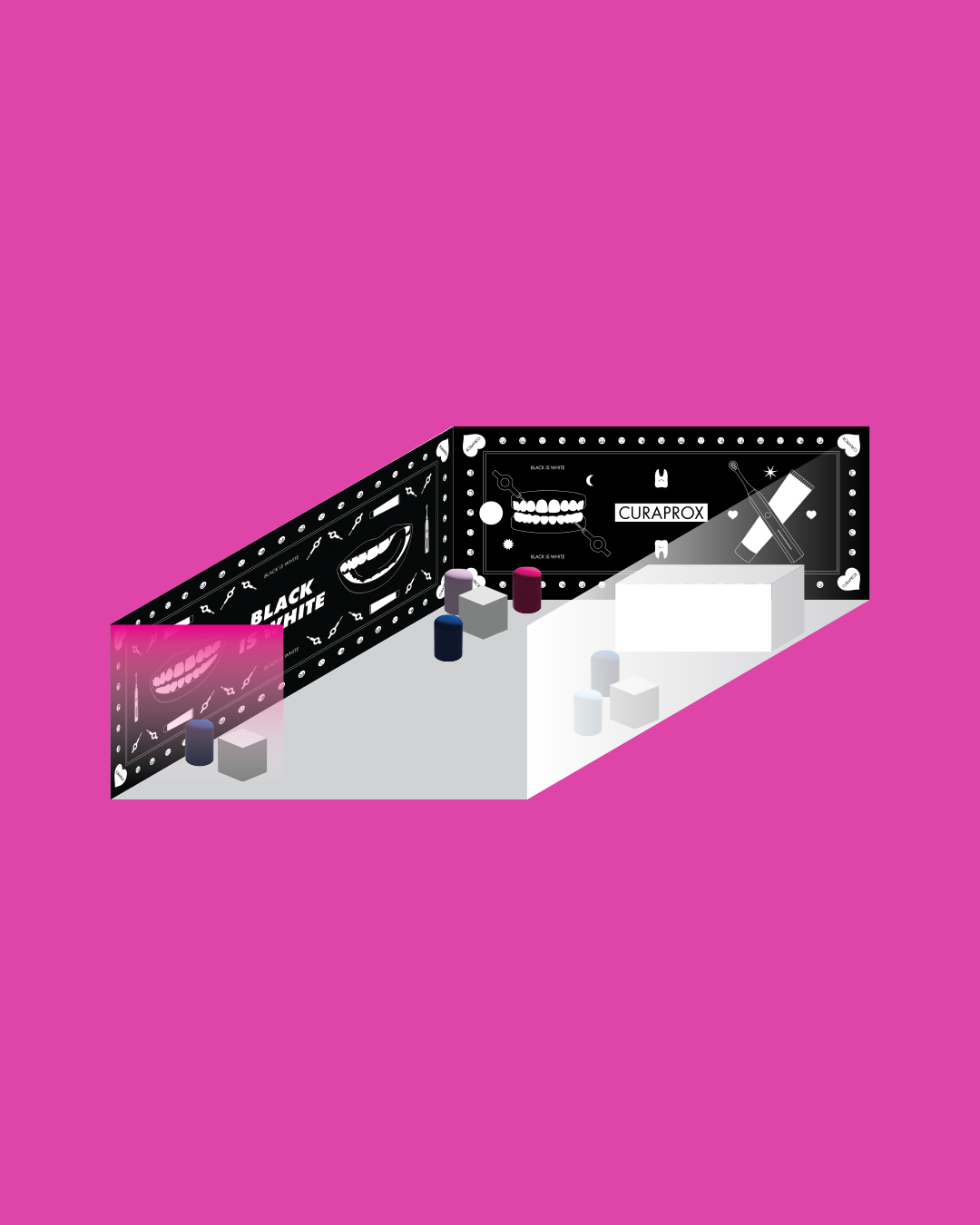
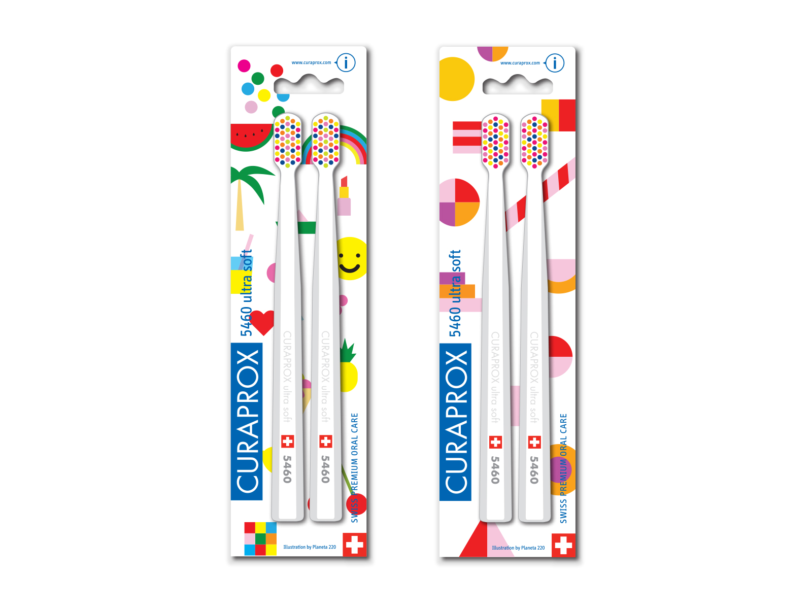
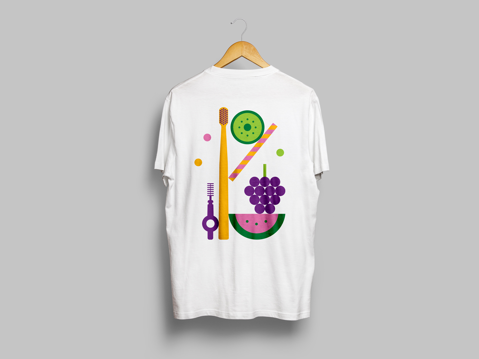
Curaprox Gift Boxes

5
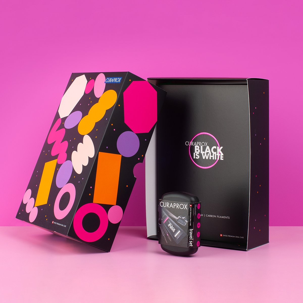
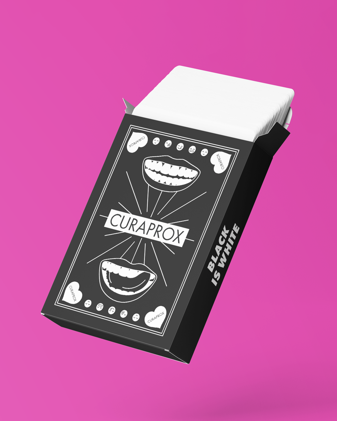
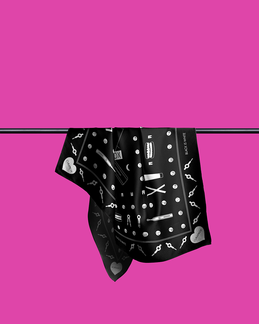
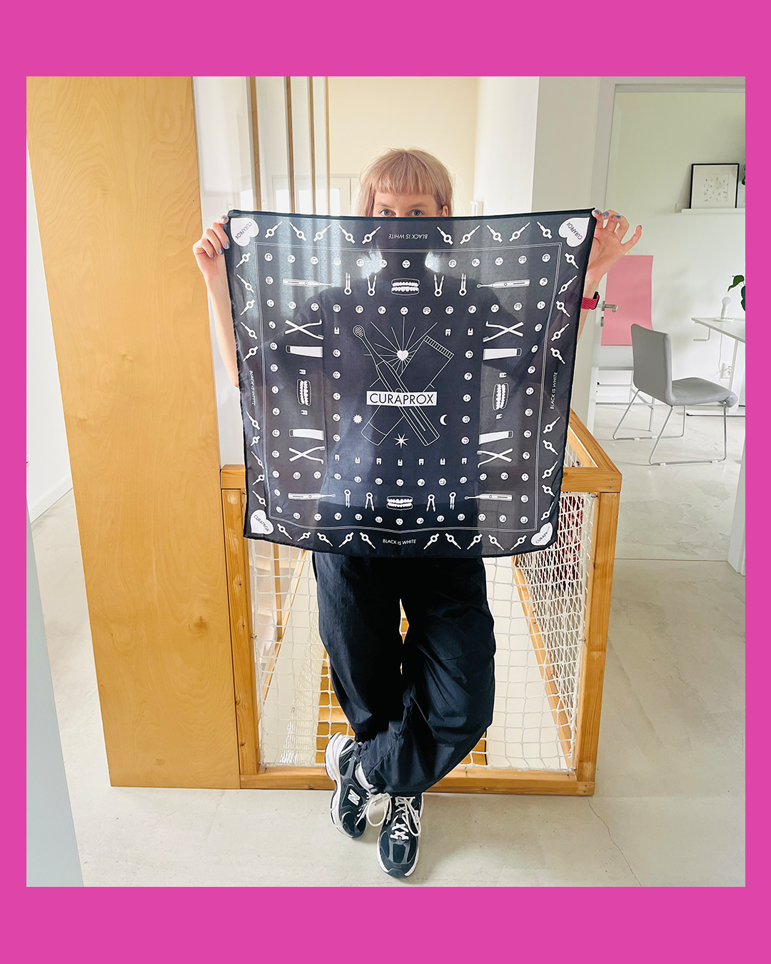
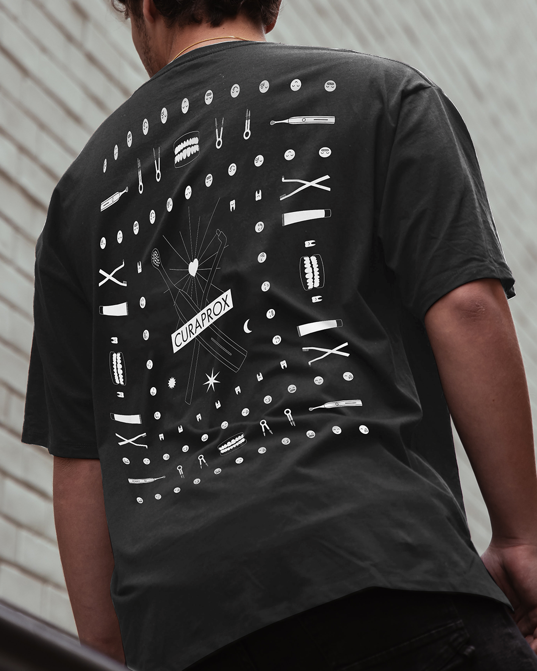
Curaprox 80's Edition

9
Čierne diery

2
OCELA – Cover design

10
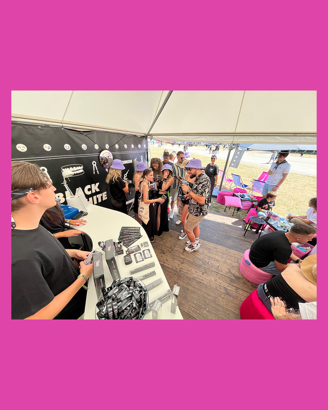
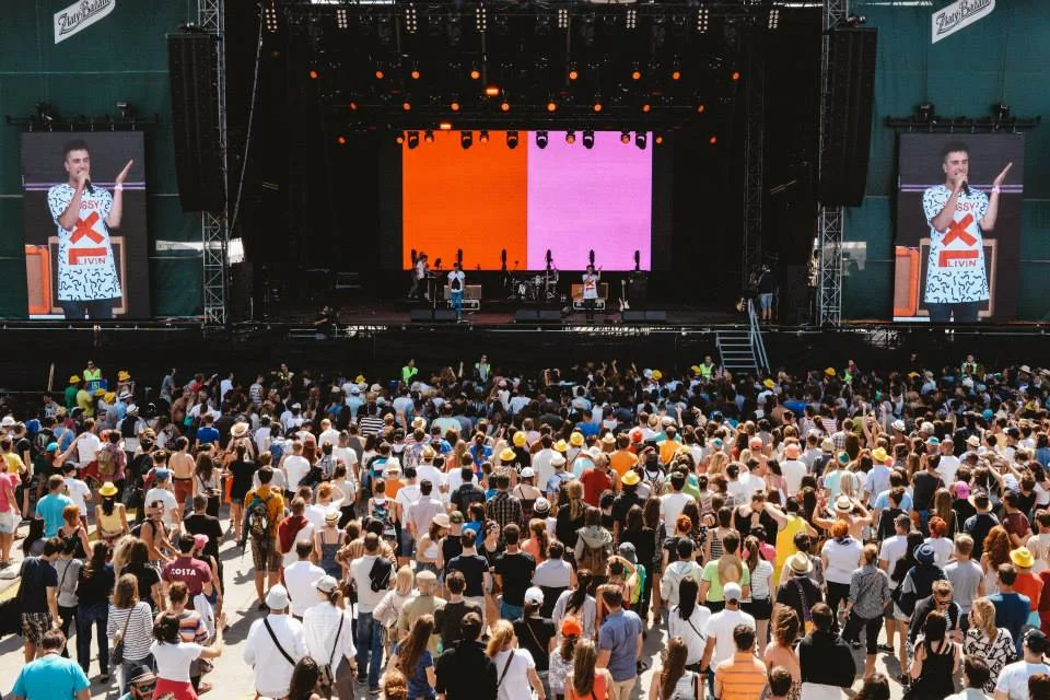
Curaprox @ Grape Festival

6
Biela noc 2019

17
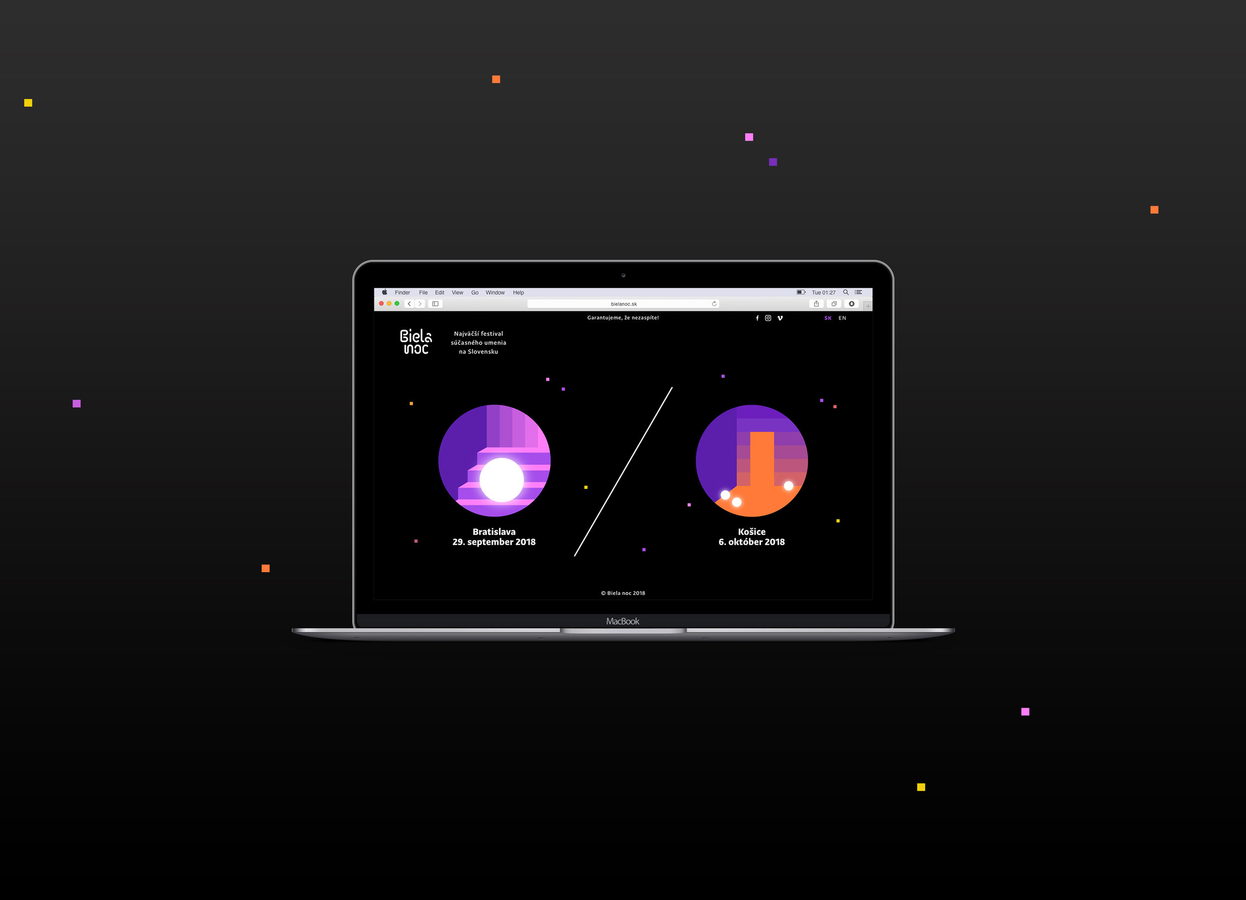
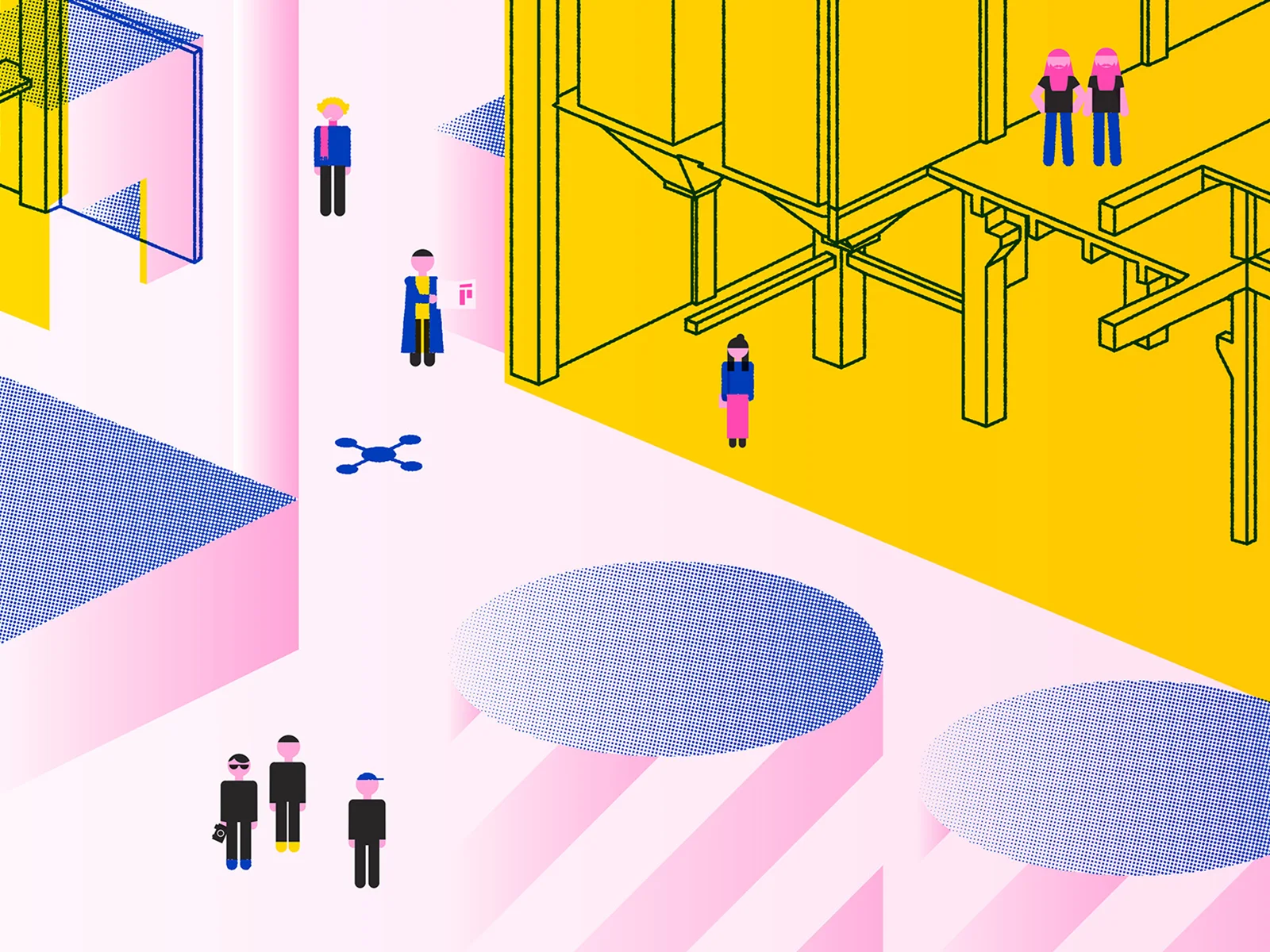
Biela noc 2018

16
Urban Market 2017

23
Biela noc 2017

13
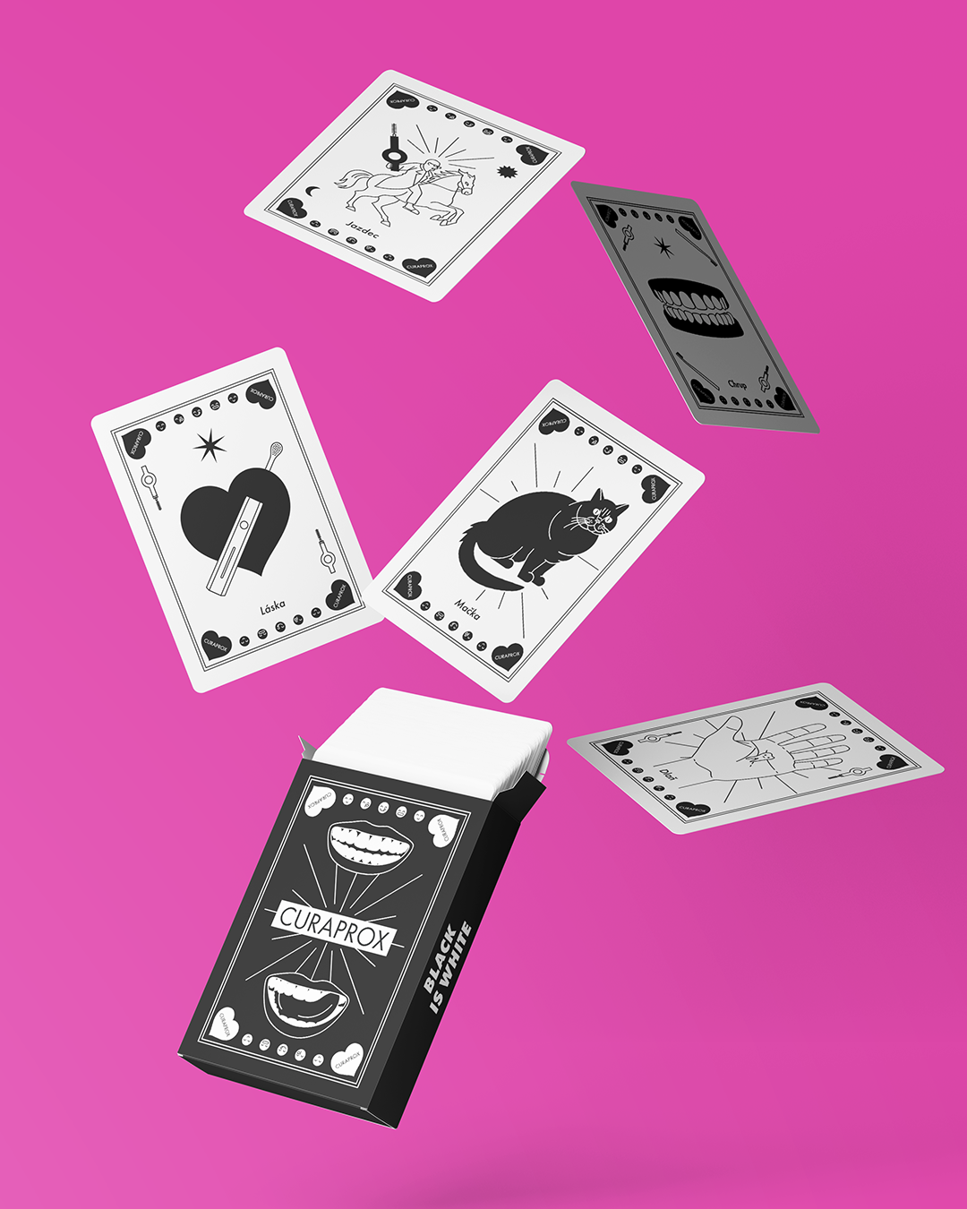
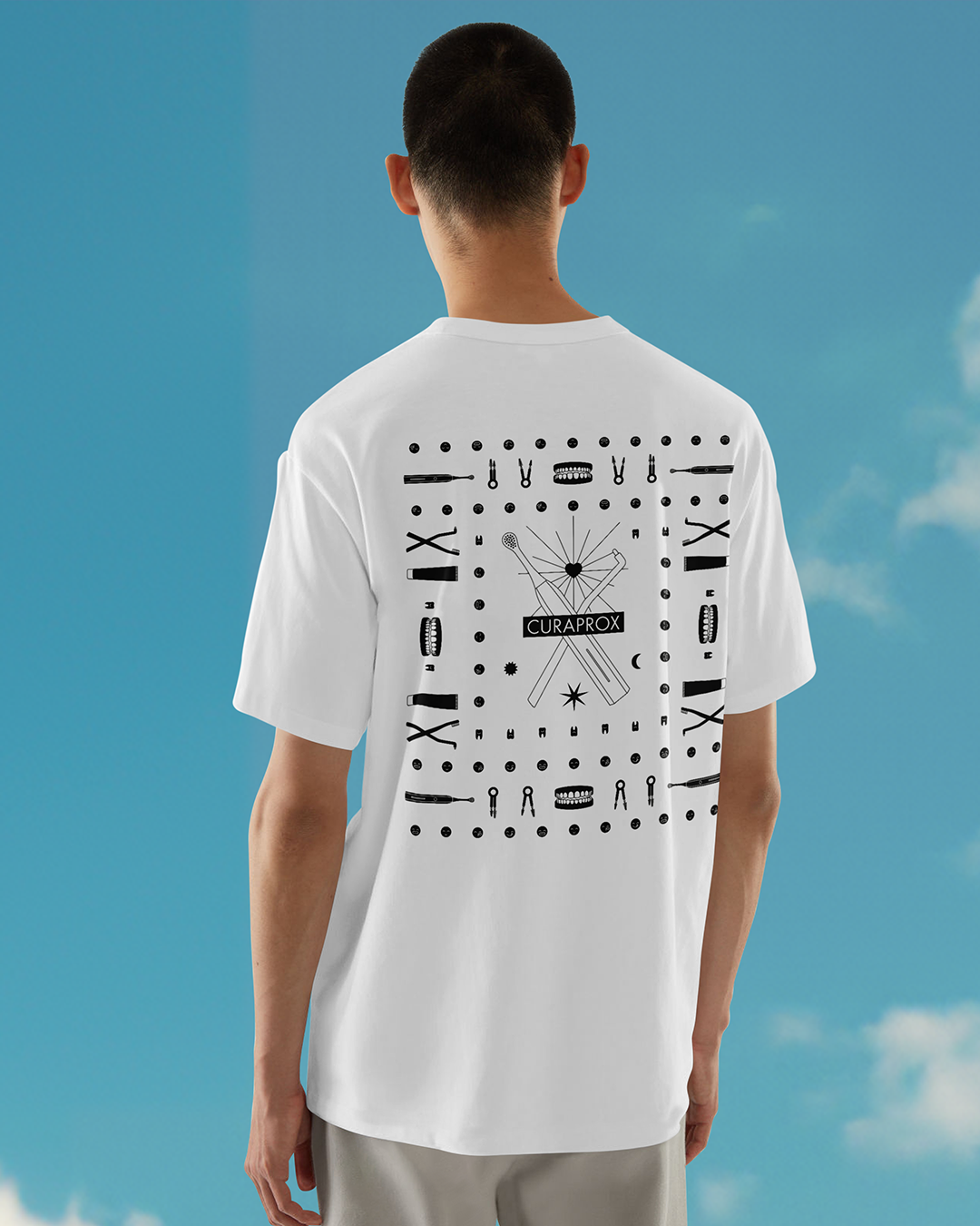
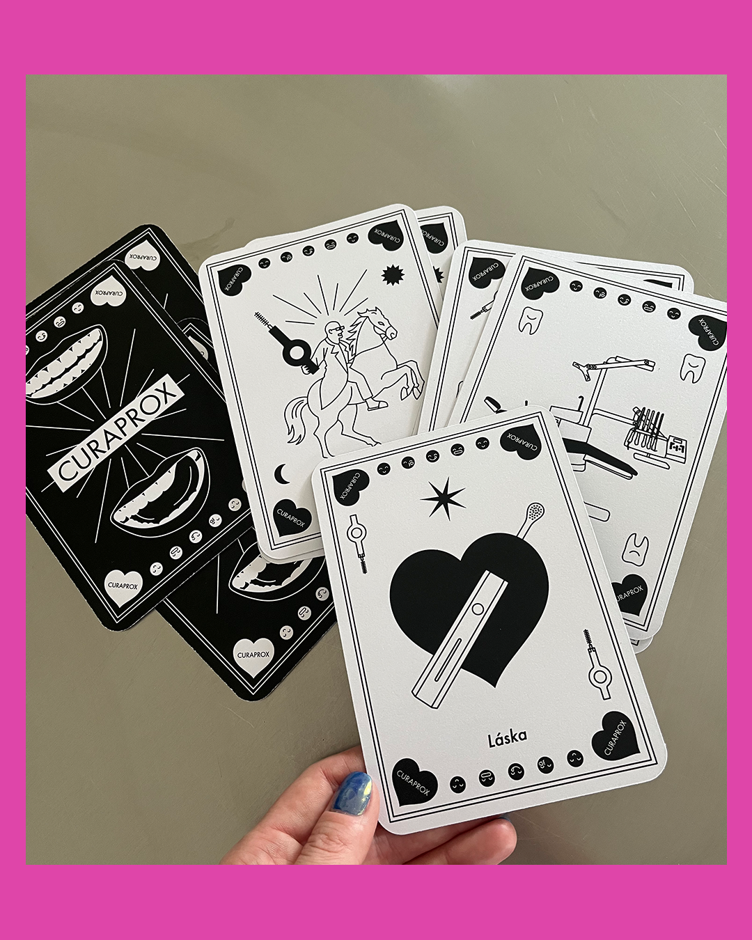
CURAPROX

8
Puojd
14
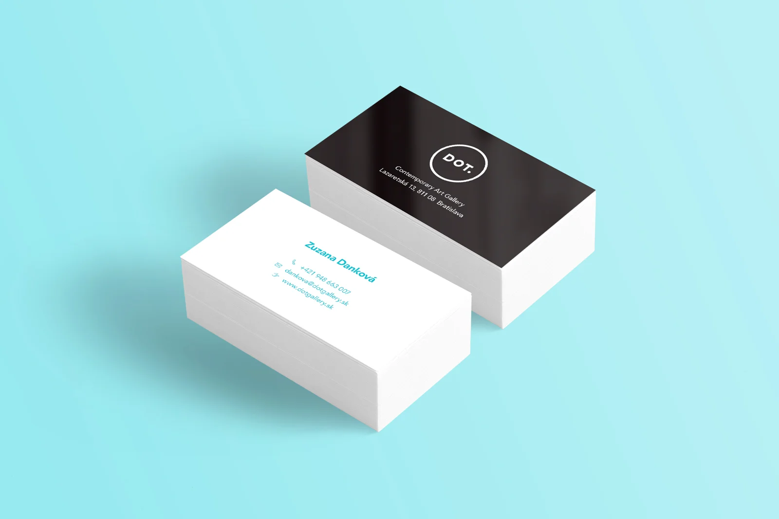
DOT Gallery
7
Brand Identity

12
Prints

18
Biela noc 2015

10
TTTeleport (Illustrations)

10
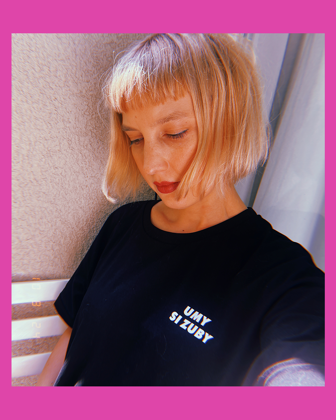
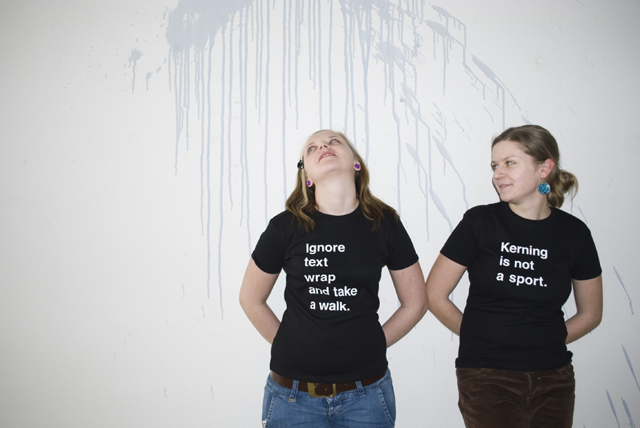
T-shirts for designers
19
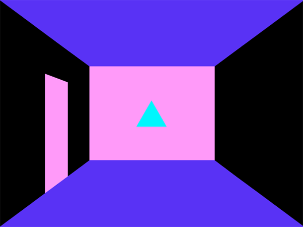
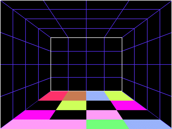
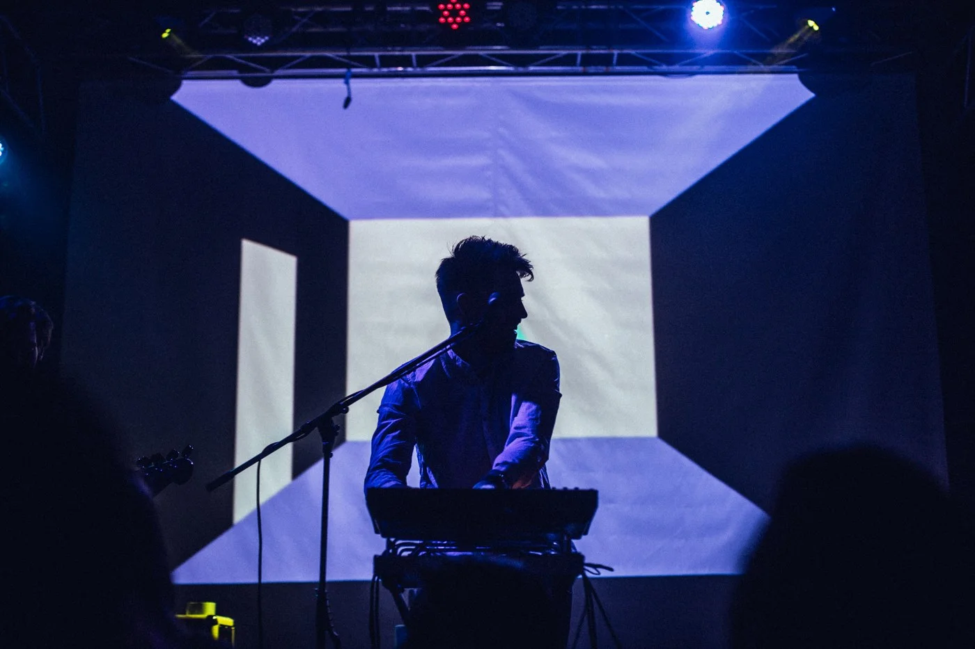
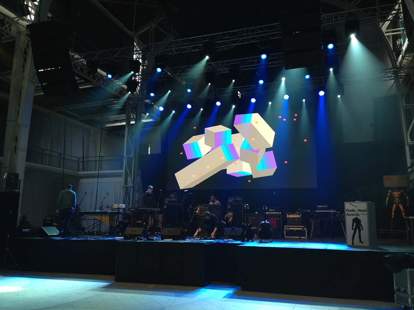
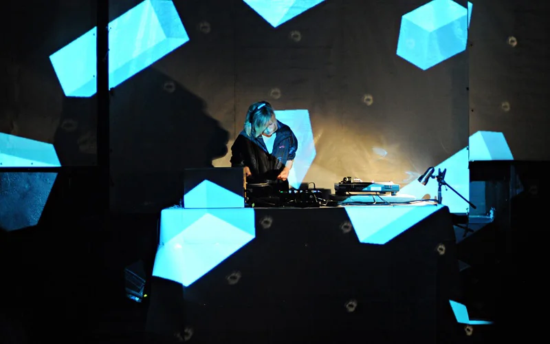
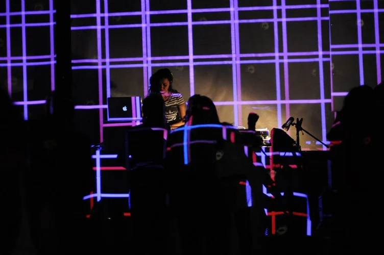
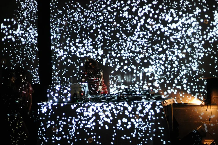
Live visuals

7
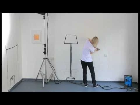
Tapedrawing